Do you remember those websites back in the 90s, and how they first landed on your screen? Do you remember Comic Sans, Scrolling Marquees, Hit Counters, Animated GIFs, or “Under construction” pages? If so, you are right on track! I was reminiscing these past days about these…
Well, a lot has changed by now, especially in the creative industry. Technology has advanced; marketing and communication paradigms have changed, bringing along innovation within web design. Therefore, websites have become increasingly exciting, insofar as unconventional features that are primarily designed to serve content to their users.
Some of these features have become trendsetters for many years. Others simply appeared and passed, barely touching the market for a short while. Trends come and go. There will always be a new trend coming along superseding the one in existence. That’s also the case for website designs, although we never know what becomes novelty and groundbreaking. Having all these cool functions to explore, many website owners adapt to whatever trend comes their way. Unfortunately, others are still stuck in the 90s.
Speaking of which, have you surfed various sites lately? Because I have. And I have noticed that while most sites adhere to the latest web design trends, others fail miserably at maintaining an updated design and implementing it properly.
Have you landed on a website with infinite scrolling, but without any function to go right back to the top (except for scrolling endlessly upwards again)? Some websites have features that are the death of them – slow loading pages, missing or hidden navigation menu, and even pushy CTAs that burst right in front of your eyes, cajoling you to subscribe to their never-ending newsletters and freebies. With that being said, I have listed below some previous design trends that should remain buried forever.
1. FLASH

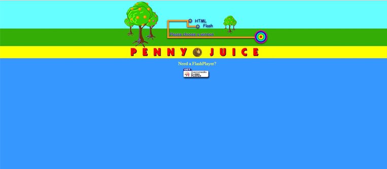
This is the first trend I recommend that you forget about. Start adopting the new HTML5 or other ways to animate your website. It simply is too outdated. Even if Flash played an important role in the rise of the Internet, it has recently become a bad choice for any modern web design and may have a negative impact on your website search engine optimization (SEO).
Although many websites still use it, there are many reasons why you should drop it.
1.1. Flash does not work on mobiles
If you incorporate Flash into your website, it will be unusable on mobile devices. It might even cause frustration among your audience. Taking into consideration that more than 60% of the Internet traffic is made using mobile phones and tablets, I think you should pay more attention to this aspect.
1.2. Flash is bad for SEO
Flash does not have any URLs for the separate pages and does not allow you to monitor outbound links. Therefore, Flash-based websites don’t provide enough elements for an effective SEO. Besides, they tend to be harder to use. Hence, Google gives lower rankings to those websites.
1.3. Flash must be installed into the browser
Being a proprietary software, Flash has to be installed, as it does not come with the browser by default. Users with a browser without the plugin are prompted to install it. Otherwise it restricts access to the content that heavily relies on it.
 1.4. Terrible loading time.
As I have mentioned before, Flash-based sites tend to take longer to load. Taking into consideration that Internet users are busier than ever, it’s essential to have a site with load times as short as possible. If visitors have to wait too long, they might be tempted to look elsewhere, hence your competition, for a faster site.
1.5. Serious security flaws
Flash has always been plagued with reported security issues, but the last security flaws which led Firefox to block Flash by default on all websites until the flaws were patched is the final warning. It won’t be long until other browsers do the same thing.
2. CAROUSELS
According to a usability study published by Neilson Norman Group, auto-forwarding carousels annoy users and reduce visibility. For sure, each of us viewed such sites at one time, and did not pay too much attention to those auto-forwarding pictures.
According to this study, there are a couple of reasons why these believed-to-be “cool” design features are not great for your site’s usability and conversions:
- Automatic rotation makes users lose the control of their interactions with your website. That is particularly annoying to those with motor skill issues.
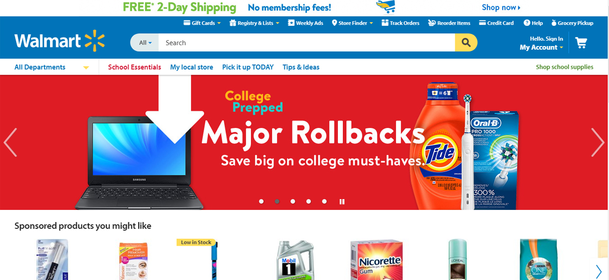
- They create banner blindness, and are often ignored by the viewers. Take a look at the example listed below. You will notice how the image slider hardly gets any attention, especially when they are focused on their desired products.
- In many cases, the slides rotates so fast that readers do not have time to read your texts. Especially when part of your audience has a different native language than yours. Users clearly express their frustration by saying “I didn’t have time to read it. It keeps flashing too quickly.”
3. COMIC SANS FONT

Surely, there are many pros and cons to using Comic Sans font. But it’s time to let it go, even if it is one of the most frequently used fonts in the world. Granted, like everything else, there are designers who love it, but also there are designers who absolutely despise it. Personally, I am somewhere in between. It looks homely and handwritten, making the perfect choice for those things we deem to be fun and liberating. It could be great for toy shops. Nevertheless, t is not the ideal choice for corporate identity, luxury brands, media, or health services.
Still, Comic Sans is rooted in a history where early word processing had a limited number of fonts by default. Thus, Comic Sans was the go-to choice for the ‘less serious of fonts’. But nowadays, tens of thousands of fonts in every imaginable personality are readily available online, paid or free of charge. I hope the previously written article about Top 9 free fonts for designers (link la articol) will be a starting point, should you need some inspiration.
4. UNDER CONSTRUCTION PAGES
A common practice throughout the history of Internet and web design has been the use of “under construction”. These were useful pages for upcoming websites or for page that were in the process of redesigning. It was awesome in the past and people liked them. But nowadays, in a fast-paced environment, you should definitely put it on the ‘Do NOT’ list.
In many cases, a website establishes the first contact between your business and your target audience. So by providing a link to a web page, you have promised to deliver something (usually content). But by simply publishing an “under construction” page, you deliver nothing but frustration and disappointment. This is not the kind of first impression you want to give your customers.
Nevertheless, please take into consideration that plain “under construction” pages do not have any content on them. So, you do not deliver any content to Google, which in turn ranks websites based on their content. Therefore, they will not rank or index your page, and this is bad for your website!
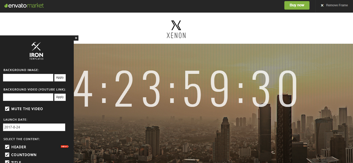
So, instead of using this terrible option, you should consider putting up a beautiful landing page with some basic info, a newsletter sign-up form, a waiting list form, or a sleek-looking countdown.
You may find some inspiration here:
5. DRAMATIC DROP SHADOWS

Although drop shadows is a tool that adds more spatiality to your text, you should stay away from the cheap & fake lighting effects! Big, soft, dark, and distanced drop shadows are the design equivalent of a Glamor Shot lighting, and no one really believes it. Even worse, anyone with some Photoshop skills can easily recognize the default drop shadow settings when they see them.
There are many other eye-catching ways to use drop shadows. For example, to make the text more realistic with added contrast, you may use subtle shadow, blending it in with the background.
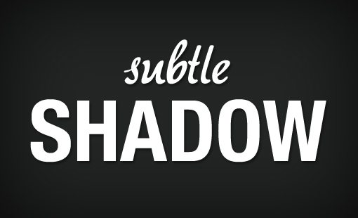
If you want to add a cool retro vibe to your text, you may use the solid hard edge shadow behind the text. This is especially true if the hard edge shadow is separated from the text slightly, as well.

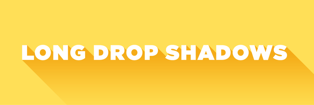
For an interesting, yet simple design element that gives movement without unneeded distractions, you may use long shadows. This is a newer trend that works perfectly with the minimalist trend.
6. BEVEL AND EMBOSS
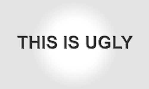
Nothing screams 90s designs like the old default bevel and emboss effect. For non-designers, “bevel and emboss” is a Photoshop effect that can be used to create a 3-dimensional appearance.
If a millennium ago it seemed like a good idea to add a tens of thousands of effects to your typefaces for highlighting your texts, it’s time you traveled into the future. Consider getting the same effect in a different way.
For example, make the button glossy, but using a smaller inner shadow and a light outer drop shadow.

Bottom line:
The trends above serve to illustrate the idea that keeping outdated design elements can actually negatively impact your website. Thus, making a bad impression on your viewers. But you should also keep in your mind the message you want to convey. As long as you have these pointers in mind, the design style you want to use is a matter of choice. Just make sure it’s one among the newest trends.




Leave a Reply