
Here are 2017’s graphic design trends you need to follow. We are covering packaging trends, typography trends, layouts and even cinemagrahs.
2017 is the year we return to the organic roots and we will see a return to the natural. In terms of colors, the start has been given by Pantone (as every year, in fact), who has crowned the color for 2017 as Greenery, based on it’s meaning of new beginning, freshness and environmentalism.

Manifesting as a “fresh and zesty yellow-green shade that evokes the first days of spring”, Greenery envelops the notion of breathing, reinvigorating and appreciating the great outdoors.
That said, let’s take a closer look at the graphic design trends that define 2017. Most of them influence both print and web design, but some of them are just for the web.
Bright, Bold and Vibrant colors
In the past few years, many designers have used safe and easy to digest color schemes, in order to create very clean and controlled designs. We saw many lights and neutral colors like white, grays and black dominating the layouts. But in 2017 we expect bright, vibrant and bold colors. This trend has started earlier in 2016, through a variety of design elements, but it’s expected to really pick up its speed this year. As Pantone crowned the color of the year as Greenery, we expect to see the designers using more colors found in nature and intensifying them. With photography, the trend is to use bold and saturated images.

In terms of graphic design, this doesn’t mean that should be a color revolution in every company. But using bright colors with traditional neutral backgrounds, companies can give their branding a fresh new look without deviating too far from what they made great.


Color transitions
Staying in the same register, the color transitions is one of the biggest design trends right now. Started in 2016 and rising quickly after, this trend is everywhere, from logo to buttons or picture overlays. As some of the big brands decided to change their logos and images from flat color to multi-colored transitions, we are expecting to see more companies adopting this trend, both for print and web design.


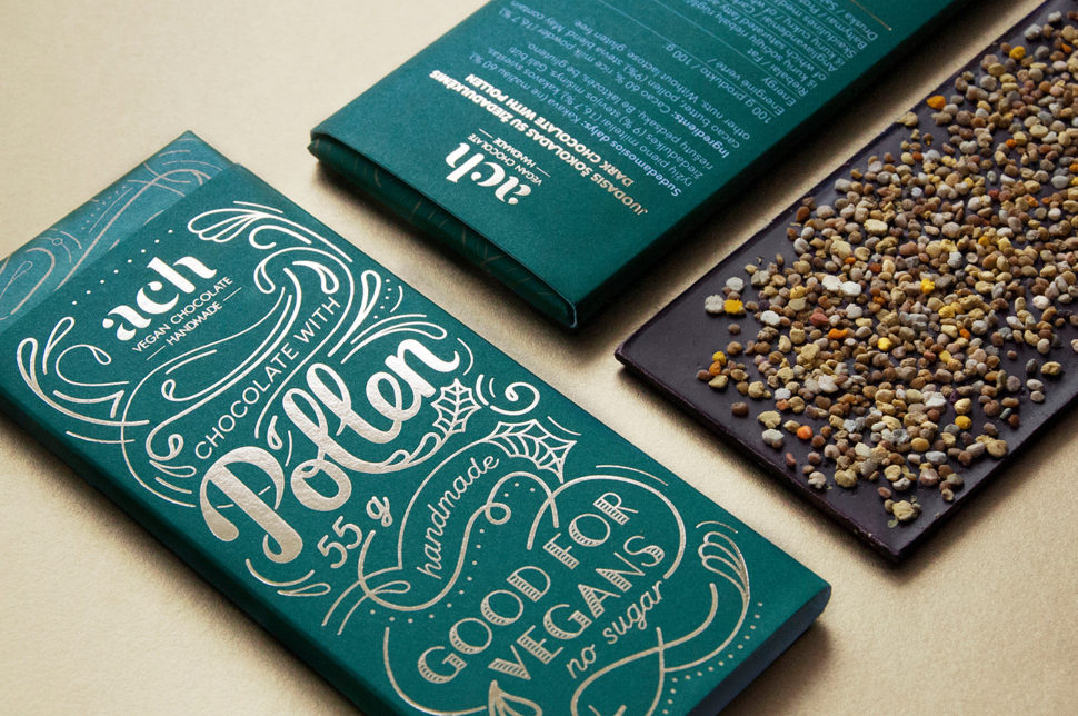
Pattern and geometric shapes
This trend started in 2016 and it will definitely also continue in 2017. As flat design was a very welcome addendum to the graphics last year, helping to simplify the visuals and improve user experience, we expect to see it growing and expanding this year. I’ve stated at the beginning of this post that in 2017 will be a return to the natural, therefore, I’ll expect to see more nature-inspired patterns, like marble, precious stones and plants. Painterly patterns contrasted with simple typography will also bring a crafts vibe to printed media.

For packaging and brand design, bringing together the best qualities of flat design and pattern will create vibrant, colorful products, which feel both ultra-contemporary and artistic.


On the other hand, the pattern doesn’t have to be just about multiple colors or symmetry. Just bringing more visual to graphics using organic line pattern, will make the designs feel completely on-trend this year.

Minimalism
For those who love simplicity and functionality given by the minimalism, here is the good news: tracing its roots back to the early part of the 20th century, and for some, even further, minimalism is today more popular as ever. As the intentional white space means more breathability and reduced focal points, the simple way of communication of the message through design has led to adoption of the minimalism in many brand and design trends. Inspired by Scandinavian design, ultra-minimal typography and layouts will still feel cutting-edge this year, and brands who opt for this visual approach will appear elegant and refined. If you need a touch of color, you should consider adding a subtle metallic foiling as the only embellishment you need, while keeping your palette restricted and strong.


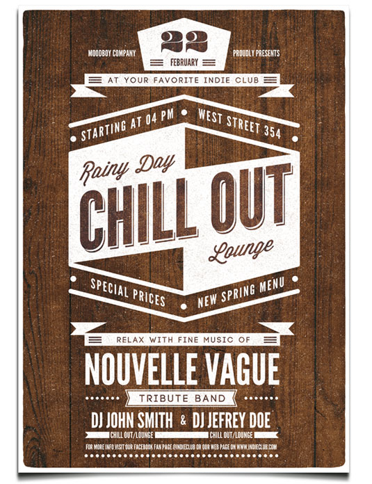
Modern retro
By its very definition, modern-retro has been around for a while. Modern flare added to retro designs, typefaces and color palettes makes an interesting fusion of old and new. The key in this trend is both authenticities, as well as simplifying and modernizing any particular element that stood out from any time in the past. In 2016 we saw the popularity of modern-retro designs rising and finding its own way onto logo designs, print layout, web and packaging design. In terms of colors, maybe we’ll see some changes, meaning shifting from the muted browns and grays of 2016’s most vintage designs to candy colors. But for sure, the preference for this graphic design trend will continue to grow in 2017 and we haven’t seen all yet.

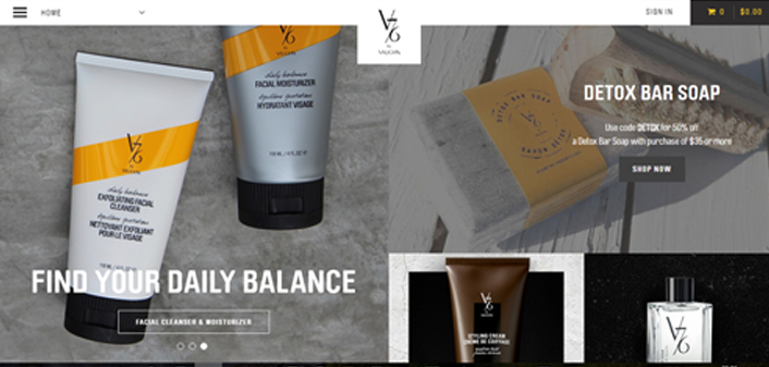
Modular layouts
Functioning to break up a text and put it into manageable chunks, modular isn’t a quiet new trend, but it’s popularity has increased in the last past years. Regardless if we are talking about print or web design, most times, using a long block of text is boring and you risk losing the readers. Especially for the web, the graphic designers have figured out that making the information more manageable makes more people interact with it. The modular design is not just a great management tool, but it also can look professional when it’s done well. We expect to see more modular layouts this year, both in print and web design.

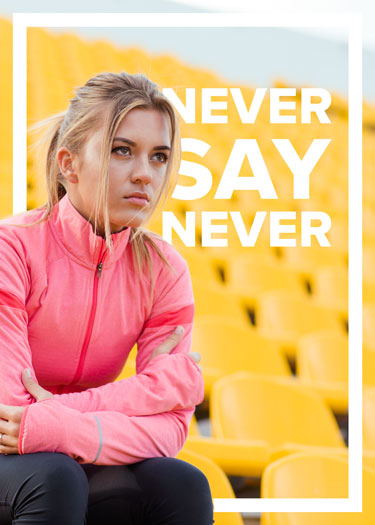
Bold photography and sleek text
At this moment, this trend is pretty much a staple in the world of graphic designers, because the mix between bold photography and sleek text communicates a clear message without boring the audience. “Bold and sleek” works very well both for people with a short attention span, as well as for those who don’t want to spend too much time looking for the main information and get straight to the point. If they are done well, the photography and text tend to work together and create some great contrast and brilliant borders, streaming class and excitement.
This combination works great for display ads, social media promotions, and graphics where a small amount of information needs to be conveyed instantly.

Cinemagraphs
Cinemagraphs are an incredible, simple and effective answer to one of the marketing’s toughest problem: time. As marketers should do and use every possible tool to grab the audience’s attention in a very short and exciting way, cinemagraphs are the perfect tool for doing this. They aren’t the regular gifs we see all around the web. Cinemagraphs are still images with minor element moving in them. This technique makes simply photos look more realistic and bring them to life. With more and more competition between marketers, we expect to see cinemagraphs coming to screens in 2017.


Material design
Material design may be the biggest and boldest of the design trends of this year. Google has created this style guide trying to simplify the way designers design and users interact with the Internet. The core concepts of this trend are “material as a metaphor; bold, graphic, intentional; and motion provides meaning.”
This means the visual aesthetic communicates clearly with the user. By drawing inspiration from real-world materials—particularly paper and ink— the designs are grounded in reality, yet lightweight and minimalistic. Paper is tactile, casts shadows, but is also incredibly flexible, so, designing with these principles in mind, you’re weaving together the fabric of the Internet and add depth to your design.
By using bold colors, contrast and typography in your design, you should guide the user’s behavior and influence your audience to act the way you desire. Google’s Material Design aesthetic is very similar to Flat Design 2.0, but it takes intentionality to another level.

Have we missed something? Let us know in the comments bellow.
Also, check these awesome web design trends to be aware of in 2017.


I like how gradients are now called “color transitions”. Makes it sound real sophisticated.
Haha I was thinking the exact same thing! Funny how they are back, also.
Absolutely agree about colors. They play a very important role in website design. Choosing the right colors for a web site is as important as the graphics or content for it. Colors affect people differently. A user’s emotional reaction can impact a company’s image and brand.
Yes I think colours and typography are the most important part in designing a good website.
Another one is animated logos. I keep seeing them all over the place. When they are subtle they’re pretty nifty but there are some awful ones out there too!
This is actually a pretty cool idea. I’ll write a post on this one
Great. I’ll look out for it. I’d be interested in reading your take on them.