The Web is a rapidly growing space. Year over year, we see new technologies and development techniques, which allow much more freedom and creativity in terms of designing interfaces and interactions. In this space that has become more competitive than ever, the designers continue to keep up with the technology and expand the design trends, in their persistence to provide remarkable and modern websites.
In the same time, the communication between companies and their customers has also evolved, redefining the way the people interact with another as well as with brands. As a result, every ambitious business owner strives to provide a great user experience to his website visitors. Therefore, we need to look into the future and know the latest design trends that allow us to be one step ahead of the competition.
Speaking about trends, we should keep in our minds that all they are influenced by different industries, such as art, fashion, media, technologies and cultures. Moreover, this is a never-ending process, as long as they don’t emerge sudden and disappear to nowhere, but it takes some time to peak, change their forms, eventually become overused and replaced by other trends.
Below is a list of web design trends you should be aware and keep in mind for 2017. Some of them are new; others have gained their popularity or became popular during the last years.
1. Colors
Choosing color is extremely important for website design, because they influence positively or negatively the visitor’s emotions, feelings, thoughts and perceptions and ultimately influence the conversion rate.
Pantone 2017 color of the year is Greenery. A refreshing and revitalizing shade, Greenery is symbolic for new beginnings and it is also emblematic of the pursuit of personal passions and vitality. According to Leatrice Eiseman, Executive Director of the Pantone Color Institute, “Greenery bursts forth in 2017 to provide us with the reassurance we yearn for amid a tumultuous social and political environment. Satisfying our growing desire to rejuvenate and revitalize, Greenery symbolizes the reconnection we seek with nature, one another and a larger purpose”.
Well, I don’t expect (and I wouldn’t want) to see all the new launched websites in 2017 to be green.☺ But I’m sure it will inspire many people who will design or redesign their websites.
If you are looking for some inspiration color combinations, you can visit the Color of 2017 Pantone page, to see their pairing colors recommendations.

Due to the popularity of Google’s Material Design, the colors and color combinations recommended in those design guidelines are likely to become more popular in 2017. The colors are bright and bold and they will be always a trend, because the vibrant colors are a design element that stands the test of time.
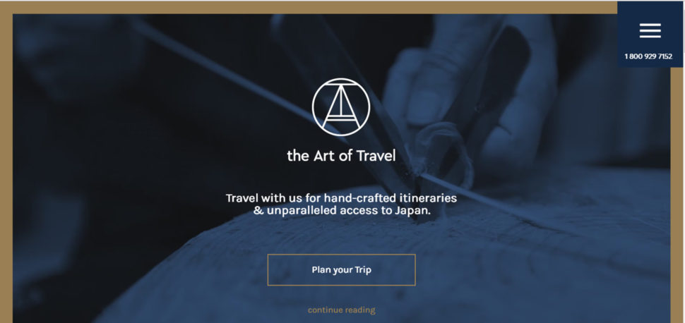
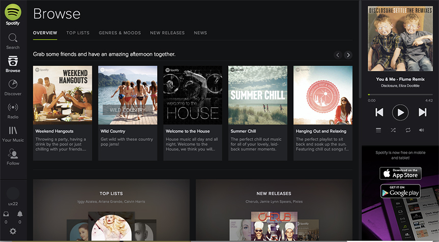
On the other hand, duotone was the hottest design trend in 2016 and I would expect to see it becoming more popular this year.
Sites such as Spotify, Adison Partners, Doers or The Art of Travel have made great use of duotone within their websites design.


2. Bold, creative typography
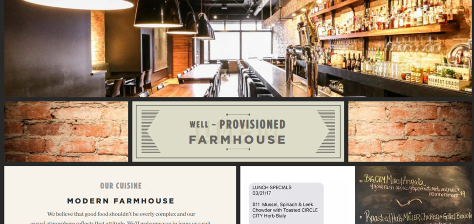
Because in the online world our focus should be on content, more and more website designers use creative typography just as big and bold as the statement itself.

As you see in the screenshots listed above, in terms of “big” and “bold”, it’s not about the size and weight of the font, but rather about dedicating significant space to a simple, yet all-encompassing statement about the product or service.

This trend is not new, but 2017 is likely to continue to push of boundaries of what designers will do with the type and we’ll expect so see not just more space on the screen, but also more creative typeface as we were used to see on the web.
3. Authentic photography
In the last years, we’ve all heard about delivering trust. But this is not just about the copy we publish on the website, but also about imagery we use. The time of general stock photos is gone. If we talk about products, we want to see them in action. We want to see them in a natural light, integrated in the environment they are supposed to be used. And as much details as we can. We want to imagine ourselves using the products. If we are talking about services, we want to see the real people who use them. Therefore, more and more companies, from the largest to the smallest brands, are opting for authenticity when it comes to photos used for their websites. If the content is the king, the photos are its queen.
4. Retro modern style
Whether it is pixel art, vintage typography or 80s or 90s inspired imagery, retro look with a modern twist has been a trend for few years and has become more and more popular in a variety of web design contexts. Regardless if it’s about online shops, portfolios, corporate website or blogs, when apply “old-style” elements to their work, the designers produce creative and appealing designs that make their websites stand out and look really different.
For example, Black Market has opted for a vintage look combined with modern modular layout, getting that rustic appeal, which works very well with what the company offers.

Sweet Magnolia Gelato has gone for a retro look, but also has used some eye-catching animations. This combination gives the site a sleek modern feel, while it is still keeping an older style charm and is helping the business owners telling their story.

5. Modular design
Modular design isn’t new, but it has gained popularity in the last few years, because It provides a better organization and structure appearance of the web page and it looks nice and clean on any screen size. Even if modular design has attracted the designers’ interest since 2011, and could be considered pretty “old”, I would expect it to continue in 2017, especially for heavy content based websites.
Build in Amsterdam have created a very nice modular design website, which has helped them to define clearly each content element.

6. Mobile-first design
There no news that the use of mobile platforms and handheld services has increased so dramatically in the last few years, that mobile-first is no longer a feature. It’s vital. Additionally, Google favors mobile-friendly websites and rank them much higher in the search results. Therefore, not just major brands, but also the small companies, have already adopted this, in order to offer a better user experience and avoid losing potential customers. It’s true that just designing a responsive website, the people will not engage and it will not lead to a higher conversion rate. But not having a mobile ready website leaves you missing all the action. In addition, be ready to follow age-responsive design, which allows adapting to a specific age competency of the user.

7. Explainer videos
Product explainer videos and video background have increased in popularity in the last few years and continue to grow, as long as they are an alternative to reading a lot of content the user may not read. More and more videos appear to make the website content much valuable, add some dynamic to the website static imagery and catch the eye of your visitors in a more efficient way. In fact, a recent report from Google predicts that 74% of all web traffic in 2017 will come from video. So, the websites will feature more full-screen glossy videos, as long as three-quarters of all web traffic will be generated through video content.
8. Advanced animation and GIFs
Rich, clever and advanced video animation is another great way to make your website to stand out from your competition. It seems to be a never-ending trend in the web design game, because of what you can accomplish through their simplicity. If it’s used properly, the animations grab the visitors’ attention, enhance the users interaction and turn the web page into a great and outstanding one. Therefore, I’m expecting to see more animation and GIFs in 2017, and not just from the major brands.
9. Virtual reality
VR finally went mainstream in 2016, as numerous gaming headsets have been released and 360 video has increased in search interest. It’s really interesting to see how virtual reality’s popularity grows, as the medium and matter are closer to what we know. The UI challenges with VR are both more complex and easier to understand than conversational interfaces, so I expect the designers are going to think of interesting ways to incorporate 360 video into websites during 2017. If you aren’t already aware, Google’s VR View is a JavaScript API that easily allows you to add 360 video experiences to your own website.
You can view this interactive, 360 web VR experience, which was created for the new Blair Witch movie on mobile, using a VR headset for your mobile.

Bottom line:
As a successful business owner or a website designer, you need to keep up with all the latest web design trends if you want to succeed in this virtual market. But you don’t need to use all of them. In fact, before using any of these trendy elements, you should put into your target audience’s shoes and then start working with trends. Because all these hot web design elements have only the mission to add some engagement and real value to your business presence online and make it stand out from competitors.


Nice! Love how advanced animation and GIFs made the list. These are great for capturing the users attention.