November 21, 2024

A Showcase of Clean White Web Designs

When it comes to web design, white is always a symbol of elegance, minimalism and style. You can use white to create space, to keep it simple, to drive the attention to other elements at your page and also to maintain your site with a clean and minimal look. Several websites use white as their main color, and this is what we will show here. You probably have seen some of these sites before, but they are such a great example that I had to mention them again. And in case you want to share a “clean white website”, the comments are open!

Made by Sofa

whitewd01

iA

whitewd03

Fell Swoop

whitewd04

Sherpa.

whitewd05

72 Rivington Street

whitewd06

Zander Martineau

whitewd07

televisionkillsme

whitewd08

Cynosura

whitewd09

Ragged Edge Design

whitewd10

Medium

whitewd11

squareFACTOR

whitewd12

chrissloan.info

whitewd13

Fourth Floor Interactive

whitewd14

Gustavo UreƱa

whitewd15

Feelwire

whitewd17

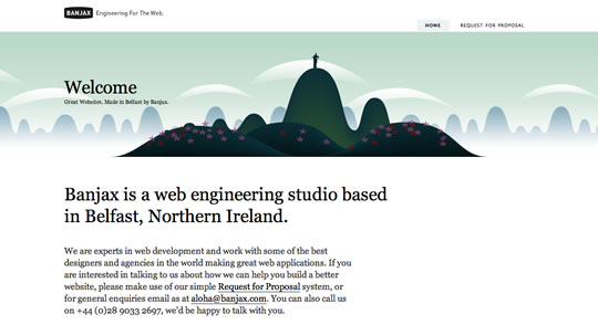
Banjax Web Design

whitewd18

we make it live

whitewd19

Cameron Queen

whitewd20

Mark Boulton Design

whitewd21

Tisha Creative

whitewd22

Clogg Solutions

whitewd24

pixelumbrella

whitewd25

Tandem Film Production

whitewd27

Vertigo Visual

whitewd28

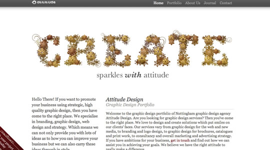
attitude design

whitewd29

plumd.com

whitewd30

n’uova design lab

whitewd31

big youth

whitewd32

Sitepark

whitewd33

checkout

whitewd34

Ui Tuneup

whitewd35

zenhabits

whitewd02

nestliving

whitewd36

Share

Gisele Muller loves communication, technology, web, design, movies, gastronomy and creativity. Web writer, portuguese/english translator and co founder of @refilmagem & @mentaway Twitter: @gismullr

3 Pings & Trackbacks

  1. Pingback: 55 Colorful Web Designs to Inspire You | Inspiration

  2. Pingback: 50 Inspiring Textured Web Designs | Inspiration

  3. Pingback: 40 Fresh Examples of Minimal Web Design | Inspiration

46 Comments

  1. Simon Carr Reply

    I am a big fan of this style of web design.

    My own design portfolio uses a lot of white space. Please have a look at it, would be great to have it considered for a list similar to this. cheers.

  2. Ian Devlin Reply

    Nice list, I too enjoy a good white, minimalist site.

    Like many other posters here, my homesite is also white and minimalist, perhaps too much so (am currently redesigning it – but it will retain it’s white minimalist look!)

  3. Matt M. Reply

    I am a huge fan of the variety of white, minimalist designs shown here. Some months ago when we started our ethical seo company, we considered the white minimalist style to be in line with our brand objectives. You might find it a good addition to your next list. Well done!

Leave a Reply

Your email address will not be published. Required fields are marked *