The official public release of iOS 9 just hit consumers in mid-September and it’s already drawn lots of attention. While updates do push out to devices and with iTunes syncing, it’s rare that all users will jump right onto the adoption bandwagon right away.
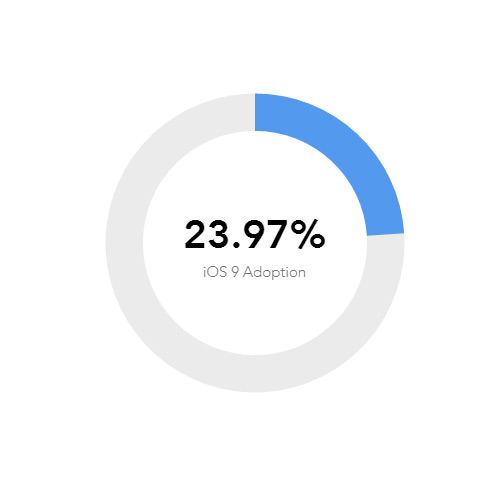
An interesting chart by Paddle shows real iOS 9 adoption rates based on sample sizes from apps using Paddle’s analytics feature. This is not to say it pulls the entire market, but it’s meant to be a portion of the larger market with tech-savvy users.
The charts update every 10-20 minutes and have been running since early this summer when iOS 9 beta was put out for developers.
So far most users have grown to enjoy iOS 9’s improved functionality, as expected with every software update.
At the time of writing this it seems the adoption rate is hovering just shy of 25%. Granted it may never reach a full 100% rate, as myself and many others I know choose to stay with familiar systems that work.
But even though this chart only maps a microcosm of the entire tech world, it’s still a rather unique method of showcasing how tech adoption trends function in the real world.


Leave a Reply