[youtube https://www.youtube.com/watch?v=0CgWnHymtJA]
Web Browser to View Website Across Multiple Devices. No Coding Skills Required.
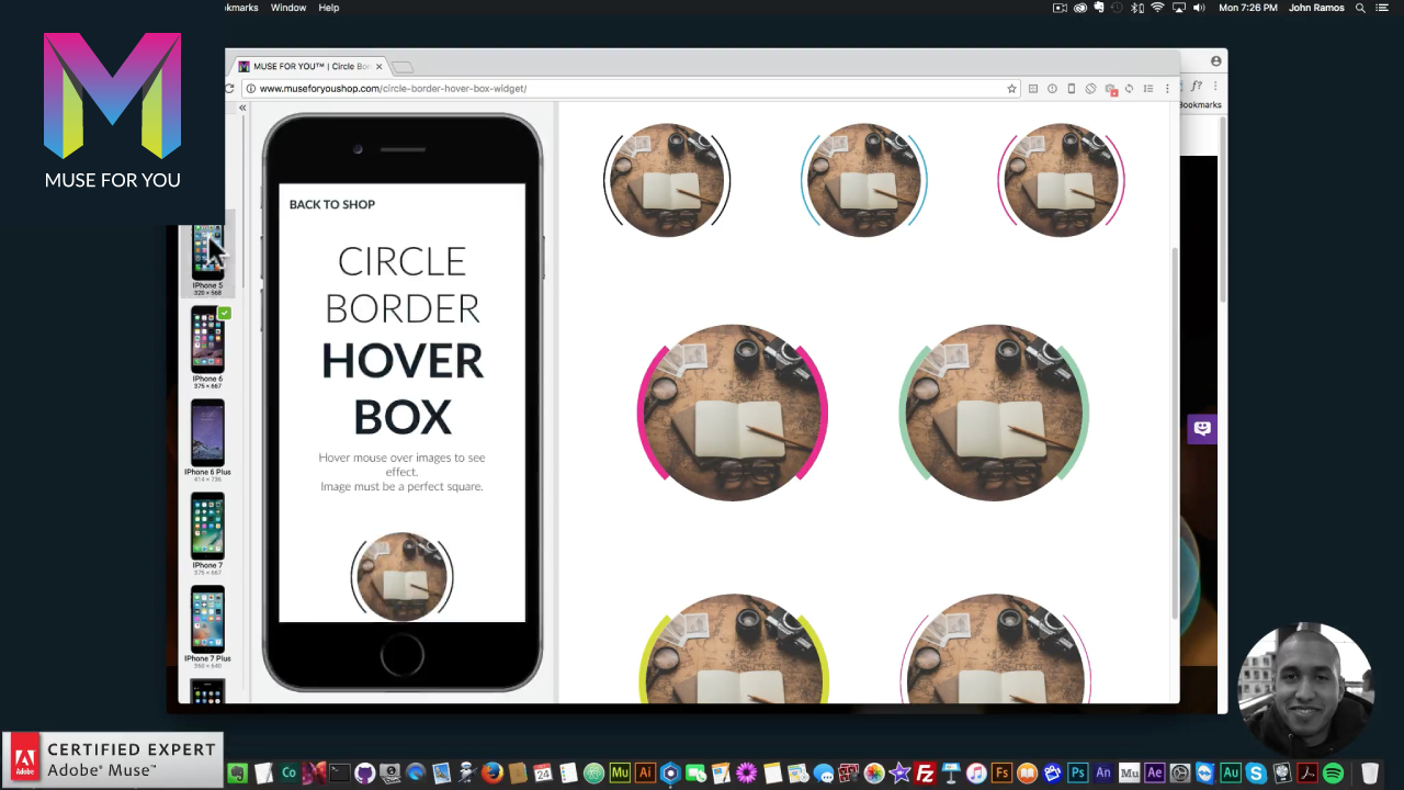
One of the challenges web developers face when building a responsive website is making sure it looks great on all devices. I recently came across a web browser that is specifically built for web developers and allows you to see your website across multiple devices. The web browser is called Blisk and it can be found at https://blisk.io. In the video above I give a quick overview of the web browser and where to download it.
When building a fixed-width or fluid-width website in Adobe Muse this browser can be very useful. You can quickly test and see how your website will look across multiple devices as you are developing within Adobe Muse.
With the Blisk web browser you can see how your website will look on the following devices:
Phones:
- Iphone 4
- Iphone 5
- Iphone 6
- Iphone 6 Plus
- Iphone 7
- Iphone 7 Plus
- Nokia N9
- Samsung Galaxy S3
- Samsung Galaxy S4
- Samsung Galaxy S5
- Samsung Galaxy S6
- Samsung Galaxy S6 Edge
- Samsung Galaxy Note 5
- LG G3
- Google Nexus 4
- Google Nexus 6
Tablets:
- Ipad Mini
- Ipad Air Retina
- Google Nexus 7
- Google Nexus 10

The browser allows you to view the mobile/tablet version and the browser version of the site at the same time. This will allow you to test the site and see how it looks visually across different devices. Also clicking with the mouse is the same as touching the device on the mobile and tablet versions of the site. Along with showing the website on these phones it also gives you the dimensions of the phones within the selection panel. This can be useful when deciding where you would like to place breakpoints within Adobe Muse.
For more video tutorials and widgets for Adobe Muse visit https://museforyoushop.com.
Happy Musing :).


Leave a Reply