Good news for Android users coming out of Opera this week. They’ve just released a new mobile browser for Android users called “Opera Touch”. What exactly do they mean when they say mobile browser? Opera Touch is a new browser designed to be used with only one hand. This is great news for anyone that uses their phone for any amount of time.

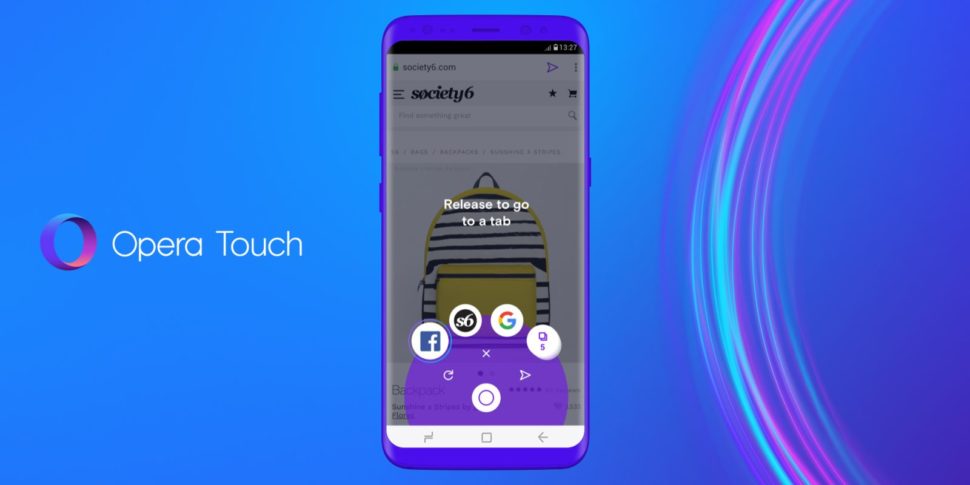
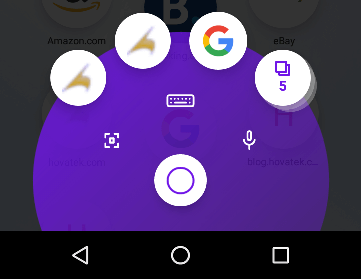
The new browser boasts a couple of impressive features that raised my eyebrows. Let’s start with what I found most impressive: The Fast Action Button. This button is exactly what you think it is. It’s located in the middle of the bottom of your Android device. This means that it’s always ready to be used, and you won’t find yourself reaching with your thumb trying to poke it. The button takes merely a gentle press to open up the scroll wheel to access multiple sites you’ve saved. Then, simply slide your finger or thumb to the next site you wish to visit, and like magic, you’re there.

This function is seamless, lag free, and so good looking. I mean look at it, it’s so simple and straightforward. No waiting or confirmation needed. Just slide your finger and go. It’s as easy as that.

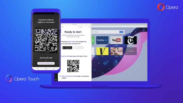
Another one of Opera Touch’s impressive features includes the all new “Flow” function. Flow is basically a function built into the browser that allows you to save and send a specific website to and from your PC or phone. No need to reopen browsers and click links. Save time, and open the exact website you just had open on your other device, saved data and all. Pretty impressive, actually.
Compare this to normal browsers. A feature like this doesn’t even efficiently exist anywhere else. If you found something you like on your computer that you want to show your friends, you either memorized the website name (Which we all know we’d just completely forget about) or send it in an email. Now, you just slide it on over to the Flow icon, and it’s in your pocket for later use.
Opera literally thought about everything with this new browser. When you think about it, what’s one of the most annoying things when using a mobile browser like Safari or Chrome, one handed? It’s having to tap the URL all the way at the top of the screen. This is getting increasingly harder as phones get bigger every year. Opera took a very ingenious approach to this issue. Instead of rearranging the entire face of the standard browser template, they simply made it to where the URL box is already highlighted, and the keyboard is ready to go as soon as you open the browser. Meanwhile, for Chrome and Safari, you have to tap multiple times and try not to drop your phone in the process. Now you can focus more on keeping your screen crack-free, and less time worrying about the least awkward angle to hold your phone.

Opera really went all out when designing this beast they call Opera Touch. Finally, a software company is more concerned with making the consumer’s life easier. We’ve need ingenuity like this for a long time, but we’re thankful it’s shown up now. Standard browsers like I mentioned before, Safari and Chrome, don’t offer simple shortcuts like instantly active URLs and scroll wheels for quick swapping sites. They’re designed for one thing: Computer use only. No more of the, “I’ll just open it up on my laptop, it’ll be easier” days. We finally have something built specifically for mobile, and it feels so good. Chrome is so out. Find your inner Touch.
Visit our website daily for more articles on the hottest topics and news in the design world.


Leave a Reply