
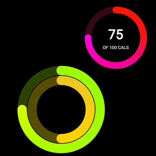
Anyone who’s familiar with the Apple Watch should know about the radial ring design. This was created as a way to display data on the very small Apple Watch screen.
It’s an easy thing to create if you know where to look – but thankfully Hitesh Maidasani just made it even easier.
He built an incredible radial chart generator hosted on GitHub completely for free! You simply enter the data statistics and colors that you need for the chart, and the web application handles everything else. The charts are exported as images which can be applied to Watch OS apps, or even onto other interfaces with a similar function.

Arcs can be set from single to triple with auto-darkened areas that don’t completely circle around. Very cool effect that practically nails down the Watch OS design style.
The abundance of GitHub development work has become truly astounding in this modern era. Never before have developers had access to so many incredible projects with completely free source code! It really brings to mind the idea of a whole new era of web design that’s slowly enveloping the old to make room for the new.
If you’re interested please take a look at the live project on GitHub and see what else you can build.


Leave a Reply