

Hamburger icons are those little three-bar icons you see in the corner of many websites and mobile apps. These primarily trigger a sliding drawer navigation which contains links to pages all around the website. Sliding drawer nav menus are great for responsive design but they can also be tricky to implement. These tips will help designers come to terms with the most popular solutions for hamburger menu design.
Please note this article will not be a discussion on the pros & cons of using hamburger menus. These are just some good tips and design patterns for building sliding drawer hamburger menus. Plenty of alternate navigation styles exist which could be used in place of sliding menus if these feel too restricting.
But well-designed sliding nav menus can fit perfectly into most layouts and have become a well-known interface style by most smartphone users.
Extensive Browser Support
Every major web browser and operating system should be considered when designing these menus. However mobile users would be the ones truly afflicted if they were unable to browse through a website.
The majority of modern browsers support pure CSS sliding menus and basically all of them support JavaScript. So a good idea might be to use pure CSS for the animation with JavaScript as a fallback. I wrote a great tutorial detailing how to create this effect for any layout.
Generally speaking the real troublemakers would be older smartphones and/or depreciated browsers like Internet Explorer 6 or Firefox 2. While these older browsers do support JavaScript, they may not support CSS rendering for menus on top of content or sliding animations.
But at some point you’ll have to accept which browsers are being support and which aren’t. It’s possible to design a fallback using IE conditionals where the sliding drawer becomes an inline block list of links.
Your goal should be to support the widest variety of browsers without compromising the design. It may not be possible to support IE6 but you should aim for the vast majority of mobile operating systems along with all current browsers. Also try using Google Analytics to track which browsers are most commonly used by visitors over an extended period of time.
Use a Recognizable Icon
The traditional 3-bar icon is used by most websites with the sliding drawer menu. This is how the menu came to be named “hamburger” since the 3 bars could be considered a patty with two buns.
It’s easy to design your own hamburger from scratch or grab a free icon from various online sources. But the point is to remain consistent for a good user experience.
Icon design is already a confusing subject with so many different glyphs and symbols out there. By sticking with the traditional three-bar icon you give users a sense of closure because they will instinctively know(or assume) what it does. Most users are familiar with the 3-bar icon so it’s the safest bet.
Bring Focus to the Menu
There are different methods of drawing attention to a hamburger menu. Some use fancy animation while others take up the majority of the screen. Although there aren’t any incorrect methods, there are some that feel better to me from a UX perspective.

One of my favorite hamburger menus can be found on the homepage for Comedy Central. When the site is fullscreen all the navigation links stream across a horizontal navbar. However when the site drops below a certain width all the links are hidden within a sliding responsive nav menu.
The reason I love their effect is because the nav menu opens a dark modal over the page when triggered. So when a user opens the menu it’ll appear “on top” of the page because it won’t be shrouded within the semi-transparent dark layer. Also the website text cannot be selected which leaves the navigation as the only clickable item.
Their sliding drawer menu can be closed by either clicking the 3-line icon or clicking anywhere else on the page. It’s a simple effect and this is what makes it so great – the design blends perfectly without any major rendering bugs.

But alternatively you might try going with a vertical navigation instead. This can be created from the same icon link, but instead have the navigation slide down from above the page.
You’ll see an example on The Minute of Silence mobile website. When the page is fullscreen it’ll use a sliding nav menu which appears vertically. This is when the site loads on the primary domain – but using the mobile prefix it’ll pull from the top menu instead.
I find this technique works best if you don’t have too many links in the menu. Vertical navs are perfect for large companies that have over a dozen links which people need to access. So the design style is completely relative to each website project.
Top Free Sliding Nav Plugins
Let’s wrap up these best practices with a collection of the best sliding navigation plugins. The majority are built for jQuery since it’s the most popular JavaScript library, but there are others available.
Take a look over the following plugins to see if any of them could be useful. When going for a customized hamburger menu it would be easier to just hard-code your own from scratch. But not every project needs a custom design and you will save time by going with a pre-built solution.
Slideout.js

Very recently I stumbled onto Slideout.js which is a touch-enabled hamburger nav menu library. Slideout.js is not a plugin – it’s a dependency-free JS library for creating sliding drawer menus.
It has native scrolling and works great on all touchscreen devices. As of writing this article the Slideout GitHub page has frequent activity ranging only a few days back, which means the developers are still actively working on updates. So far I’m truly impressed with this project!
Shifter

Shifter is a lovable little guy because it’s a newer component library which has been minimized for production websites. This plugin does run off jQuery and incorporates all the traditional features you would expect.
The difference with Shifter is that it’s ridiculously simple. There are very few customizable options and the only methods to call are for open/close and to destroy a menu. If you’re skilled at writing JavaScript then this could be a library for you to customize yourself, but it won’t be fully-featured right out of the box.
Drawer
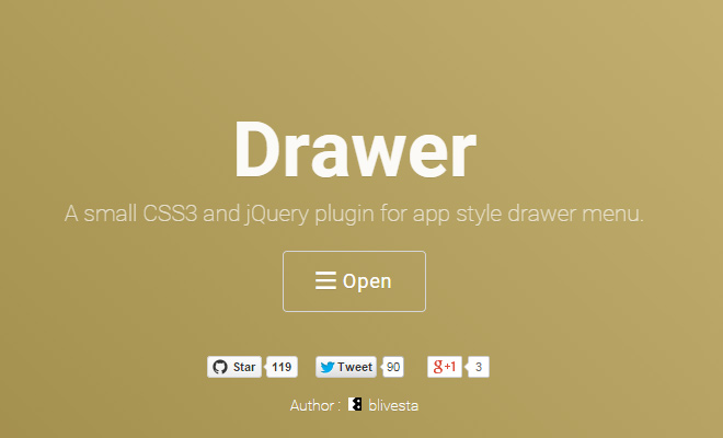
The combination of CSS3 and JavaScript has been a true match made in heaven. Drawer is a jQuery plugin which relies on CSS3 as the natural method for transition effects. This is often better since the animations can be smoother and CSS is rarely disabled like JavaScript.
Please note that Drawer requires a hefty amount of plugins like iScroll to create some of the effects. But it does work great and looks fantastic on mobile devices.
Sidr

For a more straightforward plugin you might try Sidr on purely-responsive websites. This plugin was built not only for hamburger menus but also to display the full menu on larger screens. Sidr is controlled programmatically so it can work from a click or swipe event. The code is easy to use and easy to customize for a first-timer.
Pure Drawer

The Pure Drawer library is built using CSS transition effects for off-canvas menus. This library is triggered exactly like sliding hamburger menus with the added benefit of relying on CSS to handle the majority of effects.
Pure Drawer has lots of custom options for pulling the menu left, right, or even from the top of the page. You can also change the animation style and icon design for the menu. If you want a nav made with pure CSS then I’d highly recommend this library your hamburger menu.
Slidebars

Slidebars is yet another jQuery plugin for implementing sliding sidebars and hamburger menus. It’s a little slower with development because the creator has been busy with other work. But it does have a GitHub project page where contributors can ask questions or supply bug fixes.
Wrap Up
Design is not full of rules, but rather guidelines for creating wonderful ideas. In web design these ideas need to be usable and easy to interpret on any screen. Hamburger menus get a lot of flak but they’re still used a lot because they work. So while this trend is still around it’s a good idea to create menus that users will anticipate rather than trying to radically change the game.


I love hamburger menus but I find that most of my clients do not. I think they are simple and show a level of professionalism and find it to be a great user experience. I am not sure how I feel about them on the desktop version of a site. I do love Slideout.js, it works well in bootstrap framework.
Really Nice article! Thank you for sharing!