
Typography is often the workhorse of every design. Written text is used to communicate a message clearly and legibly while taking care of the more difficult, less tangible things of voice and sound. And on top of that, it still has to be relevant! Nothing makes a design fail harder and faster than an outdated or unfashionable font. In terms of fonts, the motto “Bigger (and bolder) is better” applies in 2019. That’s why today we are going to talk: bold fonts.
In the past few years, delicate, hand-drawn fonts have dominated the market. We now see the emergence of large, bold writing in every design area. The unshakable sans-serif fonts like Arial and Helvetica will always dominate, but designers will also enjoy using fanciful, full-bodied fonts more and more.
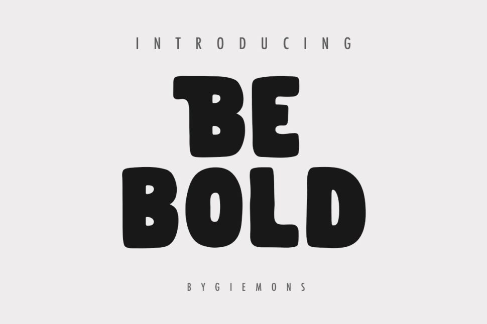
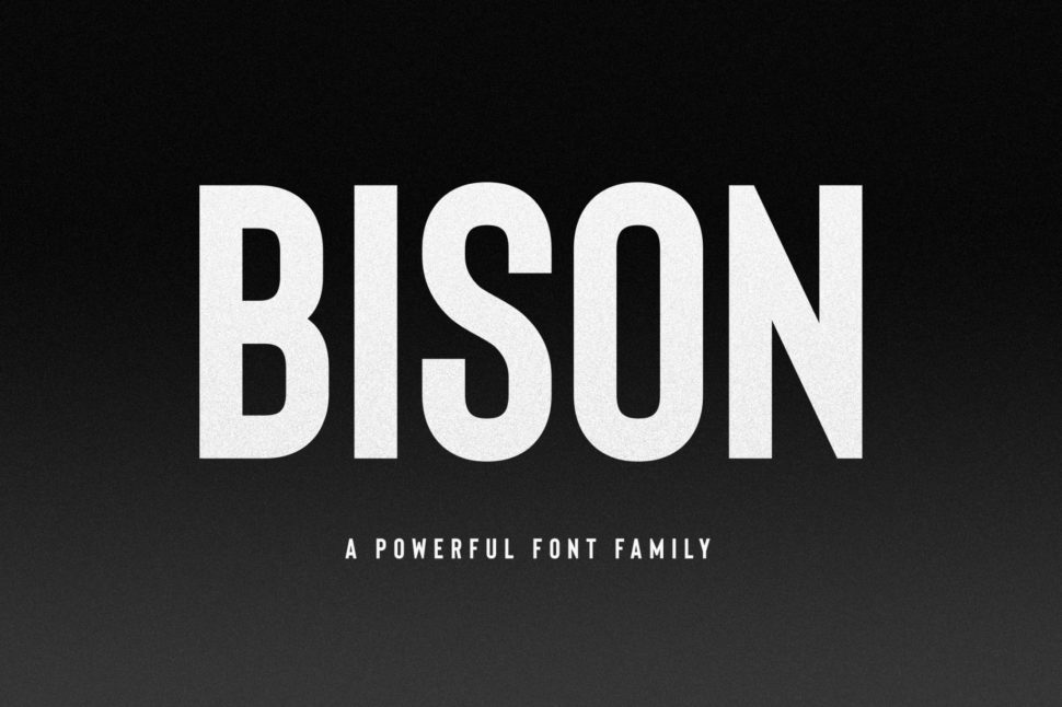
Bold Font by Giemons
Wondering how you can take advantage of the trend of big, bold fonts? Keep reading! We’ve got inspiring examples, and tips on how to use their strength in your next design.
What are bold fonts?
Before we can talk about using bold fonts in your designs, let’s define the trend.
We’re talking about font-oriented design: compositions that focus on large, sprawling fonts and are unmistakable. These are designs that are not afraid to be loud, where the font is at eye level with the graphic elements or even dominates the entire composition. The trend of bold typefaces arose from the greater trend of minimalism. If the font is oversized, the rest of the composition can remain clean and simple. The writing looks like a large, striking work of art in the middle of an otherwise barely furnished room.
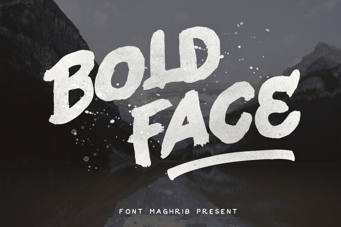
Bold font by DikasStudio
This trend favors individual fonts that one does not immediately recognize. Many designers who use this trend create tailor-made writing for every design. Other designers use old favorites in new and surprising ways.
What rich fonts have to offer
Basically, bold fonts are hard to miss. The designs work in small sizes and tend to divert attention away from softer, more understated designs.
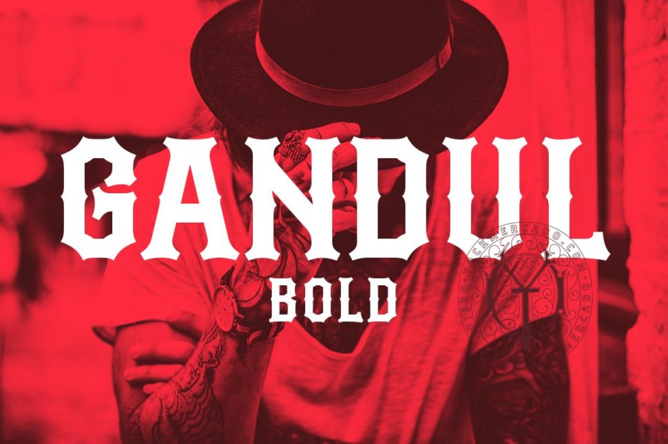
Bold font by yockmercado
Whether you’re a customer searching the shelf for a product, or a user landing on a website or app for the first time, you have a certain feeling when you’re greeted by big, fat typography. Fat fonts convey a certainty and self-confidence to a user.
Bold fonts are currently popular for a reason
The larger the font, the clearer the message.
When a potential customer lands on your website and you make it clear what you are doing with a text in font size 64, you have created a more efficient and perhaps more compelling experience for the user. The same goes for a piece of soap or a book cover.
Bold font by Ellen Luff
We live in a turbulent, noisy world with many competing charms flooding us every day. Fat fonts help convey a message or brand image quickly and in a relaxed way.
Chubby writing in action
Fat fonts have a wow factor. A big, bold font also has something about it that feels confident and cool. Who doesn’t want to be a part of it? Surprisingly, we see how fat fonts penetrate almost every design area.
Fat typefaces in web and app designs
Webdesign was one of the first pioneers of this trend. Combined with high-quality, authentic photography, a large font will quickly leave a strong impression with the user, using only a few words.
![]()
There will always be logos that downplay the font in favor of a logo-based design. But we also see a lot of logos that are not afraid to accept the trend of bold fonts. It is particularly effective when the font gives the feeling of being completely atmospheric to the logo design (the same line thickness, shape, etc.), creating a well-thought-out, coherent design.
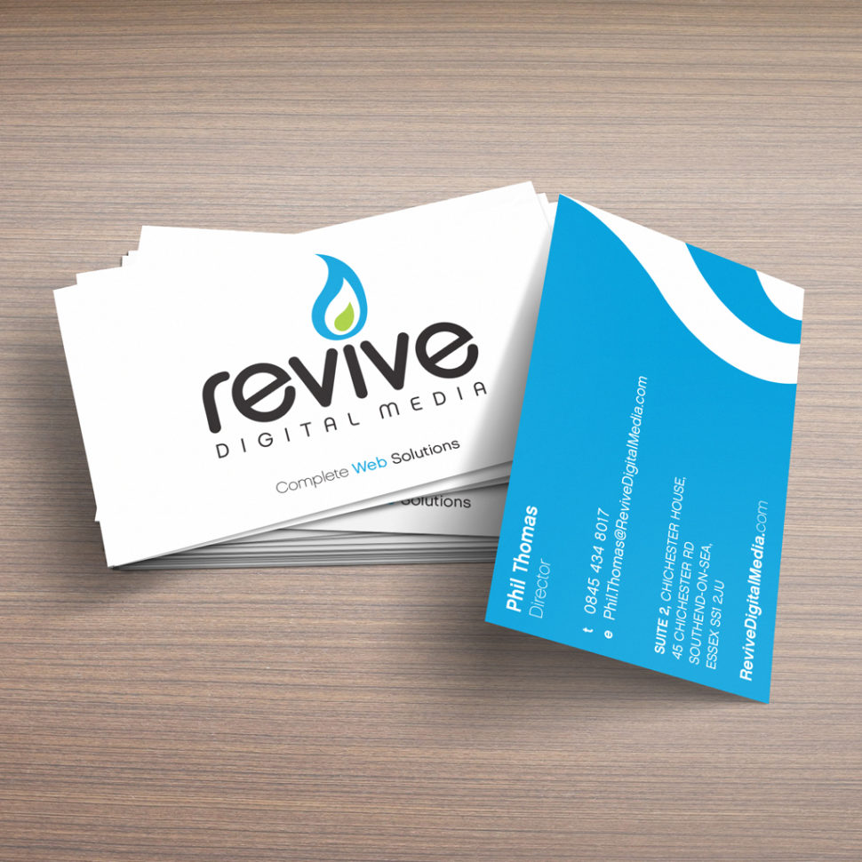
Fat typefaces in business cards and posters
Poster design is an area where bold fonts have always been the prevalent style, even back when they were created with the printing press. When we talk about a poster, which has to be read clearly from 5 meters away, the font size is important. Many designers now apply this idea to business cards, where the first impression is by far the most important thing.
Bold fonts on packaging tell a potential customer straightway what your brand is and what they should buy from you. Think of a brand where authenticity and honesty are part of their identity – perhaps the transparency of their production, ethically produced or organic ingredients, the absence of chemicals found in larger brands, etc. These are brands where the outspoken, bold font can spray a great appeal.
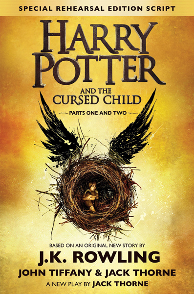
Fat writings in book cover designs
Bold fonts increasingly appeared on book covers with the advent of e-book readers in the last few years. More and more consumers are finding their books by scrolling through Amazon without ever touching or seeing the physical form of the book. While printed books are back (and now more sold than eBooks), the trend of bold fonts has jumped from the screen to the page. Go to any bookstore and you’ll see shelves full of so-called “big book designs” with bold fonts.
Conclusion
It is obvious that strong, eye-catching typographies are in vogue and will be with us for a while. As in every other area, success favors the bold. Now that you’ve seen how bold fonts work in almost every design area, you can incorporate the trend into your next design.


Leave a Reply