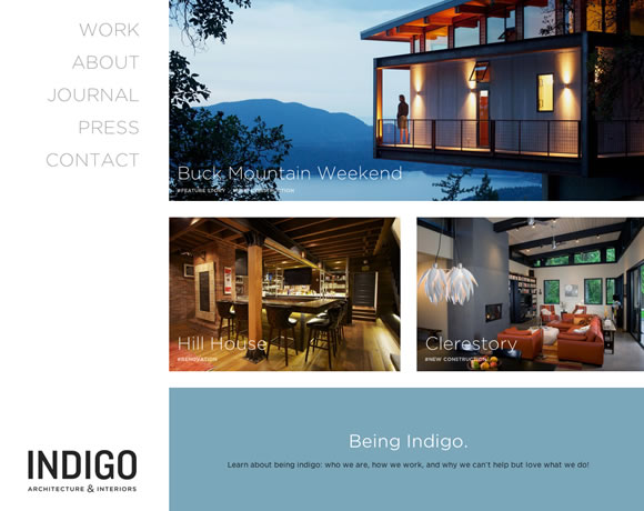
It’s easy to see that more an more designers are embracing the minimalistic approach to web design. Now there are websites that eliminate unnecessary elements and keep only what really matters, designs that are clean and intuitive, like the ones we will show here today. We have different examples of clean and minimalist websites with beautiful navigation, neat menus and nice type to keep you inspired, take a look.

InspirationWeb Design  Gisele MullerFebruary 10, 201415 Comments07.3k
11 Clean & Minimalist Websites for your Inspiration
Share
Gisele Muller
Gisele Muller loves communication, technology, web, design, movies, gastronomy and creativity. Web writer, portuguese/english translator and co founder of @refilmagem & @mentaway Twitter: @gismullr


Another pointless article. A collection of random websites. Next time write a bit more about each example and why this site is better then million other minimalist websites on the internet.
I think there is a big difference between minimalistic design with precision and design that is sloppy and only takes a fraction of the time. Thanks for the blog. Great designs none the less.
these are caught my intention and i like your minimal list. keep creative sharing
Favourites are “Indigo” and “Ditto.” I love the minimalist style.
Some of them are elegant.
But am I the only one that worries that a site such as the “Solo” site, which is trying to sell a web platform (I think) doesn’t in any way actually explain anything about itself until you scroll down about 2000px?
Not to mention that before you get that far there’s a video, that you may not be able to watch depending on your situation, that through it’s design immediately suggests the product is for a Mac when actually it’s a cloud (and presumably) web based offering.
Is it that hard to show a generic monitor screen? Is it that hard to both design and try to avoid elitism?
(of course I may be wrong, I read a fair amount of that “minimalist” 10000px deep page and I’m still not absolutely sure what the product does)
Impressive designs, they got my attention all of them are good, specially Mike Kus
Less is definitely more. Love the Thrive Solo example, very nice indeed!
another pony looks awesome!
Thanks! Great stuff!
I like the ditto page, but i think the image shows this page http://www.hha.no
Clean – Simple – Expressing – Unique
This is what great designs are.
Nice list, I found r-ny.com most beautiful from your list.
wow I really liked ”R.Co Design. will be adding it to my inspiration board. Thanks for sharing.
all of them are so awesome, but my favorite is Indigo
it’s so clean, simple but still elegant, thanks for your sharing 🙂
Great list, thanks!. See also: https://www.minimalsites.com/. It’s full of minimalistic websites. Have fun 🙂
Nice design on Cactus for Mac, Clean minimalistic designs can really turn out some amazing websites.