
Once a visitor lands on your website the first thing they notice is your header. Whether it’s only a small navigation bar or a large fullscreen photo slideshow, the header section is an important part to any layout. Larger headers tend to be more memorable and help to promote a website’s branding. When built correctly a large header can leave an impactful lasting impression on every visitor.
In this post I want to cover a few helpful tips for web designers looking to implement large trendy header sections. The best technique is to focus on a website’s content and highlight the important stuff. Make that content stand out with a featured spot in the oversized header design. Otherwise just focus on branding to create a more recognizable influence.
Hero Images
The use of large fullscreen images has become a lot more commonplace in recent years. Faster Internet connections allow resources to be downloaded quicker than ever before. Now it’s quite simple to include a 1920×1080 background image which naturally resizes to fit any screen size.
The hero image is typically compared to a banner which is placed front-and-center above the fold. This is often used to promote a product, company, or individual with the use of captivating photography. Branding is always a crucial factor, but hero images are not always about branding. The goal is to strike a connection with the visitor and get them itching to scroll a little further.

A good example of this effect can be found on the WooCommerce homepage. The hero image is not necessarily related to WooCommerce itself. Each image presents a hypothetical scenario for eCommerce shops that need a solution to sell their products or services. Ideally this image would connect with entrepreneurs who need a solution like WooCommerce to manage their online web shop.
I really like the use of hero images when done in relation to content. It helps to solidify the purpose of a website and photos look spectacular. Obviously the biggest problem is finding a photo which naturally fits into the project. If you’re a photographer this is much easier but for those of us who aren’t always snapping photos consider a royalty-free solution like Unsplash.
Legible Navigation Links
An obvious factor to designing a recognizable header is the navigation. Unless you’re creating a single-page layout it’s likely that you need some links for navigating the website – and even many single-page designs use dynamic scrolling links.
The legibility of your navigation is critical to a positive user reception. People want to be able to recognize pages at a glance and quickly ponder their options. Links could be bold, caps, underlined, or heavily contrasted with the background… anything to make them readable.

An example from the design studio 1minus1 is their ability to generate contrast off the black/white color scheme. Also the links use a snippet of description text located underneath the primary text. This may not help a lot with user experience but it does add to the overall design.

Kin HR is another website using a slightly different approach to navigation. Links are placed in the top right corner of the page with bolded all-caps text. They use a shade of grey which animates to a brighter white on hover. Also the current page link has an underline effect to denote location without relying on content. Legibility is about connecting ideas quickly in the easiest fashion imaginable. Keep this in mind when designing your own navigation menus.
Noticeable Branding
It should go without saying that a company’s brand is very important. Regardless of what the company does it needs a recognizable branding. Visitors remember things that are recognizable because they stand out amongst a sea of familiar logos.
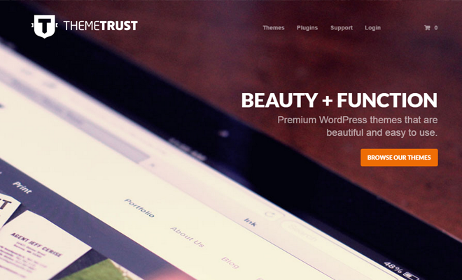
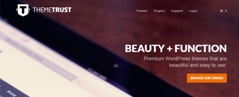
The logo for Theme Trust is memorable and large enough to be a focal point right off the bat. It’s also a great example of a simple logo that doesn’t use too many frills. The capital ‘T’ in a shield icon is also found in their favicon which adds some multidimensionality to the design. Look for new ways to expand a website’s branding outside of just the header. But don’t underestimate the power of a great logo.
Fixed Scrolling Menus
As web browsers have become more standardized some effects have become much more commonplace. Fixed scrolling navigation is one such effect that has found plenty of fame amongst modern developers. It’s a quick solution to navigating a website from anywhere on the page. And thankfully it’s much easier to build with advancements in CSS3 and jQuery.

The website Ausdom has an interesting method of fixed scrolling navigation. When first landing on the page all the links appear to be situated right within the header’s hero image. The links are a bright white color that seem crisp on the darker background.
Yet as you begin to scroll the navbar will pop out and follow you down the page. It uses a bright white background so the logo and link text changes to a new color scheme. This is a cool design style which creates uniformity on the page and still makes the navigation usable from any location.

As an alternative to the blended navigation you might try designing a more noticeable scrolling bar. Drew Wilson has a scrolling navbar on his portfolio and it uses the cloudy blurred effect common with iOS7 apps. There aren’t many links since the website is only a single page but it is still a creative design choice which keenly captures attention while scrolling.
Inspiration Gallery
Along with the tips above I put together a short gallery of well-designed website headers. These are primarily large headers that focus on imagery, content, logos, or navigation to capture interest. Since users gravitate toward interesting page elements these headers are perfect for demonstrating how to ignite curiosity in first-time visitors.
Daniel Filler

Grain & Mortar

Playground Inc.

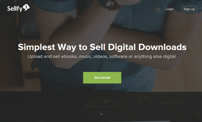
Sellfy
Kiawah Island

Localfu

Statsiv

n+1

Seed Spot

LeShopo

Picsell

Góralski Domek

Clouder

Circle

Paleo Granola Sola

Cuppa

Photoshop Etiquette

CUPS Annual Report

Pastini Pastaria

Metaverse Mod Squad


This was such great inspiration, I really love the pastini site, the scrolling designs are great & the response states are great. Thanks for the share! I really like restaurant sites when they are done well.
I loved the Legible navigation links of 1minus1 website.
I believe this post as an inspiring one for all the web designers.