
Colors influence our whole life from the very beginning. They could attract or distract attention, set a mood, or even influence our emotions and perceptions. As we know, “an image worth more than 1000 words”. Therefore, the professionals involved in the communication area use the colors to send, support or to highlight a message.
However, sometimes it could be hard to know where to start when choosing the color palette for your design projects. Which could be the best option? Using the pairing colors or the contrast ones?
Well, there is not just one right answer or a magic formula for this. You should try different color schemes and combinations to see which of them appeal you the most and transmit the right message. But before doing this, you should know the basics of the colors and their combination. In this post, we will focus on the contrast (or complementary) colors and their usage, with some case studies.
So, let’s start with the basics.
Contrast is more than opposites like black and white or large and small. Contrast is a design principle that should be a part of every design project. Why? Because it helps you organize the design and establish a hierarchy, showing the viewers which parts of your design are more important and help them focus on those. On the other hand, the contrast adds to visual more interest, regardless if we are talking about the logo design, print or online ads, website design, indoor or outdoor signage.
In the color theory, the contrasting (or complementary) colors are directly or almost directly positioned across one from another on the color wheel. For example, purple and yellow, red and green, or blue and orange. As you can see below, the complementary colors provide the maximum contrast.
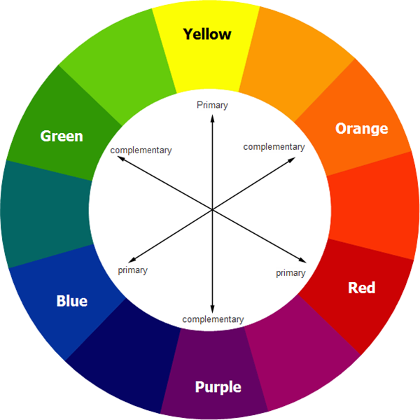
In terms of contrasting colors, we can also talk about Hue, Saturation and Color’s temperature.
Hue
Hue is a specific term for colors, traditionally one of the 12 found on the color wheel. But the color theory also can provide some handy information for graphic and web designers. Besides the traditional complementary colors, some other options include
- Split-Complementary: any color on the color wheel plus the two that flank its complement; this scheme still has strong visual contrast, but is less dramatic than a complementary color combination.
- Triadic: any three colors that are evenly spaced on the color wheel.

Saturation
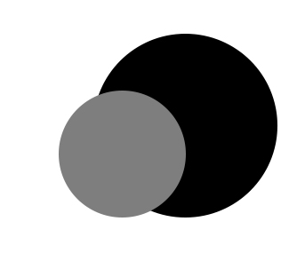
The saturation of colors refers to the color intensity, comparing to the black – white spectrum (the complete absence of a hue). A color in its purest and brightness form is 100% saturated. The more you desaturate a color, the closer you are to gray (or black, or white, depending also on the brightness of the color). Therefore, using bright and saturated colors can be a strategic plan to highlight the important parts of a design project.

Temperature
As we know, based on their temperature, all colors can be categorized into groups, based on their temperature: cool, worm and neutral. Reds, yellow and oranges are considered warm colors; blues, and greens are cool; black, white and gray shades are neutral. Depending on how they are used, the beiges and browns can be considered neutrals. You can get a high contrast by mixing the color temperatures in a design, especially warm and cool colors.

Using the contrast colors
In logo design:
The companies use many times contrasting colors in order to underline and emphasize their branding messages. But before choosing your color palette, you should start with the following elements: your brand persona, your brand message, the color psychology and meaning. Let’s take a look, for example, to the following logo designs:

Mountain Dew uses green and red. Right away, a name like “Mountain Dew” evokes images of the great outdoors. Green works for the Mountain Dew’s logo because it nods to the brand’s connection to nature. But the red brings the kick that’s so central to the brand persona.
Visa uses yellow-orange and blue. They are definitely complementary colors. But besides the positions of the colors on the color wheel, let’s have a closer look to the meaning of the colors. Blue is a color often associated with trust, loyalty, royalty, friendliness, wisdom and peace. Yellow evokes positivity. So, the general message is trust, loyalty, positivity and wisdom. What else can we ask from a company at whom we throw wads of cash?
![]()
In web design:
On the web, color contrast is about finding colors that not only provide maximum contrast, but also provide enough contrast between content and the background for anyone. This doesn’t mean you have to limit your colors to complementary colors, but the contrast should be kept in mind all the same. You can combine different saturated and desaturated colors, to enhance the drama.

For example, the primary objective for this website is to reflect the adventure and wildness through the design, by combining different colors, textures and layering. In order to do this, the designer not just used the vibrant orange-red letter on the forest green, but also used contrasting levels of the saturation.

Using contrasting colors in web design helps you not just add more appeals to your design, but also organize your message and highlight the important parts of the design.
For example, the Mint website. The designer used one of the powerful combinations of contrasting colors. The white text, the orange color used for the call-to-action buttons and the bright green logo contrast with the dark background and stand out. Again, the designer used not just complementary colors, but also played with the dark and bright colors in order to highlight different elements of the website page.
In print design
For print design, the principles of the contrast are the same as for the web design. Whether you are working on a flyer, a brochure, a poster or have to publish an ad into a magazine, establishing the contrast is one of the most important things to consider. If it’s done properly, the contrast should be really noticed. It helps you separate the things, but it’s also the bond that puts the things together. Not only that a page is more attractive when contrasting colors are used, but the purpose and organization of the document are much clearer.
For example, the Hilton/F&B Brochure.


They use contrasting colors in their brochure design in order to highlight not just the pictures, but also the copy. Both of them are important, so the designer created the contrast playing with the colors.

On the other hand, let’s take a look to the Relic’s ad. They used tonnes of complementary and pairing colors in order not to just organize their design, but also highlight the message and create a summer feeling.
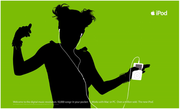
As in the web design, using the contrasting colors in print design helps you create a focus. For example, the adverts from the iPod used contrasting colors to focus the viewer’s attention on the music player. The ad featured a black silhouette character on a brightly green background. The iPod and the earphones appear in white and stands out from the black silhouette and the bright background.

In indoor and outdoor signage
Because business signage is the first visible advertisement for any company’s services or products, you should give a special attention to the colors used for them. It’s true that the colors used have to match to your brand colors in order to provide a unified image of your company, but there are also other things you should take into consideration. One of them is the level of the visibility that will be created. By contrasting a light color on a dark background or a dark font or graphic on a light background, the viewers will be more drawn to your signage.

For example, Starbucks uses white text on dark green background; and the signage can be viewed during the days and nights. Staples uses white text on the dark red. Although the white is a neutral color, combined with the dark red, it pops up!

With LEDs signs, it’s important to use contrasting colors. Contrasting colors do not only make colors eye-catching and more vibrant, it forces eyes to gaze at it. This is the key to getting the most marketing power out of your color choices – add some contrasting colors in the message that you’re trying to send.

Bottom line
As we said in the beginning, there is no magic formula for using the contrasting colors. You have to try and experiment by mixing different colors, using not just the primary colors, but also tones, shades and tints, because each concept and color combination can drastically change what you are trying to say with your project design.


Leave a Reply