As the saying goes, you only have one chance to make a first impression. This is a lesson that’s vitally important to remember when you’re a startup and you’re working on your landing page. The vast majority of landing pages out there have a few key goals – to inform visitors about the product, to build excitement for that product and to have a clear next step, such as finding out more, signing up or buying the service.
But of course, it isn’t as simple as that. A well laid out design will help to communicate those elements more effectively, while a more visually appealing site design can help to add some professionalism, which can reflect positively on the product itself. Even if the product itself looks and works perfectly, if the landing page that promotes it looks wrong, then there’s a good chance that it won’t convince as many visitors and many people could find it off-putting.
I wanted to bring together a collection of some of my favourite landing page designs. Each of these examples blends great design, with a clear call-to-action and enough copy to build excitement and interest. I’d love to know which of these you find best, and if you know of any others that deserve to make the list – be sure to tell us about them in the comments.
Chartbeat
Chartbeat is a real time analytics product that helps website owners see where traffic comes from and what visitors are doing as it happens. Their landing page is stunningly designed and makes use of interesting copy, all presented using parallax scrolling and clever animations.
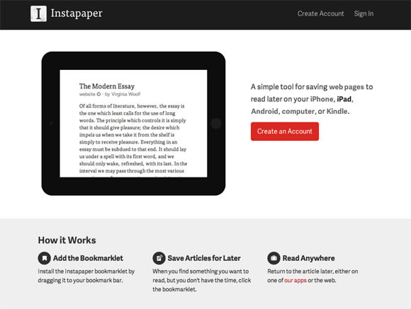
Instapaper
Instapaper is an app that allows you to save websites to read later. The design of the landing page mirrors that of the app itself – it’s clean, easy to read and makes use of minimalism and white-space to declutter, and present only the information you need to see.
Coin
Coin is a new startup that promises to do away with credit cards and store cards, by using an electronic card that can store all of them. Their landing page focuses on their promotional video to help describe the idea, but also uses a variety of animations tied to the scroll function in order to help present the product in an innovative and easy to understand way.
Harvest
Harvest is a time tracking tool designed for businesses and freelancers. Their landing page features a breakdown of the functions of the tool, nicely separated with white-space to create a clean, calm effect. The copy has been kept informative yet short, so it’s easy to digest and the page helps to show off the interface of the product beautifully.
Squarespace Apps
Squarespace – the website publishing platform – have released a suite of mobile apps designed to make blogging, publishing and analysing your Squarespace site easier. The landing page for their mobile apps is simple, uncluttered and clear, and they’ve put a ton of focus into the visual aesthetic and design of the marketing page itself.
Simple
Simple aims to replace your bank by offering a Visa card that hooks into it’s software. It helps to track what you spend your money on, helps you to save and offers a wide variety of software-based features. The landing page for the service helps to show off the benefits clearly and concisely and helps to keep a minimalist aesthetic while still providing a lot of information.
Plentific
Plentific helps people looking to buy a home by offering a variety of advice, tips and financial tools. The landing page uses big, bold imagery to draw you in, but scrolling down reveals a wealth of information – all presented beautifully.
Thinglist
Thinglist is an interesting take on a to-do list, by instead being a “want to-do” list. Designed by the team at Elepath, Thinglist’s landing page is fairly minimalist, but has a bright, colourful visual style that contrasts nicely with the dark background.
Amp
Amp is a tool that helps musicians create websites for themselves, no coding necessary. It’s rare to find a landing page that’s entirely in black and white, but Amp has pulled it off – the result is a clean, elegant and simple design that looks fantastic.
Readymag
Readymag is a drag-and-drop website creator that makes it easier to create microsites and online magazines. The landing page makes use of a flat design aesthetic along with big, bold typography and a varied colour palette.
Droplr
Droplr is a file sharing tool designed for businesses, much like Dropbox, to help make it easy and secure to store and share files across an entire company. Their landing page makes an interesting use of illustration to subtly add a bit of personality.
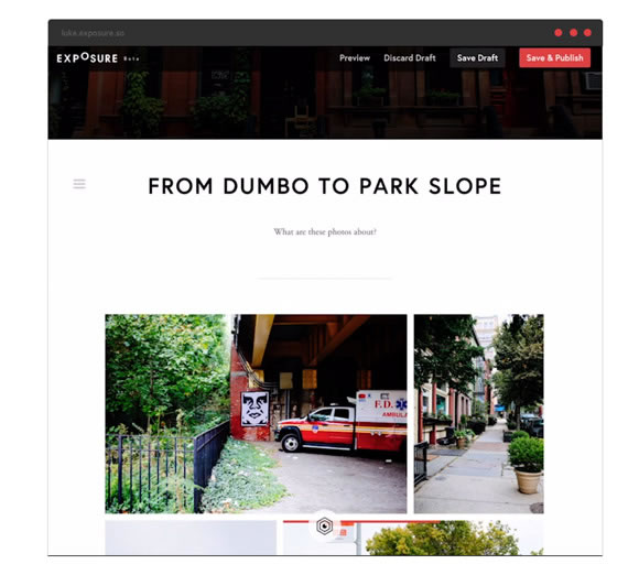
Exposure
Exposure, also from the Elepath team, is a tool for photographers to help show off their work in the style of a blog post, so that all their photos work together to tell a story. The landing page for the product uses plenty of white-space to separate each element, and is clean, minimalist and elegant.
Sketch
Sketch is a vector graphics tool that many designers are leaving Photoshop and Illustrator for. It’s landing page is slightly more cluttered than the examples above, but they’ve taken each benefit to using their software and have gone through it in detail along with examples, resulting in a thorough yet beautiful marketing site.
AppDock
AppDock is a yet-to-be-released App marketplace, built with developers in mind. The landing page has a very distinct and quirky style with the use of illustration. It’s unusual elements like this in a landing page that can help to make it memorable.
Marquee
Marquee is a publishing platform designed for artists, writers and bloggers to help make it easier to get their content live. The landing page uses a beautiful, flat style and launches straight into a fast loading product demo, which is instantly engaging and interesting.
Which of these landing pages do you like best? Do you know of any other marketing page designs that you think deserve an honorable mention? We’d love to hear your thoughts in the comments.


nice collection !!! keep up working like this 🙂
Wow! What an awesome collection, Dan! What do you think about carefully created landing pages like these, versus optimized and highly tested ready-made landing pages like the ones you get from a company like Leadpages?
Cool collection as usual, I really like your stuff and love reading the blog, You guys really dig into every post content.
These are the one of the best landing pages inspirational, great work done by the authors.
Dan, great post! We always try to persuade our clients to use a clean, simple design. Too much verbiage, images, nav items can clutter up a design in no time. Another contender that deserves to be on the list is stripe.com
Very nice collection Dan ! Sketch incredible. someone has already used sketch? I like reading this blog, thank you Dan for this other good post.
I liked the simplicity of the landing page for Instapaper so much, it inspired me to research the app and I’ve just purchased it for Android!
Came in looking for landing page ideas and left looking at Sketch. Thanks for the info 🙂
Amazing collection Dan ! keep it up:)
The best landing pages are always simple yet unique and pleasing to the eyes. This is a nice compilation. I always think that moz.com’s landing page is great!
Thanks for the article and examples. Nice looking instead of beautiful.
“Sketch is a vector graphics tool that many designers are leaving Photoshop and Illustrator for.” Really? How refreshing if this is really true. Too bad it is just for Mac. I’ll stick with Inkscape thank you.
instapaper’s landing page looks awesome!
Great list of landing pages i really like AMP, nice modern design.
Wow amazing collections. I do believe that first impression last. So it is very important that the landing page of the website should be remarkable to make a good impression.
Great collection of creative, beautiful and thoughtful landing page design. Now a day landing page is a best platform to promote your website along with effective traffic and leads.
Great article, currently re-designing the landing page for my work’s website and this has come in handy for a bit of the ole inspiration 🙂