
Designers who design logos over time have always known that a logo must work in black and white to be effective. If it doesn’t work in black and white, it doesn’t work one hundred percent. But is this really true?
This article aims to be a complete and exhaustive answer to the question: should a logo work in black and white to be a good logo? Short answer: no, not necessarily. But it depends on the logo, the context, and some other things. The long answer is, of course, is the rest of the article in which I will talk about when a logo may or may not need to work in black and white.
Let’s do this!
Does a logo need to work in black and white to be effective?
The main reason why the effectiveness of a black and white logo has always been considered fundamental in the design phase is simply because up until a few years ago the cost of printing many colors was excessive. Printing a colored logo on every envelope, on every label, letterhead or business card, involved excessive costs for any company. The logos were therefore preferably always printed in black and white, to save ink and therefore money.
A logo that didn’t work in black and white didn’t work in most of the applications that were made of that same logo!
The Apple Logo
The Apple logo in the 80s is a great example (and at the same time the exception) for this rule. The logo was the famous apple that we know today. Back then, it wasn’t colored in that smooth gunmetal, a techy color that we all know now, but a rainbow of colors.
![]()
Because of the cost of print, a lot of designers referred to the old logo as “the most expensive logo ever.” The reason they went with this logo was that they wanted to “show off” the wealth and high quality of their products. A color printed logo was rare and therefore conveyed the idea of refinement. In the last few years, however, design and logos have shifted from a paper platform to a digital playground. We no longer live in a world dominated by paper but by screens. This, together with the fact that the cost of color printing has been extremely reduced, has resulted in a gradual but important abandonment of that dogma of the logo in black and white. Along with this, another famous dogma of logo design has collapsed in recent years: that of avoiding nuances at all costs.
Logos such as those of the most recent (2016) Instagram rebranding are a prime example.
The Instagram logo
The new Instagram logo breaks all boundaries previously put up by the stigma that logos need to work in black and white. Aside from the personal taste factor, the logo works just as it is, color gradients and all. But why?
I’ll explain. The Instagram logo is shown in 99.99 percent of cases on a screen (almost always on a mobile phone) and is practically never printed. Does shade give problems inside a screen? No. Does it create bad effects as if printed in black and white? No. So, can the Instagram logo can be fine even if not reproducible in black and white? Absolutely yes!

However, this does not mean that a colored or shaded logo should also not have a monochrome variant, as we will see later in this article.
Is it a good idea to start with a black and white logo?
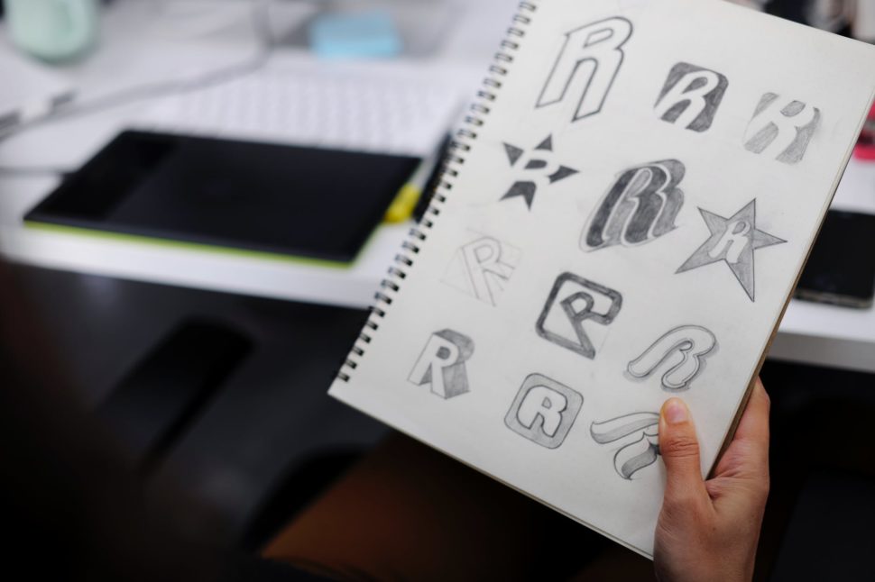
Advice that a lot of seasoned designers give is to start your logo by creating a process by designing it in black and white.
The fact that there is no longer a need for a logo to always work in black and white does not mean that designing it from that point is not useful for the designer.
Let’s try to reformulate this concept. The advice “always start a design in black and white” does not mean “the logo MUST work in black and white”. It is simply a piece of advice that helps to improve your design phase!
When will your logo need to work in black and white?
Although we now live in an age of super-performing digital screens, there are still numerous occasions and situations in which it is useful, if not necessary, to use a black and white logo.
Let’s look at some examples of when a logo is needed to work in a monochrome version.
When printing newspapers or books
The first case to consider is the classic one. Until a few years ago there was a need for logos to be printable in black and white, simply because everything was printed that way.

Even today, if you are dealing with a logo frequently printed in newspapers, magazines or books printed in black and white, you must design a logo that works well when used in such a case.
Black and white newspaper logo when making window stickers
This is another case at the limit. When printing on glass, perhaps with the technique that in English is called “Frosted vinyl”, you need a logo that works well if printed (usually) in white or at least in a monochrome variant.
When printing on receipts
When a logo needs to be printed often on receipts, it will inevitably have to work well in its black and white version to be readable and understandable.

Take for example a logo designed for a clothing store. That shop will certainly want to see its logo printed on every receipt of every pair of jeans or t-shirt sold, don’t you think?
When using the white (or colored) version on photo or video (watermark)
Another really important point to make is whether your logo will appear as a watermark for a video or photo. This point is very often overlooked, but it doesn’t mean it’s any less important.
If you have some bright and shiny logo glaring at people in the bottom of a video or photo, it can and most likely will draw everyone’s attention away from the original image.
That being said, having a black and white logo is unavoidable in this case.
How to make a black and white logo work
So, no, it’s not always necessary to have a black and white logo that works, but there are a few cases that it would be beneficial. So what strategies do you have to adapt to make a black and white logo work? Here are a few quick tips:
- Start from the beginning with a black and white logo design
Like we talked about above, a lot of designers recommend doing this no matter what. But, if you know that you’ll need a black and white version of the logo, it’s best to start the designing process with that in mind.
- Don’t go overboard with the logo
As much fun as it may seem like to have an awesome and elaborate logo, it doesn’t always work out well. The easiest thing to remember here is that the simpler the logo, the more likely it is to look good in black and white (of course, there are exceptions, so use caution).
- Have multiple versions of one logo
This can sort of play along with the point above, but it’s a little more complex. Having multiple logos for a variety of uses is not a new practice by any means. In fact, a lot of big name brands like Nike and Adidas use a few different logos, depending on where they’re being used.
The conclusion
As a designer, you may have heard the old piece of advice to start with a black and white design. While it is a good tactic to keep in mind, it’s not always necessary -, especially in this day and age.
As with any good piece of advice, the best thing anyone can tell you, in this case, is to plan ahead. While not all logos need to be used in black and white, some of them do. Knowing this beforehand can save you hours of work, and a headache.


Leave a Reply