
Often, with websites, the contact page is one of the most neglected pages on the site. Once everything else has been designed it’s pretty easy to just put up a contact page with an email address on it and let the user do the rest of the work, but that’s an approach that lacks elegance. Good contact pages solve a purpose – they guide the user to contact the correct department and give the right information. In the case of freelance designers and small design shops, contact pages can aim to coax information like what sort of budget range the visitor has, what sort of work they want doing and the scope of their project. Of course, design agencies also need to make sure the page is also visually appealing, as it helps to show off the work they can do.
I wanted to bring together some examples of contact pages that all do a great job of looking good while also making the task of getting in touch and providing the right information effortless.
Jared Johnson

Jared Johnson’s site makes use of a contact form styled to look like a postcard, complete with a grainy, textured background which is perfectly in keeping with the rest of his site.
Grain and Mortar

Grain and Mortar make use of both a contact form, and a separate section showing their office location on a map, along with contact details including their office address and phone number. The entire page is presented in their brand colours of black, white and orange and fits with the rest of the site beautifully.
Welikesmall

Digital agency Welikesmall has an unusual and fairly quirky contact page, which features a huge background image of an aerial shot of their office, complete with an animated string of nodes and connections to highlight their “digital” image.
Dan Rubin

Designer Dan Rubin has a contact form that walks the visitor through creating a useful, informative email. The page itself is distraction free – the only thing to focus on is the contact form, which guides you to provide just the right amount of information.
Rune Werner Molnes

Rune Molnes is a photographer based in Norway. His contact form is visually stunning, with a minimalist and elegant map in the background, and a contact form beneath the large heading “Rune travels the world capturing amazing pictures”.
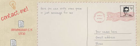
Mario Petrone

Web designer Mario Petrone has a particularly quirky and hand-drawn style to his website, and even the contact form gets involved. The contact form here also takes on the visual appearance of a postcard, complete with a stamp, and a text area that uses a handwritten font.
Cobble Hill

Cobble Hill is a creative agency based in Charleston. Their contact page fits the same visual aesthetic as their main site – with a focus on black and white design and a strong use of white space to create an elegant appearance. The contact page starts with a truly stunning custom map showing their office location, followed by an elegant and simple contact form beneath.
Information Architects

Strategic design agency iA (or Information Architects) make use of a very different contact form. Styled to appear almost like a letter, it still gives you complete control over what you write, but it guides the visitor into giving the right, useful information.
Focus Lab

The team at Focus Lab have put a lot of thought into their contact page, and allow you to first set a subject for your message – with options such as “branding”, “app design” and “web design”. They’ve also carefully considered which questions to ask the visitor, including what their budget status is and what their timezone is.
CreateOne

Business training specialists CreateOne have a contact form that’s wonderfully simple, but yet gives the visitor a broad range of options. It’s use of white-space and clarity keeps the visual design uncluttered, but at the same time it gives you information like their email address, phone number and even their social networks should you not wish to use their contact form.
Always Creative

Houston based design agency Always Creative have a space-themed aesthetic to their site, and the contact section at the bottom of their homepage keeps that theme alive. The background of stars makes use of a parallax effect, while a subtle background for the contact form itself uses an image of the surface of the moon.
Which of these designs is your favorite? Do you know of any other contact pages that deserve a mention? I’d love to hear your thoughts in the comments.


The links on the images with https dont work!
Really well designed examples. The Rune Werner Molnes link does not work with SSL though.
This article is a bit bias, how is “Rune Werner Molnes” contact form stunning?