
Food & drink manufacturers follow many of the same design techniques. Website layouts differ from corporate conglomerates to small-town restaurants but the goals are often very similar.
In the case of recognizable brands such as Garelick Farms, design techniques are used to build on top of the brand to create a memorable browsing experience.
Garelick Farms uses natural design aesthetics to symbolize a down-to-earth feel in their site. Crisp textures, earthy tones, and lots of photos bring out the natural style of Garelick Farms’ products and their company image. I’ll cover a few of these techniques and how they affect the website’s overall tone and delivery.
Textures & Stitching
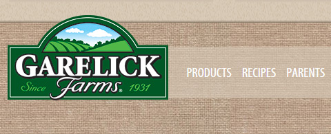
Right from the first pageload you should recognize a matted woven texture repeating across the site. It looks like a burlap sack or some type of hand-made case – definitely brings to mind the countryside and farm life.
The Garelick Farms branding is lined up into a box in the header. It uses a green logo with a basic hand-drawn font. Everything about the design gives off a sense of homemade style.

You’ll find a stitched border surrounding the content box with slim navigation links. It all ties into a general brand of natural Earthy colors and imagery. The idea is to give visitors a sense that they’re actually visiting Garelick Farms.
This is why many farm-based products have illustrations on their packaging. Eggs, chicken breasts, and milk all use imagery & colors to evoke a sense of down-home cooking no matter where you’re located.
Colorful Green Branding
The logo for Garelick Farms is finely shaped, illustrated, and delightfully green. It’s a rather simple logo but also recognizable which is crucial for good identity design.
Since green happens to match up with Earthy colors, the Garelick Farms website follows this throughout the whole website.

Each navigation link uses a green hover effect with a dotted line indicating the link is active. Green is used as a highlight color where it stands out against the other beige elements.

Scroll down a bit further on the homepage and you’ll find a mini-menu of products. This slider relies heavily on green overtones for the navigation buttons and hover effects.
In this case other colors are used to distinguish elements as non-active.

A very similar effect is used on the products page with another green mini-nav menu.
When clicking on a product you’re brought to a unique product page with nutrition facts and possible recipes. Again we find green tones used to highlight certain areas surrounding the general beige background.
Garelick Farms’ color scheme is a good example of how less can be more.
Hand-Drawn Page Elements
Bringing more natural style into the layout are the many customized page elements. Hand-drawn stitching is one such effect, but not the only one.
You should recognize that some headers and text blocks use a custom hand-drawn font named Populaire. It’s very subtle and doesn’t look like 10-year-old handwriting – but it does feel more natural than most pixel-perfect fonts.

While it’s obvious that Populaire is still a digital font, it gives off the impression of a bespoke hand-made font family. It all returns back to the same theme of natural & earthy design qualities to be strewn across the entire site.
If you scroll down on the homepage you’ll also find this same font applied to buttons.

Some buttons & links use icons to offer visual cues to visitors, but they don’t detract from the UI design at all.
There is room for improvement on this site, but overall Garelick Farms stays true to their brand & theme consistently across the entire layout. This makes the design feel uniform and true to itself while still maintaining a simple user experience.
Closing
A great designer can bring out their ideas perfectly to match the tone & style of a company. Garelick Farms is a relatively simple company and their layout also works in simple ways.
Very few colors, basic textures, and hand-drawn elements give this site a recognizable style across every page. Sometimes a basic website can work better from a stylish perspective since it gives visitors a reason to connect with the design & remember it in the future.


Leave a Reply