Web designers understand the need to create coherent, user-friendly website navigation features. They also know that doing so is much easier said than done. In fact, it’s fair to say that this area of web design is an ongoing challenge for many.
There is no one-size-fits all navigation scheme for all website types. In the same way, there no one single solution to every client’s or user’s needs and expectations.
The need for responsive design has put us back on the right track however. So have the best practices addressing minimalist website architecture.
Follow these 5 best practices and you will do well:
Best Practice #1: Help the visitor reach her main goal
Visitors often like to see what’s new or has just been introduced on a website. Show information like this up front. Make sure its marked or highlighted appropriately.
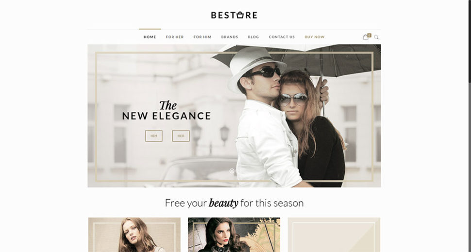
It would make no sense at all to relegate a new line of clothing to “the back pages”. Place an eye-catching image and CTA that points to its location in the catalog on the home page.
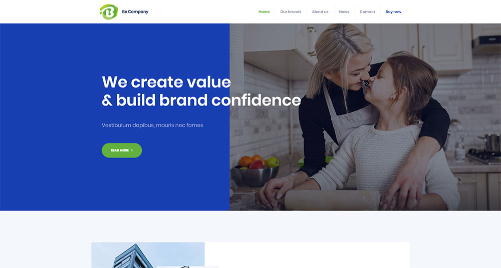
Like this:
A search bar at the top of the page will help to ensure a visitor doesn’t get lost. Strategically-placed CTAs will make sure she finds what she’s looking for.
“Buy Now” takes her right to the spot.
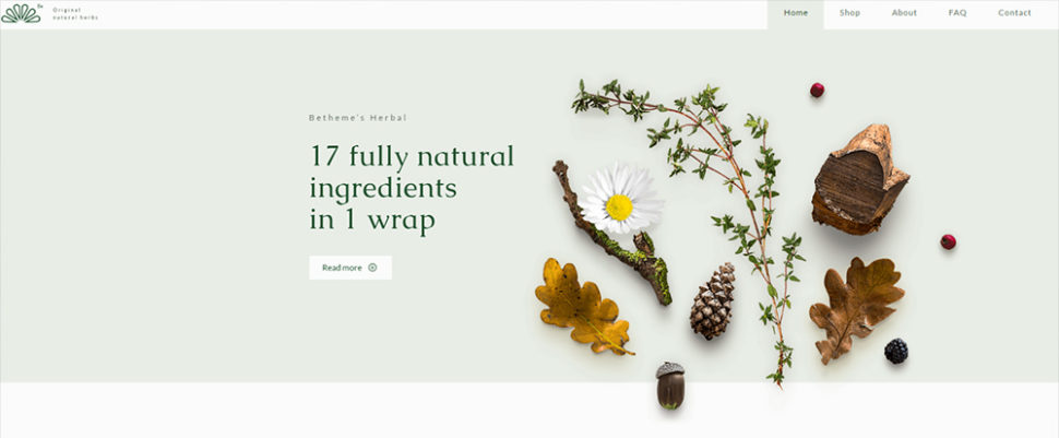
“Read More” starts a visitor along his or her chosen path.
Best Practice #2: Always let the visitor know where she is
The use of a Current Locator has been a website navigation gold standard for years. The eCommerce website megamenus point to a host of different product categories. These can become quite complex. Thus, making it easier for a visitor to forget where he is.
Tracking where the user is now, where he was before, and where he might go will greatly help to avoid that problem.
A contrasting color indicating where he is now will be a great help.
A mini-map of the user’s journey on the page can help him trace back his steps:
Keeping a fixed menu on top of each page will help the user decide where to go next.
Best Practice #3: Use standard icons and lingo
Use a Hamburger menu? By all means.
How about a cleverly animated menu with random clickable areas? NEVER!
A bold logo that takes you to the Homepage when clicked? Always a good idea.
An animated logo that takes a visitor to an unanticipated location? Don’t even think of it!
Best Practice #4: Don’t go over 7 menu items
“For Him” / “For Her” is a good start.
Only list the most important sections or locations for the user. The two major attractions should be placed at the top and bottom.
Best Practice #5: Choose the menu type according to the amount of content
A simple menu works best for promoting a single product or product line.
Your online shop might sell 90 brands and styles of clothing for men, women, and children. If that is your case, you want to use a well-structured megamenu.
A collapsible vertical menu will work as well.
A Simple, Yet Effective Solution – BeTheme
Navigation standards and best practices are likely to change over the years. Your best bet is to keep everything simple and well structured. This is the best practice that’s more likely to be evergreen.
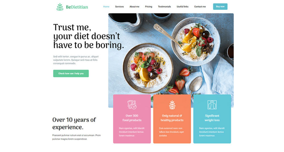
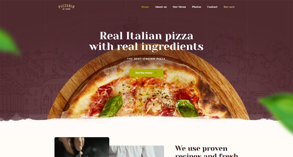
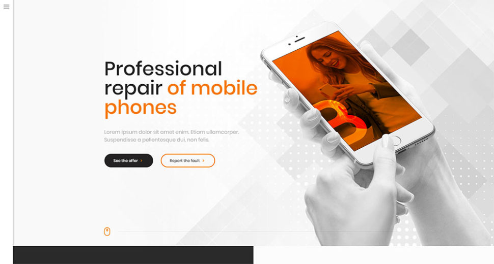
The easiest way to do this is to use BeTheme’s pre-built websites. Best practices are built in, and these pre-built websites will save you tons of time and effort.
2 of more than 320:
Summary
Here’s a wrap-up of what’s been covered:
- Direct visitors toward their goal. Do this on every page
- Let visitors know where they are, have been, and where best to go – always
- Use standard icons and lingo so as not to confuse users
- Limit the number of menu items to seven
- Select a menu type in keeping with the amount of content on the website
- Use pre-built websites. They’re designed to make website navigation easy.










Nice blog you have share. Thank you for such a knowledgeable info. Keep on sharing