Apple former UX and UI designers, Bruce “Tog” Tognazzini (wrote Apple’s first human interface guidelines) and Don Norman (UX designer 1993 – 1996) wrote a feature with Co-Design stating “Apple is Destroying Good Design”. The previous employees are critical towards Apple’s design for IOS mobile devices. “Apple, you used to be the leader, why are you now so self-absorbed? Worse, why does Google follow all your worst examples?” They added. They expressed a sort of nostalgia towards
the earlier day, where the company’s design principles where more focused on being powerful, popular, and influential.

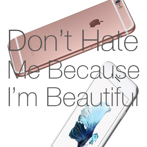
“Apple is reinforcing the old, discredited idea that the designer’s sole job is to make things beautiful, even at the expense of providing the right functions, aiding understandability, and ensuring ease of use,”
The biggest point made by both designers, was that Apple has strayed away from the ease of usability they were once known for. In addition, they point out the ridiculousness of the gestures required that are part of the current iOS UI, like shaking an iPad violently in order to undo, when a simple undo button is much more simple for a user. The continued on the complicated gestures Apple incorporated into their usability where more focused on maintaining visual simplicity, instead of the user’s ergonomic capability to perform said gestures.
“What kind of design philosophy requires millions of its users to have to pretend they are disabled in order to be able to use the product?”

Tognazzini and Norman did not hold back in their comments and I definitely appreciated their colorful perspective. I encourage you to read the full piece and share your thoughts in the comments below.


Beauty and function are not mutually exclusive and anyone who says so is probably just defending an ugly UI.
I’ve heard criticisms that claim a clean pretty UI makes apple devices “just a toy” but those people probably have no idea the work that goes into simplifying functionality to the degree where usability is that easy. There is often a tremendous amount more work under the hood to make that even possible. One of the things that appealed to me with the introduction of OSX back in the day was that the clean usable interface was backed by an enormously robust engine underneath, and power functionality was still accessible through the UI.
That said, I have noticed in recent years that Apple has been declining in the usability of their interfaces. I don’t know if this is a result in a change in Jony Ive’s role with the company or what, but it seems that each new interface iteration introduces more usability obstacles. iTunes angers me every day with its hidden panels and separation of common features, and iOS9 has made it so you can’t tell a button from text without enabling a special settings override.
It used to be a person who never used a device was able to quickly and intuitively find their way around apps without hunting for an easter egg, but that has all changed now. I hope Apple finds their way back to their senses. Flat icons are fine, but give me back real usability.