

A GitHub repo named Layout Grid is gaining notoriety among developers. It was first published by Ivan Kerin and has proven to be an amazing tool for web developers.
This isn’t really a “framework” as much as a collection of CSS codes that can be reused to build certain grids. His live demo only uses JavaScript for the drag-and-drop functionality. It’s not crucial to any other layout but it goes to show the flexibility of this responsive design framework/library.
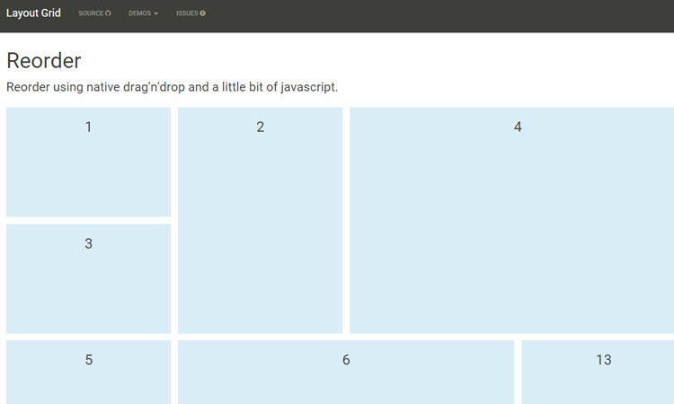
As you drag squares into place you’ll be recreating the grid. Each block remains stationary and only drops down as the browser resizes. Take a peek at the options page to see how you can style a custom grid.
Other more complete frameworks like Bootstrap rely on a multitude of classes. The Layout Grid CSS uses HTML data attributes for passing information about re-sizing content and how to break down elements once the screen gets too small.

I’ve only played with the demo and so far I have to say it’s fantastic. This may not be useful on every project but it’s certainly a step in the right direction for more systematic, uniform CSS layouts.
Download a copy from the Layout Grid repo and try it out for yourself.


This looks pretty cool! I would suggest changing the word “notoriety” to “popularity” or something else since “notoriety” generally has a negative meaning.