Making a logo is typically one of your first tasks as a new, up-and-coming designer.
I know I had my fair share of making logos for far too cheap, and mostly for my close friends and their small businesses, but it’s something I’ll never forget.
Although there are a few things that I wish I had known when I was at the beginning of my career, so I’m here to shed some light on a few basic design principles that I swear by.
6 Basic Logo Design Principles For Beginners
There are a few things, in my opinion, that every novice designer should know about logo design. Of course, you’ll end up doing whatever feels right for you, but just hear me out.
Alright guys, let’s do this.
1. Keep it simple
By now you’ve already heard of the K.I.S.S. principle. Keep it stupid simple.
This is going to be key in making any logo.
I’ve learned that the hard way.
[source]
When someone looks at your logo, it should be easy for any viewer to understand, interpret, and digest.

[source]
No one should have to stare at your logo, cock their head to the side like a confused, adorable puppy, and wonder just what the heck you have created there.
[source]

[source]
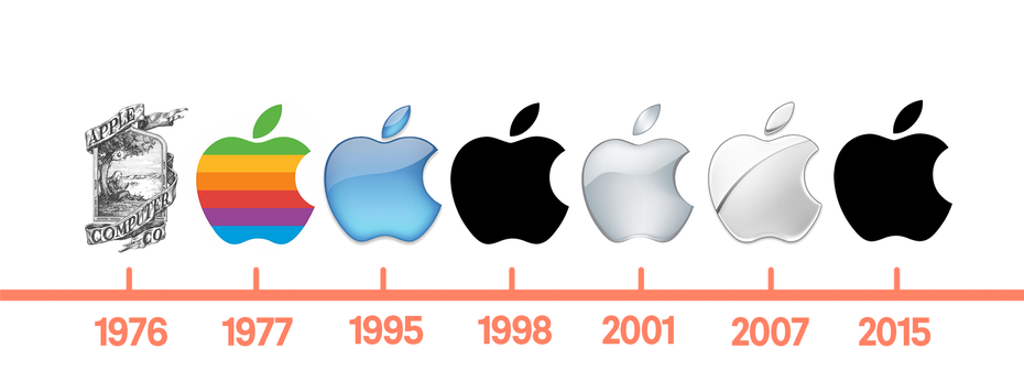
Take Apple, for example. One of the biggest dogs in the game.
[source]
Back in the 60’s… Well, only they knew what they created for a logo.
But as the years went by, they kept simplifying and simplifying it.
And that was the key!
By simplifying their logo, it was easy to understand, it was easy on the eyes, and of course, it was memorable as heck.
Which brings me to my next point.
2. Make It Memorable
I know you immediately recognized my first simple logo example, which was obviously the Nike swoosh.
But why did you recognize it so quickly?
Because it was simple and memorable.
What’s the point in having an amazing design, if it’s not memorable?
You’ll lose brand recognizability. If your logo design is no good, well, you’ll have people talking about the business you’re designing for like this, “You know… that one place! With the thing… You know what I’m talking about!”
Nobody wants that. You need something simple, and memorable.
Let me show you some memorable logos that I know you’ll recognize.

[source]

[source]

[source]

[source]
3. Use A Cohesive Color Scheme
A good color choice is going to make or break your design.
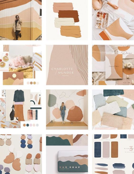
If you’re going to be using multiple colors, then I suggest that you choose a great color palette or use some sort of cohesive color scheme.
[source]
Using a bunch of colors that don’t match won’t be a good choice.
You can always do a quick google search and see what colors are predicted to be most popular this year, or you can use color psychology and pick a color scheme that will match your service best.
4. Make It Scalable And Versatile
Keep in mind that the company, business, or client that you’re designing for will be using their logo on a multitude of services.
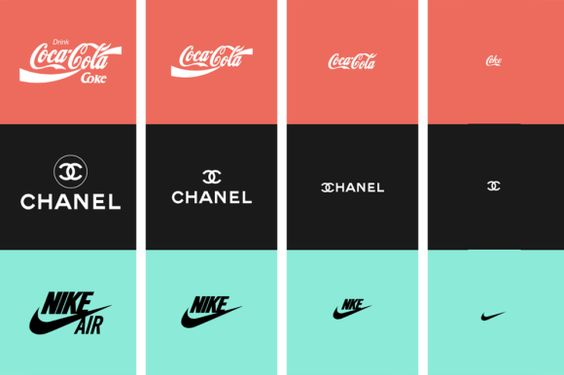
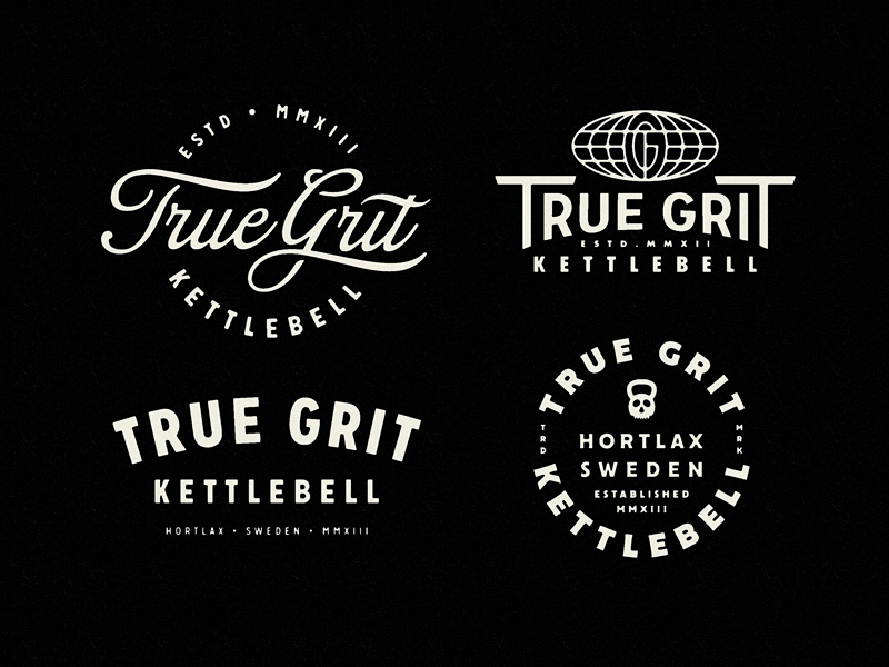
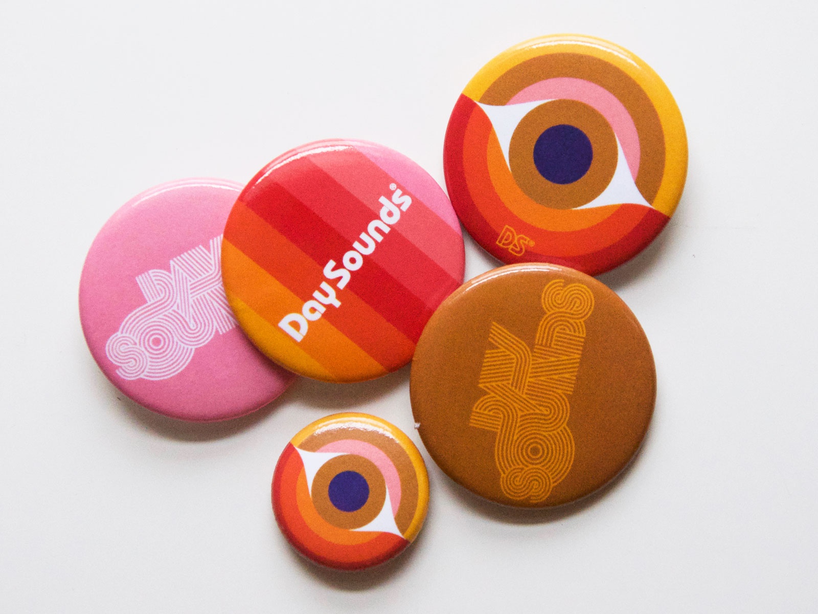
From big signs to coffee mugs, you need to make sure your logo won’t lose its quality and that it’s recognizable no matter where it’s displayed.
One way to make sure that your design looks good across all platforms is by creating mockups. We know lots of free mock-up sites that you might be interested in using.
[source]
[source]
[source]
5. Always Keep Your Audience in Mind
You always, always, always have to remember who you’re designing for, and adapt.
If you’re designing for kids, you don’t want to go with neutral colors and a minimalist, flat design. You’re going to want to use bright colors that catch their eye and look fun.

On the other hand, if you’re designing for a winery, you’re going to want something sleek, minimal, and elegant.

So whoever the audience is, you have to take your unique style and just adapt it to your situation.
6. Go With Your Gut
And finally, go with your gut and make the designs you love.
Not everyone will understand your designs, and you won’t always understand everyone’s request.
But you’re going to live and learn from those experiences and in the end, it’ll make you a better and more experienced designer.
Try to make a new logo design every day. It doesn’t need to be spectacular, but just something that will keep your creative wheels turning.
If you ever need some inspiration, we have lots of tips on how you can find design inspiration in everyday things.
Until next time,
Stay creative and stay safe, folks!


Leave a Reply