I vividly remember waking up as kid to get ready for school at around 7:30 AM, to walk 2 to my neighborhood’s school, which was about 2 minutes away. I thought it was the worst thing in the world, especially during the winter time. (First world problems, right?)
There was one thing that cheered me up more than anything during the cold winters, and I think you already know what I’m talking about. It was of course, alcohol. Just kidding, it was hot cocoa. But not just any hot cocoa, it was Nesquik hot cocoa. And trust me, Mom, I knew when you replaced the real thing with that cheap Walmart knock off brand. Not cool, Mom, not cool.
The Nesquik Mascot
Jokes aside, Nesquik probably played a big part in your childhood as well, and you are pretty familiar with the famous rabbit, Quicky.

Well, the bunny suffered a serious makeover and he now changed from the 2005 looking character, to this detailed and modern looking mascot.

Frankly, I think the bunny looks fine (a bit creepy though), and it was surely nice of them to put some clothes on him. However, as a marketer, I am surprised that they had the guts to commit to this hugr change. Of course, every redesign is risky, but changing the image of such a widely known product is probably the riskiest. The thing that Nesquik did with this marketing move was adapting to the new technologized generation. Young, fickle, easily influenced kids are expressing brand preference at an earlier age than previous generations. Marketing experts say children can express brand awareness as early as the age of 2, an awareness encouraged by a world that offers more choices than ever before.
Kids are more likely to see a little of themselves in the mascot, therefore, more likely to convince their parents to buy the yellow box of awesomeness.
An important aspect that they haven’t considered is the Uncanny Valley effect. Some people are complaining that the mascot creeps them out, and I can see why. However, I think that kids see characters like Quicky every day and the mascot’s creepiness isn’t as visible to them as it is to some of us.
The Nesquik Logo

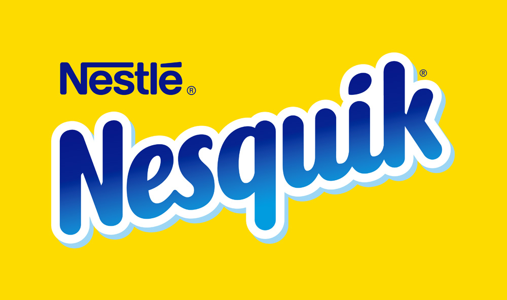
The Nesquik logo has also suffered some changes. While I like the new mascot, and the idea behind the rebranding, the new logo seems a bit incomplete. Although it looks a lot more friendly, and softer, you would expect a bit more, considering the potential.
I think the guys from AtomicVibe got it right.
“I can appreciate that the previous logo had endured since the ’90s, and thus, had cemented itself into our consciousness by virtue of nostalgia. But, in my opinion, this new logo attempts to make more of a visual connection to the product. Its smooth, soft, flowing, script-style curves are friendly, gestural, and expressive, and make me think of milk being splashed — more so than the previous version. Coincidentally, this new lettering seems to take its aesthetic cues from the product’s heritage. The product was called “Quik” from its inception in the ’40s through the ’80s, and this is a sampling of what the Quik logos looked like during that time period:

Thumbnail It was renamed “Nesquik” in the ’90s, and was subsequently rebranded. I don’t think the old logo was bad, per se, but compared to both the heritage Quik logos and this new refresh, the ’90s Nesquik logo just seems too stiff and rigid, too condensed, and too geometric — characteristics that don’t seem to fit with the “splishy-splashiness” of the product. “
The new Nesquik logo and the old logo are both suitable for the product they represent. The new one definitely brings more warmth and friendliness to the product, but it could still be improved a lot. You kind of know when a logo will be redesigned in a few years, so I’m really looking forward to the new one. Until then, this one will have do. It’s just “meh”.


Leave a Reply