
Written by Taira Sabo, Wix Design Community Expert.
Out of all of the creative people in the world, designers have a very clear vision of what their online portfolio should look like. Their line of work demands a site that lives up to their standard, showcases the diversity of their creations, while capturing the essence of their signature. In other words: they are likely to think of their website as a piece of art in itself. As they should.
Whether you’re building your own online presence, or somebody else’s one, you need a platform that can fulfill even your wildest design fantasies. To create a website, you want to benefit from the most advanced features, intuitive to use and a platform that provides beautiful results. This way, you’re in control from design to live.
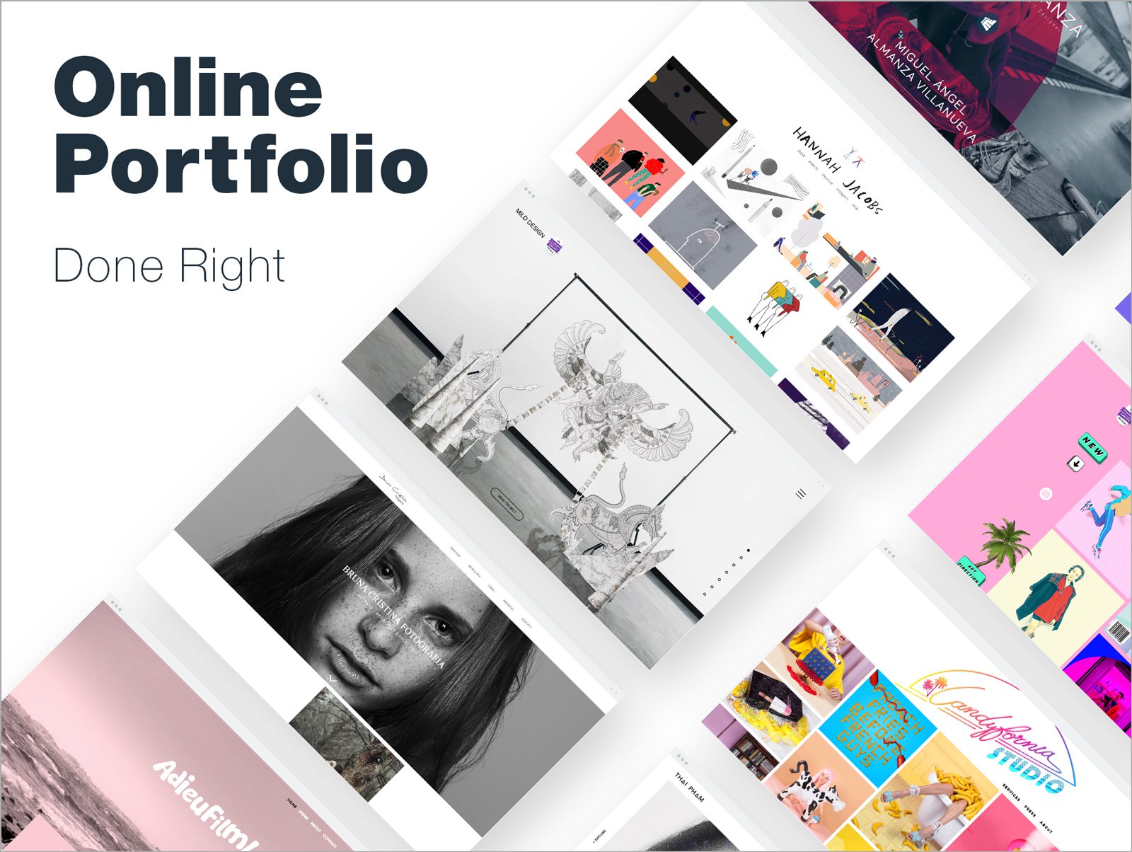
Speaking of lively results, there’s no better way to prove a point than with some stunning evidence. So without further ado, here are 10 designers who used the unlimited creative possibilities of Wix to imagine and realize portfolios that are not only functional, but serve as a true testament to their work.

1. Mike Almanza
2018 will see the confirmation of a now well-established trend: long-scrolling websites. The visual impact is great, and it fits perfectly the new mobile habits. You just need to make sure that the different strips will ‘feel’ clearly separated, while speaking the same language. This portfolio solves the perilous equation with a splash of red color that repeats on every single strip. A perfect example of how playing with only few chromas can create a memorable experience.

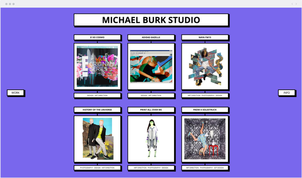
2. Michael Burk Studio
Like it or not, the 80’s are back – and web design is no exception, as shown by this eye-catching designer’s portfolio. The combination of a vintage computer layout and bright colors immediately gives that ultimate pop feel. The “Work” and “Info” buttons anchored on either side of the page complete the bold approach. The result? Another piece of evidence that when a website looks like candy, everyone wants a taste.
Grid-based layouts will probably be one of the most widespread trends in 2018. Adding strips and columns helps your site to breathe, and organize the content in a more elegant way. This illustrator clearly mastered the art of composition, with her projects allocated in small boxes. For the animation, have a look at the bottom, with the film displayed in a full strip thanks to the genius tool that is Wix Video. Of course, the sketch wouldn’t be complete without the author’s signature. You’ll find it in the header, smartly transformed into the cutest and most authentic logos.

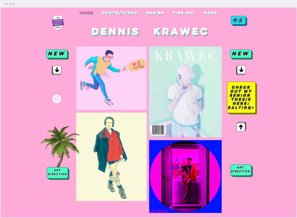
Sometimes less is more. Obviously not here. This site proves that you can go crazy with colors, animations and a busy design language, and still create a fantastic-looking opus! If you happen to need a multilingual site, take some inspiration at how effortlessly this portfolio switches from English to Japanese.
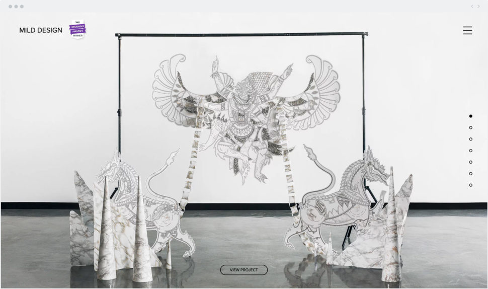
5. Mild Design
Some pieces of art are so strikingly beautiful that they need very little introduction. This website went for a long-scrolling page that allows the visitors to discover the galleries gently and quietly – like in a museum. Don’t discard all textual content just yet. If you go for the same inspiration, the footer is the perfect place to stuff all your crucial information – such as your contacts and social media.
6. Candyfornia
GIF, GIF, GIF is all we can say! While the animations (and colors) may be busy, the perfectly boxed layout calms down the craze. The very prominent logo is balanced out with clean and simple “Services” and “About” pages. Another smart move: the rolling Instagram feed directly displayed on the homepage, and which looks like the most appetizing candy necklace.

A powerful portrait as the header of your website is a classic, yet efficient way to lure users in and tempt them to continue to scroll. Another great find: check out how this design challenged the standard photography portfolio structure, by showcasing the gallery in a striking two-column grid.

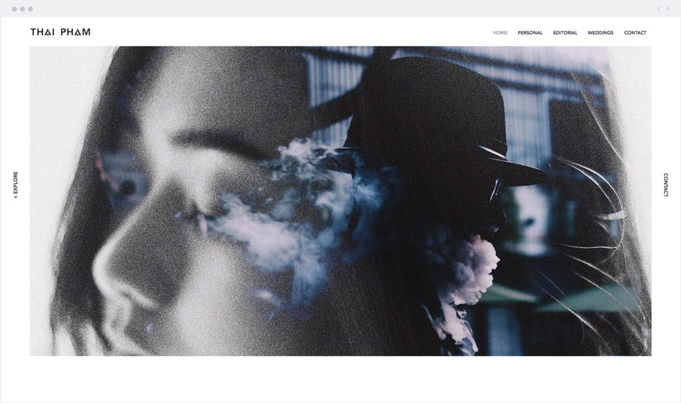
8. Thai Pham
You learned it in your first year of (web) design school: white space is a crucial element to draw your users’ eyes onto what’s really important. This portfolio put the theory into practice in a masterly fashion, with white borders and a vast amount of space between the images. As a result, the website looks like it ‘breathes’ – even though a lot of pictures are displayed. We also love the sharp and ‘broken’ letters of the logo, which give off an edgier feel to an overall elegant design.
9. Max Halley
If your work involves a sense of humor and color, why not place it front and center to catch your visitors’ attention? This über-talented designer does exactly that. His fun, bright, and neon-colored animations are the most inviting. Note the clean background that helps balance out all the adventurous hues, and ease the navigation.

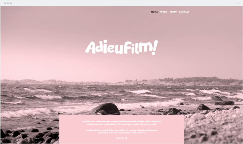
10. Adieu Film
Giving your website a character, if not a personality, is crucial. Somewhere between Wes Anderson’s movies and the sophisticated designs of the 60’s, this site clearly found its own language. We could elaborate for hours on this homepage that is supremely enticing, thanks to the lovely pink overlay and the slow motion video background. ‘Adieu’ film maybe, but ‘bienvenue’ to stunning web design!
Filled up with good inspiration? It’s your turn to experience creativity without limits. Start designing your website with Wix now!


What a great list! I especially love the playfulness of Michael Burk’s and Dennis Krawec’s websites.
Thanks for your sharing ! Useful information