
The Right Pairs of Fonts Are Like Peas in a Pod

When fonts are matched together correctly, they really make the perfect pair. Pairs are everywhere around us – our socks, best friend, partner, peanut butter and jelly, and the list could go on.
Thinking about fonts without thinking about font pairs is half the concept. After all, we’re all better in pairs, and there’s no exception with fonts. When a font is paired with a good partner, the original font is enhanced, and your ultimate design goal is accomplished. Let’s not get ahead of ourselves though.
The key to picking font pairs is to start with the correct font. Sounds simple, enough. When you think about choosing a font, what comes to mind?
The style and overall design of the project, or rather, the appearance of the words? You aren’t incorrect, yet you’re also not completely correct. Choosing a font has so many layers and complexities to the process, but we’ll map it out for you. First, let’s define the goal of a font.
Change Your Mindset
Fonts are constantly advertised and viewed as just a last minute design. When changing the font for a school paper, or a company proposal, you may not put much thought into the font you change your text to.
Yet, fonts can add credibility to your content, make content more readable, present content for better conversions, and market your information to evoke feelings within your readers, which ultimately increases sales.
Sometimes it’s the little changes that matter the most! The beauty and challenge with fonts are that they’re always displayed.
Meaning, if your font is hard to read, then readers will just click away onto another website with much more readable fonts. The competition is higher than ever to get website visitors on your page and staying – don’t make your font the reason they click away.
The Goal of the Font: Convey the Message
Although fonts do project a style and design, their main goal is to translate the marketing message. Think about it, without a font, your message wouldn’t be conveyed at all! They are the vehicle that translates the words you want your target audience to read. It doesn’t end there. A font translates much more than the physical message.
You’re also communicating a feeling. Think about why we dress up for an interview or an important business meeting. We’re communicating an image without saying anything. That image is backed behind emotions.
If the stakes are high like a proposal meeting, then perhaps you’d dress in business professional in order to seem credible. Think about selling a home. Why did you trust one realtor over the other to work with?
Sometimes overdressing can separate yourself from your audience rather than associate yourself with them or seem trustworthy to your audience. If you’re aware your price range is on the lower side, you may feel intimidated and unsettled if your realtor is overdressed because they may not understand your situation.
Choosing the correct message to portray to your audience is a challenge within itself, but most likely if you have a marketing campaign, you already know this! If you’re a bank, you want to come across as trustworthy.
If you’re a rolling skating arena, you want to appear fun. Finding it hard to see which feeling your business is trying to embody? Think of what emotions your business wouldn’t want customers to associate you with.
Serifs and Sans Serifs
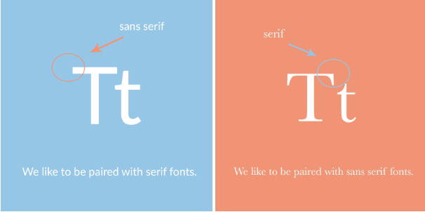
Once you’ve come up with this message, you’re halfway there. Choosing a font is merely finding a style that represents this. Be aware of the different styles of fonts like serifs and sans serif fonts. This could be an easy deciding factor that could narrow down your search! Generally, serif fonts have a traditional style.
These are the fonts that have the little feet at the end of each character. Sans serif fonts were invented after, and are usually considered a much more modern font. These fonts, not containing the feet at the end of each character, display well on digital screens. Upon picking a serif or sans serif font, experiment with the font against your design and how the font is described online.
Serifs and sans serif fonts pair extremely well together because they have what the partner doesn’t!
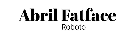
A great example of this is April Fatface and Roboto. Abril Fatface takes the spotlight, while Roboto takes a backseat, with its simple lines and versatile design.
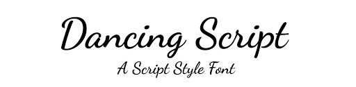
Another great example is Dancing Script and Josefin Sans. Both fonts have a similar delicate design that looks handwritten. Yet, Dancing Script could only be displayed on headlines or else it would overwhelm the readers, and Josefin Sans effortlessly simple.
Finding Your Font’s Perfect Pair
Once you’ve got a font or an idea of a font you’re looking for, it might be time to use a font combination tool. These are great because they make the pairing process much smoother. If you have no idea where to start or aren’t into design, a font combination tool, like this one by Bold Web Design Adelaide, is a great place to find inspiration or start to realize what you like and don’t like in a font.
Think of pairing fonts like music. There’s a melody and a harmony. One takes precedent: the melody. Without both, the music would feel incredibly empty. It may seem like the melody is more important, and it may relay the main message, but both are needed to make a song. They define each other, as without the melody the support music wouldn’t be called harmony and vice versa.
Pairing fonts is exactly like the melody and harmony in a song. One is the focal point that shines through, which I like to call the focal font. This is the font that usually has more personality, and is used for headlines or larger text. With two focal fonts, your reader would be incredibly overwhelmed when reading through your information.
Pairing fonts is a balancing act, requiring both fonts to work together and not to take up too much attention from your readers. Secondly, both fonts have to be compatible. This relays back to your marketing messaging. You wouldn’t release a marketing campaign with one ad that’s creative and fun, and another that’s scary and serious. Ensure both fonts align with the message and emotion, and compliment each other.
Pairing fonts is a great way to differentiate information from each other. Just as we section content within an article with headers and subheaders, different fonts can be used for the headers and paragraphs to further associate a transition within the content.
Text that you want to stand out can be placed in a standout font, and support with a much simpler font. Even the weights of fonts within a pair can be changed, making a font bold, thin, italicized, and other variations to increase its versatility. The possibilities are truly endless.
Play around and get familiar with the options out there. Once you’ve accomplished this, pairing fonts is a piece of cake. Your fonts will work together like a seamless song.
What Not to Do
Don’t choose a font blindly. Picking the correct font for your business takes awareness and understanding. A font that works for another company, may not work for yours. Rather than looking at fonts as a design decision, think of it as a sales decision.
If you’re just picking a random font from a list without much consideration, you could be throwing away potential leads to your products and services without even knowing. Within the age of digital content galore, you want to set yourself apart from the rest.
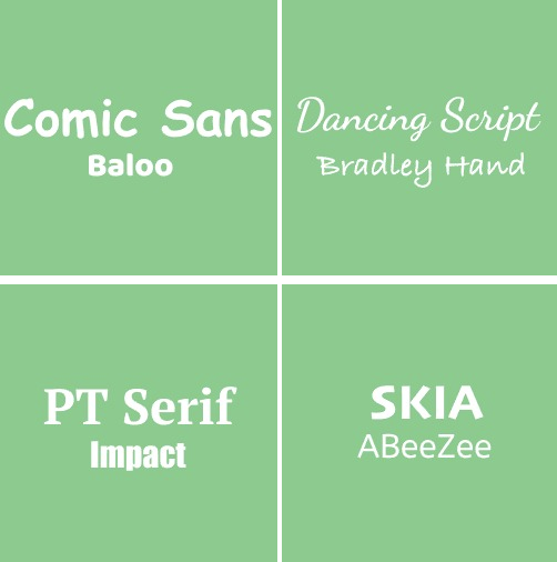
A font is the puzzle piece to a unique brand identity and a competitive edge! Don’t put two loud fonts together. A font that definitely has a “personality” should not be paired with another font like it.
Find a versatile font to pair with loud fonts or pair two versatile fonts together. Versatile fonts are simple and readable like Arial or Roboto.
Conclusion
At the end of the day, a font can always be changed if not now, later. Test different fonts and see which ones work well for your company’s design. If you’re working with print materials, print a couple of tests and get your team’s vote.
A design is just an extension of the company, design, and culture. What better way to decide if it’s a great fit than to ask the ones that work there. When you see a good font pairing, it will seem effortless and you won’t be looking at the fonts, you’ll be reading the content.
The fonts will balance each other out – working together to differentiate between text and information. After all, the right font pairs are like two peas in a pod.


Leave a Reply