Warner Bros.
Don’t those two words just spark loads of childhood memories for you?
Anyone else?
Harry Potter, Lord of the Rings, Friends, and basically all good movies/shows ever!

I gotta be honest, I really didn’t know how to feel when I heard about the brand new logo and identity that WB was going for.
And after looking at it and letting it sink in, I think I can properly voice my opinion.
But first, let’s get into a brief history of WB Studios.
A Brief History of the Warner Bros Studio
Warner Bros has been around since 1923 and is surely one of the most well-known entertainment companies ever.
With great, recognizable shows and movies like The Big Bang Theory, The DC Universe, Harry Potter, The Lego movie and loads and loads more, the library has more than 100,000, let me say that again, 100,000 hours of programming.
Not only do they have movies and tv shows, but they also have, as you probably know, comics books, video games that we all know and love.
And now that they’re coming up on their centenary, they are celebrating with a brand new logo.

Out with the old and in with the new.
We can thank Pentagram for this new design that will suit all branches of the studio.
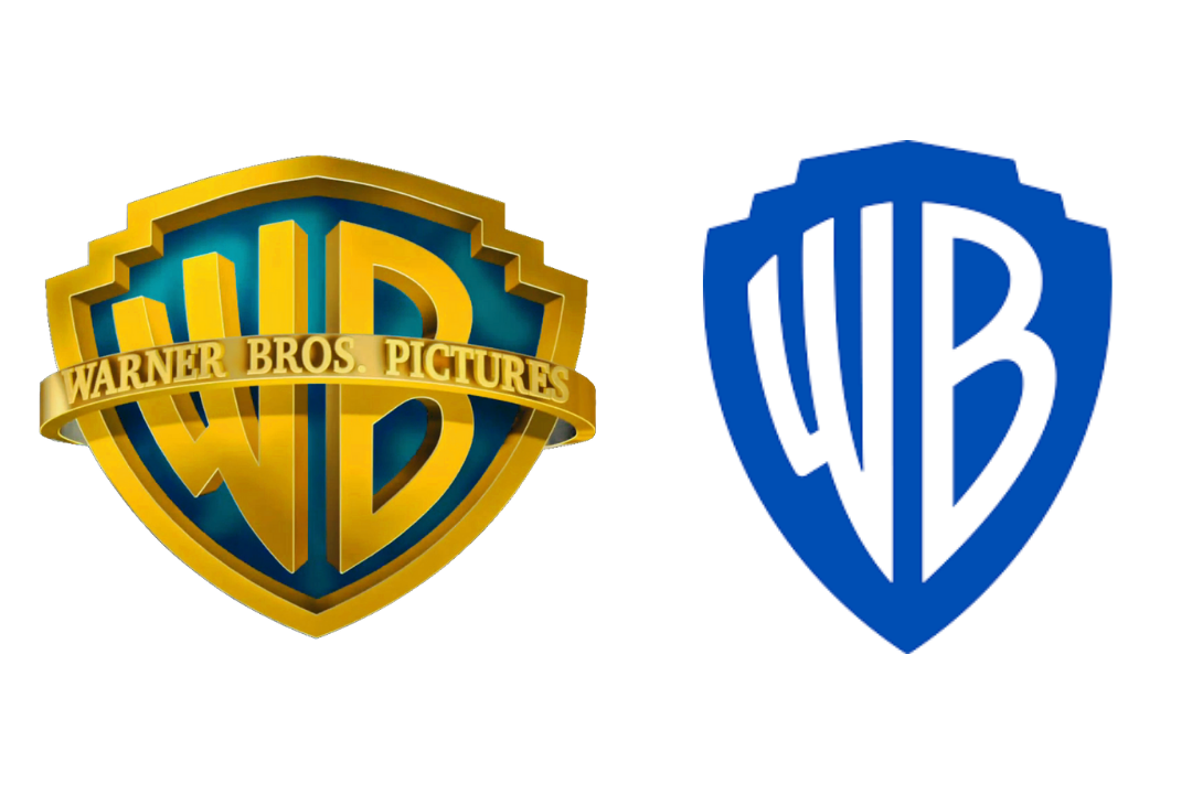
Keeping many of the same, iconic elements of the original logo, we can look at this rebranding as kind of a great make-over, rather than a brand new reinvention of the logo.
Vice president of public affairs and worldwide corporate communications, DeeDee Myers, said that the “visual identity looked a little dated.
And that’s where Emily and her team came in.
Emily Oberman, who headed up the redesign team, said she wanted to keep the original and iconic shield, but make it “more sleek and clean”.
Here you can see the process of the redesign.
Instead of looking at the old logo as dated and needing an entirely new look, they kept the original elements and just kind of gave it a pick-me-up.
By just making some simple changes and tweaking things here and there, a whole new design came out of the process.
Even though the changes may have been small, they were able to maintain the original identity of the logo and brand, while giving it a whole new look.
The team said that they wanted the new logo to give people a sense of WB Studios moving into the future with us.
While the shield has suffered a few changes, it was vital to the team and WB Studio that it was still easily recognizable to all fans and viewers.
And I truly believe they were able to do just that.
It is more sleek and clean, just like they wanted.
The shield was put into a golden ratio and thinned out a bit, and the letters were redrawn to give it a better sense of balance.
The iconic blue color of the WB Studios Logo was made more modern by brightening it just enough.
With this new logo came room for variation.
This new logo needed to fit across all platforms and needed to look natural.
The new logo can be modified to fit any occasion, or as DeeDee Myers liked to call it, logo soup.
This logo comes in two different variations. A flat version, and a more dimensional version.

This logo needs to fit any movie, show, comic book, etc, and that’s why it is so important that it can be easily modified to fit any occasion, while simultaneously keeping that originality and recognizability.
Myers told us that “There is a tremendous ability to play with it and bring it to life.”.
And that’s what Emily Oberman and the team were going for when they said, they wanted the logo to be “contemporary, while also being able to be used as a sponge for any story they wanted to tell,”.
Amongst the two new design variations of this logo is also a new font.

Warner Bros Sans is an original font that came from the original shield of the logo and was inspired by the 1920s Art Deco.
By doing this, Oberman said that the brand would still be present through the custom font, even if the shield was not there.
“We’re excited about refreshing the brand,” says Myers, “connecting it to the past, but with eyes firmly ahead.”
This project that took 3 years to complete is finally here, and it’s here to stay.
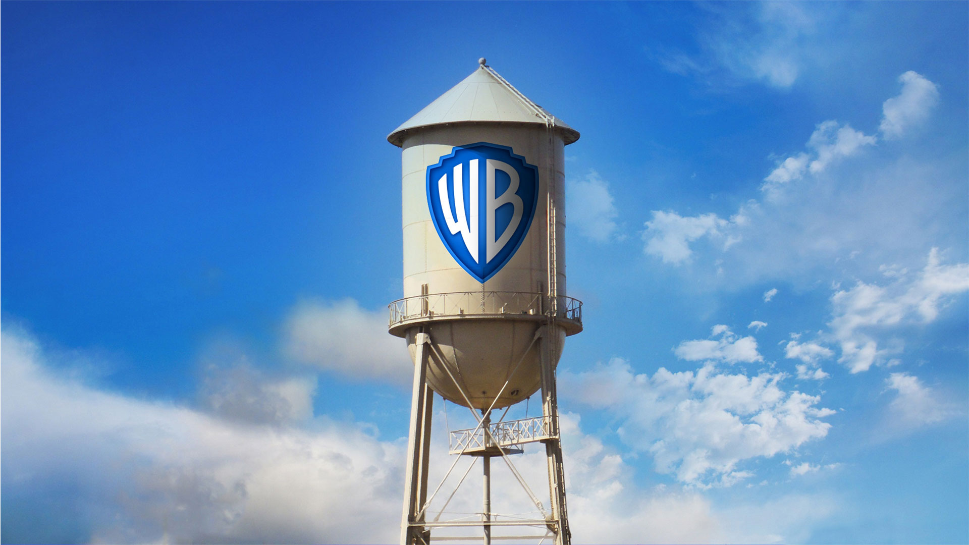
The new logo is on the iconic water tower located on the WB Studio lot, and will soon be everywhere, from literature to social media, to big screens and on the sides of trucks.

We’re curious what you think about the new logo redesign that Warner Brothers Studio went through.
Are you a fan? Will you be missing the old logo?
Let us know all of your opinions in the comment section below.
Until next time,
Stay creative, folks!


Leave a Reply