
Responsive web design means that the website will respond according to the medium that is being used to view it. These days websites are not only viewed on standard computer screens, but after the evolution of smartphones and tablets there’s a necessity to make websites that look good on multiple devices. In this roundup we have showcased some amazing and outstanding responsive web designs that use media queries to provide an optimal presentation on various screen sizes.
glitch

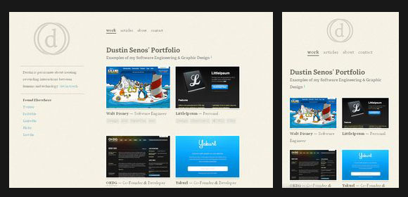
dustinsenos
clearairchallenge

trentwalton

owltastic

buildguild

dolectures

320andup

sasquatchfestival

cognition

interim

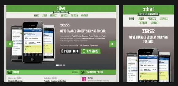
ribot
sweethatclub

sleepstreet

cohenspire

electricpulp

adifferentdesign

teixido

colly

stephencaver

hicksdesign

alistapart

porcupine

3200tigres

bakery

tileabl

visuadesign

teegallery

calebacuity

naomiatkinson

staffanstorp


Thanks for showing Visua 🙂 There’s a much more responsive, ‘touchy-feely’ version coming very soon!
Thanks for putting the responsive version next to it. I’ve been looking at a lot of inspirational blog posts on responsive web design and its quite annoying having to click on ones your not that interested in just to see how it works. I like the Naomi Atkinson site, the boxes move like an animation and i’m already a big fan of ‘The Sweet Hat Club.’
Amazing design capabilities.
I actually found out if window resized to minimum width, the design is automatically swapping to mobile version….. Fantastic!!
I use Chrome, btw.
….. That’s what responsive web design is……
Examples are very inspiring but can you also hint us what technology is used in these designs to achieve “responsive” effect? CSS switch, jQuery…?!
could be media queries and css, jquery, server-side scripts…
Here is another cool responsive design:
https://www.glueisobar.com
Wow, great post. Can’t wait to start using some of these techniques.
Tessa, that website link you posted is not responsive. At all. Are you just spamming?
https://mediaqueri.es/
Awesome sites! Really like the first 5. Great article.
Thanks,
Nathan Marcarelli
https://www.treelifedesigns.com Small Business Web Design
Fantastic web designs you have provided.
A list of ‘Responsive web design’ websites without telling us why? How is that useful?
You obviously don’t know what ‘Responsive web design’ is.. Maybe do some research? Or.. Just look at the freakin’ pictures and you’d realize what responsive web design is… When you change the browser size, the website changes into a mobile/tablet mode… just look at the pictures…. geez.
Thanks for the list. I was also greatly inspired by the article in ALA and experimented “Responsive design” in my site.
Thanks for sharing this…..nice collection keep on continue….!!!
Cool list, Owlfantastic has to be my favorite. I guess I love that the owl logo takes up a large portion of the site, where as many designers seem forced to making the logo small top left corner.
Thank You. ‘media’ CSS query pretty much does all the magic =). It’s really educative for a CSS noob to see the code of these site. Thanks for a round up!
Nice collections. thanks for sharing.
No, it’s not. Seems like link begging. Or she doesn’t know what responsive means…
You’ve made a nice collection here, thanks for sharing!
It’s defiantly gave me a few ideas to play with.
Good collection very good sources for inspiration.
But you forgot to mention my blog take a look https://www.dreamincoloronline.com/category/inspiration/
These webdesign examples really ask for response of the visitors. Look at the simplicity and ask try yourself for not clicking on the elements in the webdesign. lol
Hi guys, look at this full responsive design with a masonry layout:
https://openlastminute.it
I suggest : https://www.fe-el.com
‘Electricpulp’ has a very modern touch.
Thanks for sharing this great compilation!
Nice roundup! Here are 10 more to check out https://newevolutiondesigns.com/10-creative-responsive-web-designs