
A while back we posted an article showcasing great website navigations. Consider this the sequel.
The website navigations is meant to be clicked. It doesn’t need to blend in or be hard to find. It’s important that it stands out from the rest of the elements on the page, but yet still matches the overall style of the design. Here is a showcase of websites that achieve this in a very stylish way. These navs look amazing, have serious click appeal, and are guaranteed to inspire you.
Clicking on the images will take you to each site.
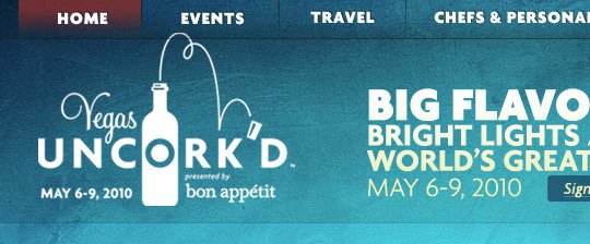
Vegas Uncork’s

Lots of unique features with easy to use navigations.
SYNTHVIEW

The bar is easy to read and easy to follow
Electric Pulp

Sleek navigation design that stands out form the rest of the page.
The House Media

The navigation is big and bold, you see it right away.
Curious Generation Group

Creative, different and well designed, the content engages you.
Chirp

This site utilized its color scheme well the white and blue are vibrant, the navigation
bar stands out.
Delibar

The navigation stands out with it’s uniquely designed shapes and color.
Narwhal Co.

Narwhal creatively used simple images to shape their navigation bar instead
of the basic bland way of doing things.
Yellow Bird Project

This nav bar interacts with your mouse to change shapes.
Ugmonk

Bold colors will attract your viewers gaze and stand out form the rest.
Intuitive Designs

It’s always a good idea to have good fonts.
Neutron Creations

Color coded, easy to read navigation
TheOldState

Again, font, color, placement…
Digital Podge 2009

This site is interactive with the % of visitors, giving a since of direction.
Arbutus

The nav bar complements the rest of the page with it’s effects.
Sower of Seeds

This bold nav bar grasps your attention and tells you exactly where to go.


Hey how is my website’s navigation meuu – http://www.techsplurge ?
I think http://www.nue-media.com has a cool navigation to
Great examples here, love them all.
People are really starting to embrace custom menus as they are drifting away from using drop-down menus.
love it .. Great examples
Thank you for this list.
This will really help, with my next project.
These are fantastic – Really like the simple appeal of some of them – Will definitely keep these in mind for inspiration while doing my redesign 🙂 Thanks Henry!
the focus is on the same sites, why? in many aticles are same sites
Beautiful collection – it is inspiring me to re think the Golf Royalty nav.
Thanks,
Lee.
Thats a great ressource, thanks for sharing… inspiring!
Great sites…I am always looking for great sites for inspiration. Thanks!
One site you listed has “packages” as a navigation button, I glanced over it and thought it said “pancakes”. That would have been awesome.
I love clicking my mouse.
I just got a spam message saying that I could make $1,000 dollars a day, just by clicking my mouse 500 times a day!
Nice ressource… I also think the visitors want more userenhanced experience when the visit webpages today.
I’ve also made som interesting animated buttons on this site: http://www.lineofbeauty.dk.
It’s in danish, but I think you can guess the site-contens by hovering over the button-links…
I like most of them. Although I miss more complicated menus with subitems..
Nevertheless thanks for sharing!
Arbutus Photography is particularly nice!
I was excited to see Ugmonk included in this list! They have an amazing site!
Thanks for the mention! 🙂
Great post!
I know when I’m designing a site the navigation is always something I have to spend extra time on.
This will be a great reference to go back to when I need ideas.
heyyy nice post han i really find it usefull for my web designs i got a lot of idea about the navigation in this post…! cheers 🙂
Thrilled to see Intuitive Designs included. Naomi and her husband provide great design, and coding.
I would have to say the inspiring layout of the sites give a boost the navigation. I tend to like the navigation most when I like the entire design.
nice collection thanks for posting…
Nice collection, Delibar is my favorite.
Great collection, thanks for the post!
I would agree with Aaron. These navigations are not impressive when removed from the sites that contain them. The overall sites are nice. The navigation is just…there. Nothing too special about them except that they help you get from point A to B, which is what navigation is supposed to do.
I’ve seen a lot of sites copying Apple’s navigation and I honestly do not know why. It is completely separate from the rest of the design and does not fit the design at all. It is also very poor at getting you to what you are looking for. Their old navigation was far superior, with a secondary navbar to guide you to the exact page you want to go. Just try to find QuickTime Movie Trailers on there new site.
really digging the iconalicous. Thanks for the list!
Very inspiring! Thanks for posting the sequel.
You should also check out https://www.graffino.com , it has quite a good looking navigation…
Other than that, the list is really cool. Keep up the good work
Showcase Of Creative Flash Preloaders which may serve as an inspiration..
and maimuse.com?
Very inspirational, thank you. Some are really amazingly designed. Man I’ve got a lot to learn.
hei i like most the Pastebot navigation…
i appreciate all the work they are awesome designs
I would agree with Aaron. These navigations are not impressive when removed from the sites that contain them. The overall sites are nice. The navigation is just…there. Nothing too special about them except that they help you get from point A to B, which is what navigation is supposed to do.
I’ve seen a lot of sites copying Apple’s navigation and I honestly do not know why. It is completely separate from the rest of the design and does not fit the design at all. It is also very poor at getting you to what you are looking for. Their old navigation was far superior, with a secondary navbar to guide you to the exact page you want to go. Just try to find QuickTime Movie Trailers on there new site.