Anyone who works on the web should know the name Jeffrey Zeldman. He’s been working on the web for almost as long as I’ve been alive, and he’s one of the biggest contributors to modern web standards.
I feel more than fortunate to bring you this interview covering his career, his journey, and his deep passion for effective web design.
This article should intrigue both beginners and seasoned pros alike. Jeffrey’s answers are not only educational but also eloquent, personal, and brimming with candor. Truly an interview made for anyone that cherishes the web & its extensive history.
Q: When did you first start working on the web and what got you interested in the field?
I was working in advertising in 1995. Our client Donald Buckley of Warner Bros. wanted to promote their upcoming “Batman Forever” movie. I thought it would be appropriate, exciting, and fun to do the majority of the film’s marketing in a brand-new technological medium called the World Wide Web that had a certain underground cachet.
After all, Batman is the ultimate geek superhero; what better medium for Batman fans than this almost completely unknown digital platform used almost entirely by nerds and college students?
Don asked if we could make a website. We lied and said we could. Three months later we launched batmanforever.com, an amazing site for the time.
It had full-screen backgrounds, an animated splash page (three years before Flash was a thing), theme and storytelling-based navigation and copy, and even typography and margins – Kind of.
These were things you couldn’t really achieve in 1995, but we were too ignorant to know they couldn’t be done.
There were 3 million people using the web in 1995. 1.5 million of them visited our site. As a long struggling artist who’d spent years fruitlessly trying to interest people in my music, writing, and illustrations, I was thrilled to reach an audience that big and that cool. Plus I loved the way the web married design, writing, and technology—three things I loved and was kind of good at. I never looked back.
Q: How would you generalize the major changes in web design from the ’90s to now? Or to put it another way, do you see web/interface design culminating towards something?
In the 1990s we were stuck with a false dichotomy between a web that was richly interactive and visually exciting (but only worked for certain browsers and platforms), and a web that worked for all (but was visually and experientially lackluster).
Today we can create a web that works for all people, using any device, at any connection speed. A web whose content is rich no matter how you access it, and whose visual and dynamic experience “levels up” when accessed by browsers and devices with more capabilities.
In the 1990s we talked about “graceful degradation”: the idea that a site existed in some perfect form when visited with the right browser, but would offer an “acceptable” experience in some lesser circumstances.
Today we believe in “progressive enhancement”: the idea that a site can be a great experience for everyone without limiting its expressive capabilities.
In the 1990s we had the fantasy that we could design for a set size (say, 640×480) or a specific range of two sizes (from 640×480 up to 800×600), and if our layout worked in both settings then our work was done.
Today we know our content will be accessed from devices with absurdly varying screen dimensions (and sometimes, no screen at all).
Put another way, Tim Berners-Lee introduced the web as a stripped-down, no-frills, two-way publishing platform that would allow anyone to communicate with anyone else, anywhere. Designers in the 1990s introduced a web that was rich in design and experience, but limited who could participate.
The web standards movement married the two ideas; mobile devices and responsive design took the marriage that much further, and today we have a richly layered web that, when done right, works for everyone.
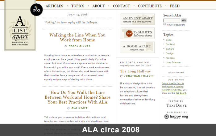
Q: A List Apart has become one of the most influential resources for designers & developers. What was your goal when first launching the site (originally a mailing list) and do you feel that goal has been accomplished?
There’s a principle that if you don’t see what you want in the world, it’s up to you to make that missing thing.
Back in 1998 there were mailing lists and websites about how to code web pages. There were mailing lists and websites about how to design web pages. Plus there were mailing lists and websites about how to write for the web.
But no site or list covered all three areas; nobody seemed to see that they were all part of the same thing: 21st century design.
A List Apart connected those dots for readers who felt, as we did, that design, code, and content were connected in important ways—that the whole they made was greater than the sum of the parts.
Q: What was it like to watch A List Apart grow from a simple mailing list to a company with its own publication wing & design conference? And how much collaboration was involved to grow ALA into its current state?
Growing a brand over nearly 20 years is like having a kid. There are times you rejoice and times you worry.
At the beginning you infuse your personality because the thing won’t come into being without it. Later you work to ensure the independence of the new life you’ve brought into the world. Your kids need to be able to survive on their own, and so do your creations.
Bringing in collaborators, and letting go of control, is one of the most exciting (and at times most painful) experiences a designer can have. I’m thrilled with where the magazine is and where it’s going—and sometimes, I’m a little sad that, if I do things right, it will ultimately go where it needs to go without me. (Sad, but also happy if I’ve built something that can outlast me.)
Currently seventeen people work on A List Apart under the supervision of editor-in-chief Sara Wachter-Boettcher.
Sara is a force of nature. She not only works on the magazine’s “editorial” aspects, she also manages personality conflicts, identifies points of interpersonal and systemic dysfunction in the way we approach tasks, and so on. Sara’s amazing, and her influence on the direction of ALA is huge.
But she is just one of the world-class editors I’ve had the privilege to work with over the course of ALA’s history. You can see all the incredible people who contribute to ALA at https://alistapart.com/about/masthead.
There are article editors, column editors, and blog editors; designers, producers, and project managers; technical editors and developers. There are illustrators. And, of course, there are the writers. Without them, we’re nothing.
As for the conference: each year at SXSW Interactive in Austin, Texas, Eric Meyer and I used to meet for breakfast at a little hole-in-the-wall Mexican place that, sadly, no longer exists.
We’d talk about the fun we were having at SXSW and we’d daydream about creating our own different kind of conference: one with just a single track where designers, developers, content folks, and other specialists would learn together from the smartest designers and influencers in the field. Our friend Brian Alvey suggested the name “An Event Apart” (although what else would you call a conference from A List Apart?).
In the last month of 2005 we launched our first test event at a little event space in Philadelphia’s Franklin Institute. After a couple additional events proved we could create meaningful content for an event series, and attract web professionals to attend, we made the very lucky decision to hire event planner Marci Eversole and producer Toby Malina. They helped us take AEA from a cool but homespun grassroots affair to the world-famous, three-day web design and development event it is today.
Q: What initially motivated you to launch Happy Cog? Back in ’99 did you ever think it’d still be going strong over a decade later?
I was working as a creative director at a dot-com company just before the first dot-com boom imploded. Despite my title, I didn’t feel I had any real say in the direction the company was taking. I wasn’t even sure I was free to run the design and development area as I saw fit.
One day after a principle in the company raised five million dollars via a logo I’d designed in 30 minutes, I said to myself “my talent is what makes this little contraption go. I should start working for myself.” (I overstated my own value to the company, but it’s what I needed to believe to give myself the push.)
I walked out a month before I would have been vested in company stock, and three months before that stock became worthless.
Before leaving I lined up $6,000 worth of freelance web design work. By Christmas Happy Cog was an LLC, and I was no longer a “freelancer”. I was an “entrepreneur” — which was just another word for chain-smoking designer/developer working in his underwear.

Happy Cog office space – photo source
Q: What do you feel makes Happy Cog so successful & makes it stand out from the many other creative studios?
When I was a pre-teen I wanted to fit in, but I just couldn’t. Somehow I was just different. That was a sad thing at the time (so sad it pushed me into self-destructive behavior for years) but today it makes me happy, because a business run by someone who is different can’t help being a different sort of business … and it’s the uniqueness, not the boilerplate capabilities, that make a company exciting and fun; and that gives it a real purpose in the marketplace.
We demand originality, and our people deliver — it’s just who they are. And that, in turn, attracts clients who also think differently.
Another thing that’s helped us is that, early on, we drew a line in the sand deciding never to work on anything we didn’t believe in.
My first Happy Cog consulting gig was $1,000 a day, which more dough than I’d ever made in my life—and it came at a time when I was broke. But the relationship with the client wasn’t working out. It wasn’t the right dynamic. I wasn’t the right consultant for this client. I couldn’t help her achieve what she wanted because we didn’t share the same vision for the project, and didn’t have the same belief in focusing relentlessly on the user. So I resigned after three days.
I remember it was snowing, and my girlfriend wasn’t working, and I wondered how we were going to pay next month’s rent. And I live in New York where rent is high. But then I smiled—because I knew that there were things I wouldn’t do for money.
And we’ve made that a principle of Happy Cog. Even when things occasionally get tight for us, we’ll never take a job just to pay the bills. If we’re going to commit to months of close collaborative work, we must believe in the work our clients are doing. I’m thrilled to have partners like Greg Hoy and Joe Rinaldi, who share this belief—and, of course, it makes our staff very happy because they know we’ll never ask them to work on something they don’t believe in.
We’ve always been content-driven and user-focused. We didn’t need to wait for someone to invent a term like “usability” for us to know we shouldn’t design things that are pretty but not functional.
And we always had this relentless focus on web standards and accessibility. Initially it made us different from all the other studios. Eventually the good studios caught up, of course.
Today we’re as focused on content strategy as we are on design and development. Above all, we care about the user’s experience—from the smallest design detail to the biggest obstacle we remove from the user’s critical path. This is the kind of design decision that makes a huge difference in site experience, but nobody ever notices. Just like nobody ever notices when the air conditioning is working—we only notice when it’s too hot or too cold. And that’s… okay.
Happy Cog has been(and continues to be) a launching pad for some of the biggest talents in design, development, and content.
We hire folks who really care, and who are delightful to work with—because along with having empathy for the website’s users, we also believe in having empathy for the people who hire us. And enjoying your collaborators’ company is part of that good experience.
Most of our clients are repeat customers, which is the only claim I’m making here that really matters.
Design is like love. You can burn through lovers and die alone, or you can learn to love someone else. And when you really love, you sometimes get loved back.
That’s what Happy Cog’s repeat customers mean to me: we’re doing something right, and it’s appreciated.
Q: Would you be able to walk us through a typical Happy Cog project workflow? What’s the creative process like starting from idea conception all the way to completion & delivery?
Not to be contrary but there truly is no typical project.
Every job is different, every user is different, and every company’s goals are different.
That said, we typically do a ton of research and have a hundred thoughtful conversations before pitching any job. And once we get the gig, we never stop asking questions. We’re not a waterfall shop that promises a certain number of fixed deliverables, ticks off a bunch of checkboxes, and rushes on to the next project. We engage in committed, collaborative relationships with our clients, with projects and deliverables that evolve over time.
At the risk of sounding pretentious, our projects are like wonderful conversations that go on and on until somehow, almost magically, they produce a product. Like love makes a baby. (In this case, of course, the baby is a professional site or application that solves real business problems and anticipates real user needs.)
Q: Can you share any crucial milestones or learning experiences that hastened your growth as a designer?
When I was in high school my science teacher began growing a beard. Then one day he cut it off. When he came to the school that day all clean-shaven, everyone asked about his beard and why he had cut it. After we all settled down he informed us that he had been dying his hair black, and we’d never noticed.
He was a gray-haired man when he began growing the beard. Slowly he began coloring his hair in sections, while growing this very strong beard. We were so taken with the beard we didn’t notice that he was subtly and slowly changing his hair color. On the day he chopped off his beard, his hair went fully black—but not one kid in that classroom noticed. We wouldn’t have known at all if he hadn’t explained it to us after the fact. He had deliberately focused our attention on the wrong problem in order to achieve his real goal.
I never forgot that story, and it still shapes the way I think about interaction design.
My mom was a musician and my dad was an engineer with an artistic avocation. He painted at night and on weekends, and led an art group in our town. I was surrounded by the stuff of art-making, and by books about art, and I developed a very early interest in cartooning and lettering.
By the time I was ten I had produced a series of comics about a spy character named “Rick Purvis.” My drawing skills kept improving with each new comic I created. To keep my nonexistent readers from becoming confused, I explained away the differences in drawing style from one comic to the next by saying Rick Purvis had had plastic surgery to hide from his enemies.
Q: What can interns & junior designers do to build their skills as quickly as possible in a studio environment?
Learn from everyone whether they work above you, under you, or at your side.
Arrive early and stay late.
Read books and blogs, listen to podcasts, and subscribe to newsletters.
Never stop learning. This business changes every six months. If you stop learning, you stop caring. And once you stop caring your career is over.
What do you feel are the differences between “good” design and “great” design?
It really depends. There are lots of clever ways of answering your question, but they’re not necessarily always true.
Like, I could say, when people see good design they say how nice your website looks. When they see great design, they say what a great service you have. It’s true—but not always.
Or I could say, good design makes the person who uses the site think the site looks cool. Great design makes the person who uses the site think she herself is cool.
Both those things are completely true—except when they aren’t. Sometimes great design is invisible; sometimes it gets noticed. The same is true in film.
Some directors are so great that we notice all their wonderful shots. Orson Welles comes to mind.
Other directors are so great that we don’t notice the camera work at all. John Ford comes to mind.
This industry is full of people who love absolutes. “Great design is invisible,” they’ll tell you. Sometimes they’re right—and sometimes not.
All great design is effective, but not all effective design is great.
You’re more likely to achieve great design if you work harder and longer. A great graphic designer keeps moving little things around on the page, even after a lesser graphic designer would say “the design is done.” The same is true for interaction design.
The beauty of interaction design versus graphic design is that you can keep testing your work on new people, and improving it over time.
At a certain point the graphic designer ships. Web and interaction designers never really ship; we’re always somewhere in the middle of a process, learning from the people who interact with what we make.
Q: How important are aesthetic design trends like flat design or Material Design? Where do you feel design trends rank compared to technical trends like responsive layouts?
Aesthetic trends don’t matter at all. By the time they have a name and you’ve noticed them, they’re already obsolete.
Chasing trends is what the beginning designer does. I did it. We’ve all done it. It’s part of the learning curve. It gives the beginning designer something to think about so she doesn’t have to think about the much scarier things—like if my design fails, how many people will lose their jobs? If my guess about privacy settings is wrong, how many families will be hurt? Those are the huge questions interaction designers wrestle with.
Copying styles gives the beginning designer something smaller and safer to worry about. Meantime, an experienced designer creates the style that best suits the content and brand.
Responsive design isn’t just technological, and it isn’t a trend. It’s the beginning of us understanding what the web medium actually is and the many ways in which it can be experienced.
When Ethan Marcotte wrote Responsive Web Design for A Book Apart (after premiering the concept at An Event Apart), he initially focused on layout and technology to give people time to begin absorbing the concept. And that was absolutely the right thing to do.
But today, five years after Ethan introduced the world to responsive design, we know that it has implications for content and other aspects of user experience—aspects that go well beyond layout.
The Responsive Web Design podcast run by Ethan Marcotte and Karen McGrane addresses these complex issues beautifully. I highly recommend listening!
Q: Web design/dev conferences have become powerful learning & networking opportunities for the industry. Do you have any tips or advice for someone thinking of attending their first conference?
A good conference conveys an astonishing amount of information—too much to absorb in a single sitting. Bring a laptop or a sketchpad to take notes (depending on whether writing or drawing best helps you remember).
Sit close to the front even if you are shy (focus drops as you move closer to the rear of the auditorium), and avoid distractions that keep you from learning (i.e. use your laptop to take notes, not to check email or catch up on Twitter—unless you post notes on Twitter, which can actually also be very helpful).
At An Event Apart, we know how hard it is to take in all the amazing things you’re learning. That’s why, after the show, we provide attendees access to slides of every presentation they saw, plus a printed workbook for those who attend the optional third-day single-topic learning session.
We also curate and create a custom Resource page for every event, containing links to any articles or online tools our speakers may have mentioned in their sessions, plus links to community tools (such as aggregators of tweets and photos from the show) along with attendee summaries and reviews of individual sessions or the whole show.
In this way AEA attendees keep learning long after the curtains have. Plus all the links and tools help folks remember exactly who said what.
After some time passes, we also publicly post videos of some of the important AEA sessions from that year, after first making them privately available to folks who subscribe to our newsletter … which also helps attendees keep learning even after the show ends.
Conferences are also great places to meet other folks who do similar work and who care about great interaction design as much as you. So even if you’re shy by nature—and most of us in this business are—don’t be shy during the few days you’re at a conference event.
Walk up to folks between sessions and strike up a conversation. A single track format like An Event Apart helps with that, because you can be sure the person you’re approaching just saw the same session you did.
Bring your business card or be creative and bring fun Moo cards. At AEA, to break people out of their shy shells we offer An Event Apart Conference Bingo. It’s a fun live interactive game that helps folks connect with their fellow attendees and speakers.
Because even better than taking back a head full of new ideas and exciting inspiration is also taking back an improved Rolodex. Someone you meet at a conference might be your next employer, your next colleague, your next employee, or even your future marriage partner(it happens).
Q: What were some of the struggles you faced when first organizing your own conference “An Event Apart”?
Capitalism is a blood sport. When the AEA conference was beginning to grow in scope and scale, there was a period where we had to promise some large venues that we would spend anywhere from $60,000 to $200,000 in their location over the course of a two-or-three-day event. Without those guarantees, we wouldn’t have been able to book those venues.
But we were acting in faith that we’d sell tickets. There was always the possibility that we wouldn’t.
If the product we were making didn’t have the appeal we thought it had—if not enough people bought tickets—then our company was going to have to make up the difference. Since the company was just a two-person LLC, what it really meant was that if Eric and I were wrong about AEA’s future we were going to have to find hundreds of thousands of dollars somewhere.
I would wake up at three in the morning with my heart pounding, wondering if I was going to lose my home. (It was the first home I’d ever owned and I’d only just bought it; my daughter was just a baby at the time.)
Turns out we were right to bet on our ideas but I wouldn’t want to go through that again.
Of course, this same thing happens to every self-financed company and every company I own has gone through it. And some of them may go through it again. Scary stuff.
Q: If someone with little experience wanted to learn web design today, what should be their first area of focus?
Beginning web professionals should learn the basics of semantic HTML markup and progressive enhancement. You should learn CSS, including new stuff like Flexbox. And should at the very least understand the principles behind how JavaScript works and what it is for.
You’ll know you’ve learned enough code (at least for now) when you can hand-code a basic web page that works in any browser on any device.
Once you’re past the basics, read my Designing With Web Standards. It’s the textbook for modern web design.
Typographic basics are just as important. Web design is largely type design. Read Ellen Lupton and Robert Bringhurst. Have some fun with Lewis Blackwell’s 20th Century Type Remix.
Be like someone discovering a new country. Look at everything critically and with fresh eyes.
If there’s a website you like, figure out all the little details that make you like it.
If you have a good experience on a shopping site, figure out what the designers, developers, and content folks did to make the experience so smooth. Was there a clear hierarchy? Was it easy to spot buttons and forms? Did you generally have a pretty good idea what your options were, and what you were expected to do next?
Every time something worked well for you meant a designer made one or more good choices. Many folks call this design. Some call it “usability” (which is really just a label for good design). Steve Krug wrote a bestselling book on the subject: Don’t Make Me Think should be on everyone’s list.
At A Book Apart we’re publishing what we modestly believe to be the modern canon for web and interaction design. You’ll recognize many of the titles. Our books are laser-focused on what design should be, and what’s coming next.
Phrases like “Mobile First” and “Responsive Web Design” taken from our pages have entered every designer & developer’s vocabulary.
Stay up to date with great free resources like A List Apart, CSS-Tricks, and Smashing Magazine.
Q: Over your career you’ve worked on a lot of cool stuff. Do you have a favorite project or personal career highlight?
Designing With Web Standards, A List Apart and The Web Standards Project changed how the web gets made & influenced hundreds of thousands of my peers. I’m in humble awe of that.
Q: If you had the chance to give any advice to your younger self, what would it be?
It’s all happening for a reason.
Q: And finally could you name 1-2 people who you greatly respect in the field of designing/building websites?
You can tell who I admire because I put them onstage at An Event Apart. I publish their articles at A List Apart, and I publish their books at A Book Apart.
And then there are folks outside my sphere of influence whom I also greatly admire and learn from—folks who write for Rosenfeld Media, for O’Reilly, for New Riders, and for other great publishers.
Some of my web design heroes don’t write at all. They just work, and their work is their art. I’m thinking of folks like Happy Cog’s Mark Huot who is an incredible inspiration.
Those who’ve overcome harassment like my friend Jen Simmons of The Web Ahead podcast, and who’ve stood onstage and maintained their professionalism & cool while anonymous cowards were attacking them via the Internet, like my friend Sarah Parmenter, inspire me to do better and be better.
And then there’s my friend and partner Eric Meyer, who has turned an unspeakable tragedy into a burgeoning movement to help those web users who are least capable of helping themselves in the moment of their greatest need.
I’d like to sincerely thank Jeffrey Zeldman for all his time and marvelous answers. If you want to learn more you can visit his website or check out his studio Happy Cog.
[sdfile url=”https://www.zeldman.com/” title=”For more information of Jeffrey Feldman please provide your name and email, and a link will be sent to you shortly “]




Finally some really good questions, in my opinion great interview with Mr. Zeldman. It was pleasure to read it.