Just like every other element of web design, color palettes follow fads that are constantly evolving. This year’s color trends are as diverse as they are compelling; brights and neons combine with greyscale to add some zing to clean, modern styles, while pastel palettes lend a softness to playful, cartoony designs. And from one end of the line to the other, color blocking in any hue has been enthusiastically employed.
What’s great about this new crop of color trends is that they all combine seamlessly with UI considerations, helping to distinguish important elements and break up sections as well as conveying a style or mood.
The Four Trends for 2013
1. Greyscale With Bright Accents
This color scheme has greatly increased in popularity of late, and it’s plain to see why: with only a couple of bright hues to draw the eye, it’s easy to differentiate important information and interactive elements. And the simplicity and control this gives to the design makes for a polished result with a great user experience.
In this site’s design, the turquoise and coral colors are alternated throughout to define sections, images, and rollovers, creating a clean and intuitive design that directs attention primarily through its bold and effective color scheme.
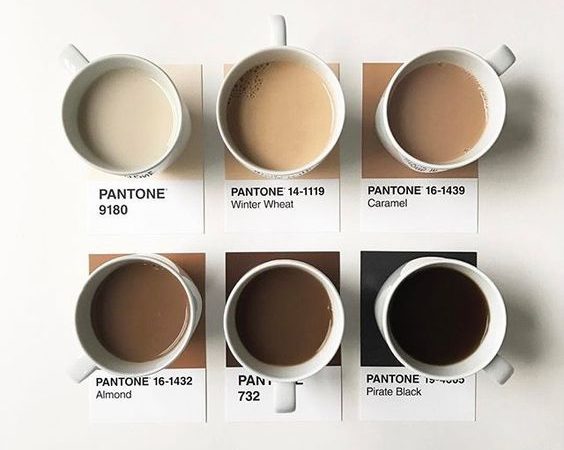
2. Muted Pastels
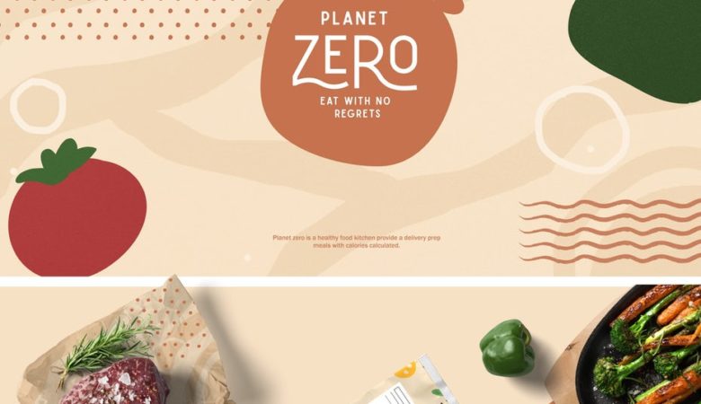
On the other end of the color trend spectrum lays the new wave of designs that feature a mix of soft, neutral tones and light pastels. This trend is all about creating an atmosphere that feels soft and friendly, and is often seen with the rise in cute, cartoony vector illustration, and hand-drawn, organic typefaces.
This example is a perfect intersection between the muted color palette and organic typography that are such a natural match. There’s an unusually large number of different colors being used, but because they’re all such soft tones the effect adds subtle differentiation between topics without becoming visually overwhelming.
3. Neons and Brights
Although neon has been a big trend in fashion and interior design for a while now, it’s still a fresh and interesting look for web design. It’s just one part of the 80s revival that’s being incorporated into all different kinds of design of late.
Neon colors look great when combined with each other, as sites like this clearly demonstrate. They can also be mixed in with other brights for a look that’s just as fun but that has less of a specific visual reference.
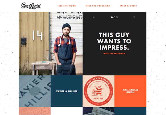
4. Color Blocking
Now for the trend that’s being combined with every other color trend. Color blocking also traces its roots back to fashion design, and it’s as versatile as it is functional. It’s not really about using any colors in particular; the point is to use crisp fields of color to define categories, sections, or single elements.
A part of the larger movement towards flat vector designs, color blocking is a strong look that can often stand in for illustrations or other graphic treatments, so it’s a great choice for minimalist designs.
Use Color Tools to Tweak the Trends
If you’re hesitant about jumping into some of these new trends, you’ll likely benefit from one of the tools below, which can help you formulate a consistent and workable color palette while still allowing you to play around and experiment with different hues.
Color Explorer offers up a comprehensive set of tools, such as color extraction, matching, and conversion, so it’s easy to create interesting palettes that are perfectly balanced and web safe to boot.
Use the Color Matching Tool to alter RGB ratios, hue, saturation, and lightness, choosing different combination algorithms like Analogue or Spit-Complementary colors to view a selection of harmonized variations. This tool is the perfect resource if you’re going for a look that uses a multitude of muted pastels.
It’s always a great look when the color palette of a site is carried through to the photography. Striking effects can be achieved by colorizing images, but for a less-stylized option, it’s important to be able to find imagery with the perfect colors for your project.
Use this tool as a shortcut to searching stock images by color and keyword, or use TinEye for the same functionality, but with images pulled from the creative commons. They’re both great resources for finding imagery that matches perfectly with a small selection of bright or neon colors.
One of the easiest ways to make any site look fresh and up-to-date is to make sure it’s on trend with its color scheme. So don’t hesitate to play around with new ideas; the color palettes of this year are based on solid principles that will look good and stand up to subtle modifications for as long as they’re in use.





Hi Luke. It’s nice to know that these color trends are coming back. I do like pastel colours, combined with plenty of white space, it does look really appealing. But then again it’s all about your personal taste as well as the target visitors. These theme would probably not work for Oxford University and similar sites. Or maybe it will if it’s cleverly designed.
Nice post Luke, really glad to know that this year we will going to see some colorful websites combine with some extra-ordinary design pattern.
The “blocking” can be a striking effect, and we’ve noticed a lot more of it since Windows 8’s “tiles” made an appearance. Who says designers only take inspiration from Apple? 😉
Nice and timely post. Really like seeing greyscale with a punch and color blocking really makes a statement.
Nice post Luke. Would love to see the colour blocking style coming through more this year.
I’ve been long looking for some color tools to use them for effective color schemes … thanks a lot for this compilation … color explorer and shutterstock are great examples of what a web app should be 🙂
Good info – we’ll be referring back to this throughout the year.
Love it, very nice color concept for upcoming website design. I will use it for my site, Thanks.
Great article Luke, bookmarked and emailed out to the team! Shutterstock Colour Spectrum is priceless, finding good images to match existing colour schemes is something I struggle with so this will save a lot of time.
@D.Grey – I agreee, and we seem to be seeing more of this style which can only be a good thing.