
Have you ever been working on a project, added some text, only to notice that you love the font, but something looks terribly, terribly off?
That’s what we call a kerning issue.
Today we’re going to go over some simple rules of kerning, tracking, and letter spacing in graphic design.
Let’s do this!
What is Kerning and Tracking?
Kerning is defined as the amount of space between two letters, or other characters, such as numbers, punctuation, etc.

Tracking refers to loosening or tightening a selected block of text, while kerning is the process of adding or subtracting space between specific pairs of characters.

Tracking and kerning are absolute essential parts of design, and can change the entire look of your design with literally the slide of a button.
Proper kerning and tracking can take your design from something boring, to something with incredible visual appeal.
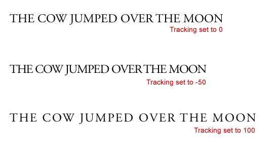
Tracking
Tracking, which is also commonly known as letter-spacing, controls the consistent space between letters that are across a block of text.
The spacing will be consistent throughout the entire block of text, and this method of spacing is most typically used in headings and logos.
If you want to increase the space between characters, then you need to adjust the value with positive number, and if you want to decrease the space, the use negative values instead.
Here are some before and after examples of tracking usage.

Kerning
Okay, so, to understanding kerning a little bit better, imagine this.
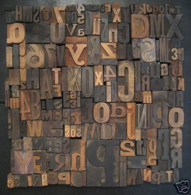
You remember those old wooden type boxes?
They looked a little something like this.
So while tracking refers to the consistent space between letters, kerning refers to the space between each individual letter.

You can imagine that each letter in any given typeface is like that old wooden type boxes. Each letter has a box surrounding it, making it impossible to move the letters closer together while you type.
Until you adjust the kerning.
When you adjust the kerning, it’s kind of like you manipulate that bo, and adjust it to your liking.
As you can see in this picture, manual kerning is definitely the way to go.

Letter Combos To Beware Of
The right amount of kerning and tracking will make or break your design.
You can have an ugly typeface and adjust the tracking levels, and suddenly, it’s incredibly aesthetic and visually pleasing to the eye.
A couple of things I do want to tell you about, so that you can learn from my mistakes and I can make things easier for you, are some weird letter combinations that just don’t look right.
I’m going to let you in on some letter combos that you can always be on the look out for so your design is always the most optimal.
•Slanted letters like: A, K, V, W, Y
• Letters with arms or cross strokes: F, L, T
• Letter combinations: W or V + A (any order); T or F + a lowercase vowel
These letter combinations don’t typically look good, from a kerning perspective.
So that’s where you as a designer come in and make the adjustments to your liking.
I just saved you a lot of time, so now you don’t have to look and wonder what looks wrong in your typeface design.
You can just automatically look at these combos and make some changes.
You’re welcome.
Wrapping up
Kerning and tracking are things that will always improve the more you experiment with them.
So, now that you know what kerning and tracking is, keep up the good work, keep trying out new things, and see what vibes with your style.
And of course,
Until next time,
Stay creative, y’all!


Leave a Reply