Working as a freelancer is a tough job with long hours at the desk. You’re always scrambling from one task to the next figuring out the best way to accomplish projects on time. But then other months you’ll find yourself dry on work and begging for a new project. This life cycle of freelancing is tough and mentally straining. But it also brings out strong personality traits through perseverance and real dedication.
One hugely important aspect of freelancing is your online portfolio. How you showcase all past work online is vital to landing any new gigs in the future. People want to see good examples of your work and what you’ve created in the past. In this article I’d like to share some design tips for creating a solid portfolio of design work. Not only will this help out your career, but it will certainly give you a boost in confidence knowing your work is expressed so eloquently online.
The Personal Touch
What makes a freelancer’s portfolio website connect to visitors is a sense of personalization. You want people to feel that your website layout is truly your own and that it reflects your own personality. This is a tough one to understand when you’re still new to web design. Not everybody knows their design style even after a couple years freelancing. Just keep trying and reiterating new ideas and your style will be found.
Danny Knaack is a web designer & developer from Germany who has really customized his portfolio. At the top of the page he’s placed some rating meters which evaluate his skill level in specific topics, such as HTML/CSS or Adobe Fireworks. As you scroll down a bit more you’ll find each individual portfolio entry is also marked with a glyph icon.
This icon is useful in explaining to potential clients which skills were used on each project piece. Not everybody will be as tech-savvy as yourself, and it may be useful to give small details about what type of work was required. This adds a personal touch since the readers can identify with your knowledgebase – whether that be WordPress or Photoshop or anything else.
Object-Based Project Showcases
Obviously one of the most important traits to any freelancer’s portfolio is their work efforts. Any projects you’ve created in the past will hold a heavy influence towards your day-to-day conversations. You want to setup a layout which is super easy on the eyes yet also draws attention from your visitors.
I think one great example of this setup is on Piotr Kwiatkowski’s portfolio of digital graphics & web design. Towards the top of the page you’ll notice a collage of his most recent projects. Clicking on one will scroll down the page and slide over to that particular portfolio entry.
But what makes his layout so unique is how each project has been split up into different criteria. Graphics Design, Web Design, and Freebies encapsulate the majority of his project works. This makes it a whole lot easier to go through a website and pick up on your most qualified skills. You certainly can’t hide behind the lesser works of your portfolio projects.
Although I have to admit, setting up a freebies section on your portfolio is the perfect solution for bringing in more attention. Web designers always love a free PSD files from exceptionally talented designers. If you can offer a gallery of freebies with downloads then your work will be much more credited, shared around, and ultimately appreciated. You’ll certainly gain more attention from project leaders looking to hire freelance designers for digital platforms.
Limit User Focus
Another technique when building your portfolio is to limit attention and focus onto a single area. You mostly want people checking out work which you’ve completed in the past. Also maybe some details about yourself and how they can get in touch with you.
The online portfolio of Christopher Ariñez displays a locked sidebar on the left side with some basic information and a contact e-mail. You can scroll down the page over all his previous projects. This layout is sporting one of the most accessible design patterns, also including a “Back to Top” button in the bottom-right corner.
I often recommend minimalist design patterns and for good reason. People want to find your portfolio and quickly skim through your work without too much hassle. This ultra-minimalist approach forces visitors to stay focused on portfolio content, not getting caught up in more detailed paragraphs and headlines about yourself sewn all over the page.
Super-Easy Contact Info
One final important piece to any freelance portfolio is the connection. You need to allow people some route for getting in touch with you. Freelancers who are in-between redesigning their webpage or need to wait on portfolio examples can get away with basic social icons. The lax portfolio of Matthew Martin is just one example of this technique in action.
But similarly you want to keep these contact details on your website even after adding content. It’s certainly possible to keep everything on a single page, or split up your design into multi-page settings. The portfolio of Pete Lacey is one such example where you can find his social networks and e-mail info from his “About” page.
On the contact page you’ll find a fully-designed contact form with a scale of Availability. This is definitely something unique which you don’t typically see. But this is a nice way of letting people know where you are currently with project work, and how open you are to new contacts.
Granted there are other ways you could setup a scale like this – even just static text somewhere on the page. But I really like the way pete has each “level” of the scale dimmed except for the current availability. Underneath you’ll find the typical e-mail contact form which should be a staple component of your portfolio.
I would argue it’s much easier to send somebody an e-mail if you don’t need to jump into Outlook or GMail. You aren’t worried about the title or sender information. With a contact form it’s all right there on the page and simple to fill out. It’s the simplest way to keep your visitors interested in hiring you without too much work as a prerequisite.
Showcase Gallery
Along with my tips I would love to show examples of these trends in real websites. Many freelance web designers & developers will go out of there way to customize a unique looking portfolio layout. I want to dedicate this gallery below to some of the best examples for heavily-customized portfolio layouts. Take this as an energetic jolt to your web design inspiration!












A good selection of works. Every designer have your design, this is important and important is to do understand to the people. Is our trademark. Colours, styles, typography all is important for explaine what we understand for good design. I like some examples in the showcase like Dannaway, oberhaeuse,danielmall. Thanks for sharing!
This is a great showcasing of work – inspiring. You did an excellent job showcasing how a freelancers personality and professional style can drive their website, and most likely help them find new clients. I think a thorough explanation of services is also important, and sometimes forgotten. It’s so easy to just say – I do everything! – when in truth some of the top paying clients want people who “specialize”. Thanks for the article!
I totally agree with you on the importance of an individual and personal touch. The collections is very cool too. I hope to be covered in such a collection myself on day 😉
Hey man, just saw that my site is part of the list. Really happy that you put me in there!
Thanks!
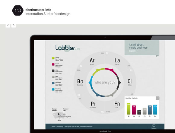
really nice collection of portfolios and a good article, too. The Martin Oberhaeuser portfolio is actually very similar to what I’m preparing for my new portfolio…
visit my site and give me your opinions
–> https://www.slimhamdi.co.cc
thanks
This is a great list of tips. Making your portfolio personal and showing you’re passionate about your work is important. Without it, potential employers may get turned off.
In my book that I wrote for young web designers (https://www.studentguidewebdesign.com/a-students-guide-to-web-design-portfolios-ebook/), I talk about a lot of the same principles to apply to your portfolio.
Thanks again, Cheers.
Great list ! visit my site : https://slimhamdi.me , maybe it deserve to be in this list 🙂
Thanks for linking me! ; )