
There can be many pitfalls on the way to getting traffic to that beautiful site you created. All the design and creativity in the world won’t bring visitors to your site. You have to know a few basic laws of optimizing a webpage for search before the traffic will begin to flow in your direction.
Below are a few tried and true reasons why your site may not be converting visitors to customers and what simple steps you can take to fix the problems you may be encountering.
1. The Keyword Search Doesn’t Match The Landing Page
This is the most overlooked and perhaps the most important element if you want your PPC campaigns to pay off. Beyond doing the research and having the perfect set of keywords and keyphrases you need to make sure the ads you create for the keywords are pointing to the right page in your site and not just your home page. If your website sells bicycles you are going to want to group your keywords based on the mindset of the potential customers. For instance, you would group “low-cost bicycle,” “bargain bikes,” “cheap bike” separately from “best quality bike, ” best bikes,” “pro bike;” Of course this is a very simple explanation, but you get the gist. Create pages that appeal to both mindsets and aim your ads accordingly. For instance I recently typed “low cost bike” into Google. These were some of my results:

Pay specific attention to the “Bicycles at Target” ad that I’m sure Target is paying big bucks for. This is the page it takes me to when I click through:
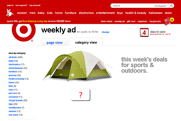
What am I supposed to do with a tent when I want to ride a bike? I can guarantee Target did not convert that searcher to a customer!
2. You Don’t Have A Clear Call To Action
A focused call to action page will have your potential customers performing what you want them to do on your site. Make the page clear, uncluttered with simple enough terminology that gets the benefit of completing the action across as well as where to go to complete said action. A good example of a straight forward call to action is Spotify.

Here you see the benefit – “free music” and what Spotify wants you to do “Download Spotify.”
Another great example of a site that uses multiple calls to action without being overwhelming is FreshBooks.

Here you have a clear benefit of this product- “Focus on your work, not your paperwork.”Multiple ways to complete a call to and none overbearing in anyway. First most important call to action is “Try it Free for 30 Days,” you can see they put it in two spots. Second they give you an option to “Call Toll Free” in a very visible location and the last call to action would be to “Take A Quick Tour” which is tucked away neatly towards the bottom. Beautiful design and getting the conversions.
3. You Have A Flash homepage with little to no content and nothing that guides them further into your site…
Here is an example of a beautiful homepage:

I have no idea what this company does or what they want me to do. The only content is a “contact us” link. Why would I contact them when I don’t even know who they are or what they do.
There are instances of flash sites that have content and draw you into the site further so I don’t want to say you can’t use flash at all. Just make sure I know who you are and what you do on your homepage and there is a clear call to action. For example this artists site obviously wants me to “like” his Facebook page and I know what I get for doing so!

4. They Don’t Feel Like They Know You

Here are some questions to ask yourself before you publish that beautiful site. Do your visitors see a personality behind your website or are you falling into the “strictly business” category? Have you added that personal touch that gives dimension to your website? Can people feel comfortable handing their money over to you? Can they hold someone accountable if they buy a product or service from you?
Create a great “About Us” page with a short but effective bio of your company and maybe a sentence or two about how you got started or who founded the company. Here would also be a great place to talk about your customer service reputation or add some testimonials. People will be more likely to buy from you if others vouch for you and have had a good experience with your business.
Adding social networking buttons will boost your “likeability” and accountability as it adds an extra way for people to be in touch with you if they have a problem with your product or service. To that end, adding a blog will also help people feel more comfortable with you as well.
I hope these ideas have helped you get started with your website design and search marketing efforts. I have used these tried and true tactics on all my clients sites with outstanding results. I hope you great success in creating a beautiful website that converts!


I especially like the ping on the need for a decent About-Us page. Prospective clients rarely appreciate it’s importance. No doubt I’ll be paraphrasing your points to help drive it home.
And I’ll likely bring back my blog.
Nicely done, Kimberly. Thanks. You’re always a fine read.
Great article. I think big and concise messages as well as big, clear calls to action are the biggest factor that contribute to conversion. A good design/layout goes without saying.
Great and informative – thanks for your efforts 🙂
Hmm, I think it is easy to convert potential customers if you are presenting something they want. For example, Spotify is offering an incredibly compelling product. That page could say just anything, and people would click around until they understood to gain access to the music. Show me an example of a website with no core product and I challenge you to design an interface that keeps people around. Long story short, people by and large don’t care about the layout or colors nearly as much as what is being offered through the site.
Great insight and its helpful. Thanks for putting in such a good effort.
“About” pages are a must no matter the niche or the website. When I run into a clever blog or website I like, I will always check the about page and its a big turnoff for me if I don’t find it.
Good article! The one thing which is more and more intresting is a headline: “A focused call to action page will have your potential customers performing what you want them to do on your site”. It is easy when you sell or presenting one product – then landing page could be a one topic page. The problem comes out when you must optimise CRO on multiproducts e-commerce project sites.
Great post…really interesting points. They are the same things I tell all my clients when build a sito for them. Is Important have a good home when you explain your business from the start. Thanks for sharing.
Awesome post, it seems somewhat obvious but this is really great landing page advice. I think a lot of it gets overlooked far too often.
Excellent article. At the end of the day it is far more important for a website to convert than to actually “look great”. While a great looking website is critical for first impressions, if everything else is ignored (efficiently laid out site, high quality and clearly written content, call to action, etc.), then no matter how nice the site looks, it’ll rarely convert.
Bottom line is the viewer needs to have a good experience at your site. Accurate landing page, call to action (when requiring the viewer to do something), easy and intuitive site navigation and deeper acquaintance with the business managers or site author all contribute to a positive experience that will make the viewer want to come back again. Extensive knowledge of your target audience is vital for determining what site content will provide a good experience for them.
These 4 points with examples are a great, hope someone from Target is reading: )thanks Kimberly!
The 4th point is extremely good! Everybody wants to get quick results and I can hardly think that somebody will be pleasantly exited with non-informative but beautiful home page.
Great Article. Thanks for sharing!!
Informative blog. Specially for Designers its a wonderful tips.
Because if the website are visually attractive and user friendly they will also consequently fail to generate a good volume of traffic if they don’t have a quality of content.
While there is some truth to some of this post it is only applicable to beautiful websites that have been designed without the audience in mind. It is perfectly possible to have a beautiful website that has clear calls to action, isn’t built in flash and fits the websites optimisation, in fact these four elements are the basic building block of good web design.