Designing a website user interface can be a struggle match. If you’re building a small portfolio or simple blog layout there isn’t as much to worry about. However an entire magazine requires featured stories and sidebar widgets and author profiles. There is a lot to consider!
In this article I want to go over some examples of brilliant UI design focused around online magazines. I want to discuss some current trends in the field of web design. Also how you can capitalize on these ideas and build your own stunning web magazine layouts.
Big Things Gain Attention
This rule seems predominantly true for many of the popular magazine layouts. Bigger text, headline titles, links, vectors, and images will all attract more users onto your page. It makes visitors more willing to click on headlines and scroll through the text.
When your paragraphs are big enough to read at a good distance away from the monitor, then scrolling through and reading some text doesn’t feel strenuous. Your readers are more like to scan articles – but this is the case regardless of text sizes. We can use Lifehacker as a simple example.
The most recent publication has a large featured image taking up most of the top screen. As you scroll down you can find other recent posts with much smaller thumbnails. Yet each image is still large enough that you can determine what the content is about. This is the perfect tool for reeling in new unsuspecting visitors.
I’m also a fan of their fixed sidebar design. I setup a similar theme on Design Tickle and have seen fantastic results. People are more inclined to interact with the sidebar region if it’s always readily available. But notice the content on Lifehacker is actually longer than the page, so they use a jQuery script generating a custom scrollbar.
Offer Related User Content
Magazines tend to bring up the idea of articles and written content. This stems from the lack of any alternative media in print work. For decades all magazines have been limited to printing articles and editorials – but the Internet has changed that.
You can now find online magazines with a lot more functionality. This can include photo galleries or hosted web videos. Plus you’ll see a lot of big names offering users to register an account and write their own blog entries. A great example can be found on the gaming magazine 1UP.
I really like how they use an Ajax-powered tab interface switching between the different feeds. 1UP has reviews and breaking news written by the full editorial staff. But offering any user to sign up and report with their own blog posts is truly a brilliant strategy. You can build more content with writers you don’t have to pay and even help them market the ideas.
Simplicity at its Finest
I can understand the argument for beefing up your layout full of extra widgets and gadgets. You can list the most recent comments, take polls from your visitors, gather newsletter signups, and so much more. But consider how confusing this may appear to your readers.
The Alpha Geek is a fantastic example of simplicity applied to the web. Their layout still includes some great featured images, and each story box also has information about comments and the publication date. The small icons in the top right corner delineate the post category, and you can browse through archives by clicking the link.
Developing a Footer
This piece of the web interface design isn’t always a required asset. Some magazines really do better with a small footer citing company information and copyrights. But if you like the big oversized effects then why not build out your footer too?
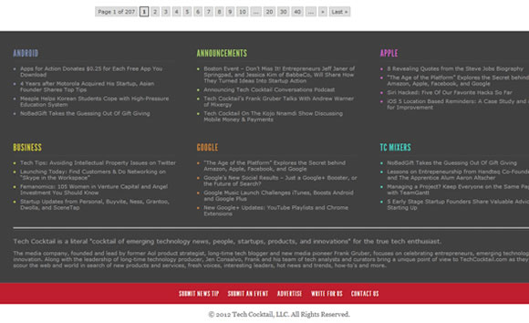
Tech Cocktail uses 6 different category feeds in the footer section. The site pulls out the 4 most recent posts from each category and lists them one after the other. Some visitors may feel overwhelmed, but I enjoy the flexibility and insinuation of freedom. Such a footer widget will create more inbound links to your site and you never know who will be interested in Android or Apple news.
Your footer could also contain links of a different sort. Maybe you can pull the most commented stories in the past month, or even the most recent comments. Having a bit of legal and company information is always handy. Visitors like to get in touch and share their opinions. But this may not be the predominant focus in your footer area as it feels too professional and can sometimes appear off-putting.
Brazen Branding
The most successful online magazines are the ones who can brand themselves properly. You want visitors to land on your page and remember something rational. Maybe the site name, the domain, the logo, favicon, just something! This keeps visitors interested and even googling your website to check it out again.
I’m sure most of us are familiar with Wired Magazine. Their branding has been similar for years and readers instantly recognize the logo and top navigation interface. The site has reviews, blogs, videos, and tons of other great online media. Consider branding as the first most important step, and you can easily branch out into the layout design from this starting point.
Showcase Gallery
Along with the suggested interface techniques I also want to offer a brilliant design gallery. This includes a collection of web magazine layouts both new and old. You can learn a lot by studying some popular names and how they design their webzines.






Thanks for the inspiration!
I love the post thank you so much for sharing it with us. I will be sure to use some of the inspiration on my own blog. Although I can see your agrguement with the alpha geek site. I think that it depends on the type of blog that you are running. For example if you are not a blogger that writes a huge amount of posts this can be a very good visual to entice people to read on. However if you are running a blog like the wdl it would be detrimental to have the layout like that because most readers want the top posts all the time.
Thanks! Great reading. I am building my own blog/portfolio-site. Blogging about web dev. Your recommendations are priceless! Big up!
This designs will help a lot for the designers and they look simply great.This will be really very helpful.