You can find dozens of popular video streaming services on the Internet today. It’s obvious that YouTube was the company who started this whole video craze. But it’s worth noting how other various startups have taken streaming video and adapted their presentation technique.
In this article I’d like to look into some UI components for designing streaming video websites. Often flash players and mobile web video is super important. And with social networking features these websites are growing more popular every day. It’s actually exciting to look into online video streams and how you could design a similar layout for one of your own projects.
Creating a Friendly Experience
User interfaces are all about the tools your users need to interact with for operating any part of your website. Streaming video is often a lot more complicated because you need to offer so many resources. These could include resolution sizes, quality display, volume levels, or tracking with the play scrubber.
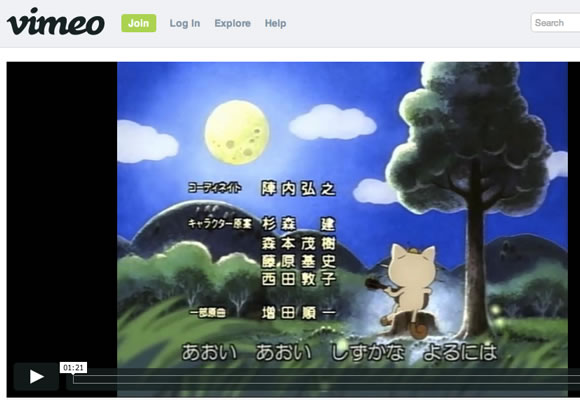
Vimeo is possibly the best example of professional modern video streaming. All of the most advanced video editors I have found online will upload their content to Vimeo because everything is so adaptable. It’s easy to embed and work with quality control, not to mention their support for Flash and HTML5 video players is unmatched.
The single video pages actually feature very large resolution sizes and take up much of the screen real estate. If you have an account you can change these settings on your preferences page, which is also similar to YouTube and Dailymotion.
But take a look at vimeo’s default buttons you’ll also notice they are much larger and easier to work with compared to similar Flash players. Both versions including HTML5 are sporting the same design, which includes sharing buttons for social networks like Twitter and Facebook.
Sidebar Buttons
When I think of any video player interface there is always some type of toolbar arranged towards the bottom. This is used for so many important features like the play/pause button and tracking bar. But I love to see additional buttons located along the side of the player box.
220.ro is a Romanian video streaming website very similar to YouTube. Their side buttons are setup by default with “Favorite” and “Embed”. What is particularly interesting is when you hover over the favorite menu another flyout appears with further options to choose from.
If you have an account you can save specific video URLs into any piece of your profile. You’ll have the options of saving to your favorites list, a video playlist, or sharing onto a group homepage. It’s a really cool networking idea where users can quickly share videos with each other among different areas on the website.
Easy on the Eyes
I remember a few years back YouTube tested out a feature where you can dim all the background components around a video player. This worked out really well, although I haven’t seen anything similar ever since then.
That is until I saw the new Dailymotion layout which does include this feature! It can appear like something small, but these seemingly insignificant changes directly affect the website performance and user experience.
The video player itself has many similar features as Vimeo. You can switch between HD-quality or share the link out to your favorite social networks. I would love to see a dimming feature added onto the video player itself, maybe as a small button or icon with the embed code. But of course these ideas would require some work-arounds from future web developers.
Setup a Unique Branding
If you have the ability to create a video player it’s worthwhile to include some custom branding. Consider something like a small logo or link to your website somewhere in the toolbar. This gives a quick way to access the video URL even when it’s embedded into an external website.
Metacafe does an excellent job with their video branding. Whenever you first launch a video there are often ads which display across the screen at first. Then you’ll notice a small Metacafe icon in the lower right-hand corner of the screen. This is a typical watermark approach, which can work in some instances.
A tiny logo icon in the bottom corner of your video toolbar is an alternate solution which can be less obtrusive. Some videos will already have a small watermark in the corner, so adding your own can get confusing and obnoxious. But consider linking back to the original video page instead of your website’s homepage. Then your viewers will have a more pleasant experience, and the embed code will serve a much wider audience.
Final Thoughts
I have always been a video lover ever since I was a kid. Now that the Internet is so prevalent all around the world, more people have access to more information than ever before. Offering a video streaming service takes a lot of patience. But it also offers incredible benefits to a dedicated userbase.
I hope this article can get you thinking about how user experience design integrates within websites. The best developers learn how to adapt for a growing audience and create products which are heavily supported. These ideas are still just as true with videos on the web – and hopefully in a few years we can put some official standards in place. If you have similar ideas or questions on streaming video UI/UX feel free to share with us in the post discussion area below.


Except that Vimeo is the worst video service on the planet. I have rarely been able to view an embedded Vimeo video. After YEARS of this, I no longer even bother. Again, Vimeo is the worst. Seconded ONLY by Metacafe. Fortunately, YouTUbe, after years of work, now works everywhere. Now that they have enabled me to bypass the useless flash interface.
I would argue many of the video designs from Vimeo are perfect for modern-day browsers. Especially if you are working with HTML5 video. I can’t think of a single vendor who wouldn’t support Vimeo embeds.
I agree with Bobby that Vimeo is the worst video service on the planet. Youtube is providing a great service in this internet marketing world. You can get more traffic and leads through this service.