
It’s that time of year again, where we look into our crystal ball to see what will be the hot trends in web design for the upcoming year. It’s no secret that trends come and go, with some hanging around longer than they should. (Yes, splash page, I’m talking about you.) But trends are a necessity in the development and growth of our craft. Trends are born, improved upon, and often spawn other trends. So as a web designer, when you apply trends to your projects, challenge yourself to expand upon them and make them your own.
As you read this article, keep in mind that the shift in trends from one year to the next may be subtle, and you will probably recognize some of these trends already. But it’s our estimation that the concepts we mention below will grow and become even bigger in 2012.
1. Responsive Web Design
I believe eventually, we’ll all stop talking about responsive web design – not because it will go away, but because it will become what’s expected. However, I don’t think this will happen in 2012. It’s still too new of a concept, and there are many web designers that are not familiar with it at all.

The continued introduction and adoption of more an more mobile devices is what will make 2012 the year of the responsive web site. Web designers and developers will move to the use of fluid layouts instead fixed width, and media queries will find their way into many more stylesheets – allowing more sites to easily be viewed across multiple screens sizes and devices.
2. Fixed-Position Navigation
We have all run into this technique at some point, mostly on personal websites or individual blogs. I have seen a large drop in this trend during 2010-2011, but a resurgence has been appearing over the last few months.
If your website doesn’t have a lot of main navigation then you only need to provide a few small links. So why not keep these visible to each user at all times? This can dramatically improve website performance and even blend into the overall page layout with ease. The concept idea is to keep the navbar and internal links/logo locked in place as your visitors scroll through the content.
jQuery has allowed for very rapid prototyping of this effect. And even without JavaScript enabled you can apply some fancy CSS code to replicate the sticky nav effect. Most of the static navigation bars in 2011 have followed the user’s movement around from page to page. Yet in the example below Simon Wuyts has taken fixed navigation into a new level.

You never consider keeping your webpage content set into a slideshow-like panel for easy display. Not only does this remove the worry of screen resolution, but the navigation system is easy to work with and carries over nicely into mobile browsers. You may seriously consider this technique and all the major benefits during a 2012 site layout re-design.
3. Circles
This trend has actually been noticeable in web design for a bit, yet it recently had died down to lay low for a couple years. During the web 2.0 boom designers were focusing more on desktop-based trends such as drop shadows and rounded corners. But with CSS3 it’s now easier than ever to create these fancy box effects.
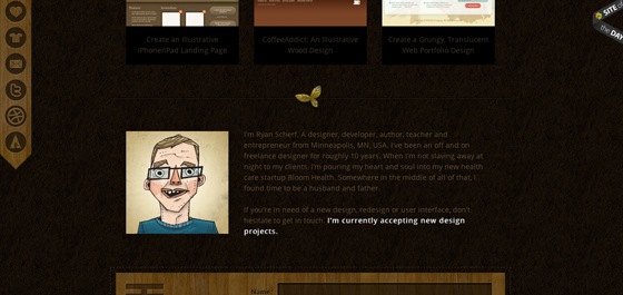
Additionally you can design circles and shapes without the need for any images. The impact of these features has caused designers to look at photos in another light entirely. I constantly check out portfolios for web designers and have noticed a dramatic increase in circular-shaped elements. These archetypes can be setup as navigation links, footer icons, or even displaying important portfolio works as seen below.

But the most extreme examples aren’t always the best. Circular shapes are smooth and encourage eye contact from your visitors. Use these to single out specific areas in your design such as listings to helpful resources and pages. Just the shape itself is pleasing enough to be dropped into the background and still hold a delightful effect.

4. Big Vector Art
The goofy oversized mascots you can spot throughout websites have begun to claim a brand of their own. Just a few years ago you could not find very much illustration work tied into web branding. But the quality of individual designer’s talent has improved greatly. And I can think of no better marketing brand than a lovable vector-based creature.

The many faces attributed to Mozilla and Firefox are just the tip of the iceberg. MailChimp is another great example which has set the bar higher than ever before. The infamous mailman monkey is featured all throughout the website and also throughout their iOS and Android apps.

Additionally the small businessman found throughout Freelance Switch really sticks in my mind. There are a slew of unique vector dudes to be found in their layout. This kind of practice has adapted into a whole new realm of website aesthetics. And if the year 2011 has shown anything it’s that 2012 will be chock-full of these adorable vector logos!
5. Multi-Column Menus
Contrary to our previous example, there are times when a website consists of way too many links to handle. Reasonably the standard type of navigation gets too messy and congested unless you move links into the sidebar. But user experience testing has shown very good results in keeping core links towards the top of pages.

This new year of trends offers designers a new chance at rebuilding. Ideas are often so black and white, but there is a whole realm of creativity waiting to be tapped into. Multi-column layouts are elegantly brilliant in their own regard. You can easily display numerous links to your visitors and keep this section fitted squarely around your logo.

The best way to get comfortable with this style is practice. Check out some recent articles on the topic to educate yourself about trends in web navigation. Designers are eagerly jumping into the testing arena with new ideas every year. Clearly the reform of standard navigation is a big one on everybody’s plate.
6. jQuery/CSS3/HTML5 Animation
I have always recommended jQuery effects when applied in small portions. Web design must encompass the whole user experience as well as fancy aesthetics and bonus animations. Luckily advances in the jQuery library as well as CSS3 specifications allow for some really outstanding effects with much fewer lines of code than ever before.
In just this past year alone I have run into some educational tutorials to be found all over the web. jQuery is the master of frontend browser effects but unfortunately doesn’t boast 100% major support. Thus using a fallback method tied into CSS means your website is compatible with mostly all visitors and still provides an exceptional experience. I can only imagine what developers are planning for new ideas to roll out as we move closer into 2012.
7. Ribbons & Banner Graphics
This is one design element which I had begun noticing a lot more in 2011. Designers began to write simplified tutorials for creating page ribbons, banners, bookmarks, or other types of display badges. Because of the massive emergence of free information more designers have begun jumping into the trends, too.

You would be surprised how many websites have included this style of design in just 6 short months. Beta testers often use these ribbons to classify the current release version of software and mobile apps. Additionally you’ll find banners wrapped around free downloads or featured articles in blogs. I’ve collected a few of my favorite ribbon PSD downloads below, so check them out and be sure to keep your eyes peeled for additional freebies in the coming months.
- Corner Ribbon
- Dark Slider with Featured Ribbon
- Colorful Ribbons
- Green Corner Ribbon Templates
- Simple Product Box
8. Custom Font Faces
The free online font library Typekit provides a free trial for any interested web designers. With this tool you embed a bit of JavaScript which allows you to write any custom font into CSS styles. In 2011 this trend has shot up in popularity, especially among WordPress designers trying to keep their blogs unique from the rest.
Typekit was however a buggy system with very little support up until a few years ago. Now Google Web Fonts has been giving them a run for their money, and it appears to be more popular than ever! You simply go through a library of supported fonts and Google will output the code you need to include. Then you simply reference each font by name when declaring CSS font-family properties on an HTML element.

What I find so exciting about this trend is how recently it has shot into the mainstream. It seems now even developers are creating free plugins to make custom fonts just that much easier to install. There is no uploading of fonts required, no stress involved and very little to go wrong. Bloggers should take notice of this and check out some of the alternative fonts available to them.
9. Infographics
This trend certainly doesn’t affect the overall web design, but as for user experience and content presentation infographics have blown the roof off new-age media. Never before has information been presented in such an easy-to-consume manner. Even if you barely understand the topic most infographics provide data, charts, and supporting imagery so that a 5 year old child could follow along.

Depending on the type of website you may find this trend not all too useful. It can take a lot of practice and time spent slaving away in Photoshop to perfect these works of art. Yet if you have the talent or drive to teach yourself I say go for it! Now more than ever before the Internet has become a place we can all gather and share information. Infographics have expedited this process using the World Wide Web as a presentation medium.
10. Focus on Simplicity
Ultimately the goal of any website is to get your visitors from point A to B as quickly as possible. Simple, intuitive interfaces are the way of our future. In just the past 5 years I have noticed most of the popular design trends stemming from minimalism. This idea is not ill-founded, as the lesser number of page elements to distract visitors will naturally keep them focused on their goal(s).
We can provide so many examples of this, and there are so many areas to cover. Earlier this May we covered a fine gallery of minimalist websites which pose as examples to perfection. Depending on the type of website you have there may be too many required interface pieces to coordinate a simplistic overtone.

But to rearrange a layout into a clean setup doesn’t require minimalism at the heart of it all. Spend some time writing and drafting out ideas for your navigation, page hierarchy, headings, content area etc. I find that a little bit of pre-planning can go a long way towards simplifying everything.
Conclusion
These design trends are just some of the few to keep up with as we move forwards into 2012. The year is unpredictable and nobody can say for sure what to expect. I think the facts are obvious that your average web designer has been learning much quicker in recent years than ever before in history. As such we could only expect plenty of innovation and new semantics ushering us into a golden age of technology and massive Internet awareness.
no doubt about it and i’m agree with some of these above designs as i’ve my own experience of web designing. thanks for sharing
Yeah fantastic..I love this post! In the future use vector images and circles, great!
I am totally agree with you. Technically I would add, that preprocessors like less, sass, haml, coffeescript and all the others are on the way to change our work.
I agree with these trends, especially Responsive layouts (more and more visitors are using mobile devices, and I think the increase will continue) and jQuery etc effects (just ‘cos they’re engaging and can look fab!). Vectors will be nice to see too, but the increase in fonts is a little bit of a worry. Fonts used properly by a good designer are wonderful, but bad typography is terrible!
Nice summary. But to be honest: What you mention in point 2 from Simon Wuyts is very nice, but wasn’t this all here already back in 2001 or 2002 with Flash? As a lot of the “new” trends?
Joachim
Perhaps the point is that many effects, which at one time could only be achieved in Flash, can now be achieved using CSS and JavaScript. For me the trend is a move away from Flash (and other proprietary tools) towards standards.
Responsive is hot right now indeed, though a bit over-hyped. Most websites still have <1% of mobile traffic, and their type content isn't even interesting or appropriate to mobile screens (for example a photography blog), but yes, it is something to consider during development.
Kind of agree with you, especially when there is an APP for almost everything! Haha.
Don’t forget fontsquirrel, who implement custom fonts the correct way.
This is a great point and I totally forgot about them!
Very good reminder!
…and Cufón too.
I will try to add some HTML5 animation on my blog to make it a little more interactive! thanks for the tips 🙂
I agree @Wolfhampton. Bad uses of fonts can hurt the overall design. Choose your fonts wisely.
Hi Jake,
First of all, good observations with the Circles and Vector Art. Now that you mention it, we keep seeing them everywhere.
Also, I think you’ll be finding more web designers integrating marketing with their websites. People are no longer just looking for good-looking websites that are easy to use. They want websites that drive sales/leads. This is good news for those of us who offer quality web design and marketing services.
Cheers!
Nice trends,
I think you’ve missed a big one here – I find that being ‘Optomised for Tablet’ is a HUGE factor and will continue to be so thru 2012. I’ve tried to do with with both my websites (iphaze.com and craigphilips.com) which both looks superb on both Tablets and the ‘old’ desktop web.
But you have a fantastic list above too. Thanks for your ideas!
I am agree with you .if you focus on design then you should have to concentrate on search engine marketing then it is beneficial for you because every one wants more return than invest ment.
I really loved this years trends! Thanks for the list.
The problem with “trend” lists like these is that too many designers will just copy these with little or no regard to wether or not the design in any of these trends actually supports or reinforces the message behind the content of the site.
Another good point 🙂 As long as these “trends” are used as inspiration to spur on creativity, they’re useful.
they’re = they are
simplicity is still the best art ever…
One of my favorite things lately is everyone using CSS3 for buttons on websites (instead of images). Now that most browsers can support the gradients, rounded corners, box and text shadows buttons look a lot better on many websites. I feel like when they are created in Photoshop a lot of designers go too far with the effects on buttons, but the CSS3 buttons for the most part have a lot more subtle effects.
Nice article..
Simplicity is an art and harder to do than expected! It’s scary to think some will take all the trends and putting them together to design a site – YIKES! Thanks for the insight.
As you already said web designers must learn quicker than ever before and they have to find more and more solution as there is so many ways to combine technologies together and make better solutions.
I’m sorry, is this a prank post?
It seems like something that might have been posted 10 yeas ago.
Totally agree with Wolverhampton about responsive design.
Other trend i might add, is to totally ignore flash presence/contribution to the internet.
no certainly not, but why do you feel the article is a prank? It’s gotten a lot of positive reception from the design community!
I agree, it looks like it comes out of a 15 years old wannabe designer or some “photoshop” designer guy.
For simple portfolio website 1 page website also getting popular now
Interesting list, but I have to wonder why https://jakerocheleau.com/ doesn’t exist and why much of the tweets on https://twitter.com/jakerocheleau are retweets of conspiracy theory message boards. Does Jake Rocheleau exist? Or was this post created by bots?
I am a real person and I am a conspiracy theorist. I’m also a web designer, private researcher, and slowly getting into iOS/mobile app design.
My personal website is down for other reasons… I’m in the middle of changing web hosts and don’t have a fresh layout to put up. If you google my name you will find I have written countless other posts on WDL for over a year now.
Agree with Craig and Wolverhampton Not quite sure why this post is mostly about what I would consider “decoration” (ribbons are already out of date imo) surely it should be more about Responsive design, Web GL etc?
I’ve listed 10 of my predictions here: https://www.phoenixstudios.co.uk/blog/2011/12/19/ten-web-trends-for-2012/
see,this is what I m talking about. Ribbons are over-used, the same with folded corners. Also the new thing that is starting to get over-used is those corner shadows at the bottom of a picture. I like your list a lot, especially the WebGL mention. It’s about originality not what everybody’s doing. When trends like these end up in a post like this, it’s already too late!
Nice article. You have hit on some very trendy things indeed. One thing that is interesting, however, is the disconnect between some trends and SEO best practices.(I mean this in general, not accusing you of having a disconnect) For example the slide show trend where the nav and page size is fixed. This may work for smaller web sites, but I have to imagine for larger web sites this would end up hurting your SEO and user experience because of slow loads times of content and overload of content. The individual page messages may get bloated. Anyway, thanks for the article, look forward to reading more.
Just like the fashions in clothing change with the seasons their are many Web Design Trends, nice post thanks for sharing….
Nice post! Thanks 🙂
I think you have captured the trend in 2011 very well and I think they will all apply to 2012. However, I think responsive design will become a requirement in 2012. Thanks for sharing and it helped me gained insights on these trends.
I think this was an interesting article no doubt about it. I am completely agreed with some of these above designs. Thanks for sharing it.
Totally agree – Responsive Web Design will be a BIG trend in 2012. Few of our clients have already spotted this as a must.
Good to know. I found the “circles” point particularly interesting as that was shot down a decade ago by a former large OEM client I worked with – good to know that “ideas” do come full circle.
With the slew of websites that I’ll be developing, I’ll definitely be referring back to this list for design inspiration. Oh how times have changed, design-wise, even from just 4 years ago.
The level of chatter surrounding responsive design is going to significantly increase. There seems to be a growing misconception that responsive design is focused on funneling the same content and interface of a desktop site into a mobile version. This may work in some circumstances, but to truly master the details of responsive design requires the understanding and the acceptance that there are significant differences between mobile users and desktop users with regard to why and how they utilize a website.
wow… this is cool.. I think I have to update my skills I mean study new technologies like HTML5/CSS3 and responsive web design.. thank you much for this post.. 🙂
thanks for writing this article 🙂
Here’s a simple animation (#6) example we created for http://www.sydneychinesenewyear.com
It expands with the width of your browser.
Very practical post…CSS 3 has opened a brand new world and a level of interactivity like never before.. this is just the beginning.
Great article. I think thats really true, because the last time i saw many websites using these points. And i will use this tipps in my projects too.
Hey thanks for sharing. All good thing to take in mind for 2012. Good points on infographics. Have a great year.
~William Imhoff
I am quite agree with you. Design of a website should be Clean, Animated and colorful although we must concentrate on SIMPLICITY.
Thanks for sharing. Really helpful, I’m gonna take into acount these trends for my future projects.
I really noted this post. I’ve been a fan of fluid design for many years, but have found it really difficult to convince pixel perfect graphic designers and clients of the benefits. The new responsive designs address many of the real negatives go fluid designs. I have started work on converting my own site to work better on small screens.
One negative about your post, is that ad for Wix really earning you enough to pay for the bad taste it leaves in your readers mouths? How many of your readers would not know what it is and bother to click it?
Otherwise a great post!
/peter
Great list! I’ve seen circles a lot lately.
Interesting, I never heard of “responsive web design”, but then understood what you meant by reading the rest of your article.
It is true that 2012 is a year with a lot of changes, the web 2.0 websites are now becoming very powerful. People are now linking the FaceBook API to their website login, registrations and others. You are right about the big vectors, yes more site now use simple layouts but high tech vector icons that really make a difference to the full design.
Great list of responsive designs, in my opinion responsive design beats the heck out of having a separate mobile site.
Great News about Web Design Trends!!
I like all of these trends, with the exception of “Big Vector Art”. It seems to me that this is being used far too much. If I’m going to buy something online, I don’t want to buy it from a cartoon character, most of the time (breakfast cereal is the exception). It just strikes me that it could be used in a much more “adult” fashion.
Is Parallax ‘https://webdesignledger.com/inspiration/18-beautiful-examples-of-parallax-scrolling-in-web-design’ effect passe already?
Great article. just to add sth. The 10th point in my opinion is not a trend. It’s how web design must be. Simple and elegant.
It was interesting to read an article that was posted a little more than a year ago and in my opinion really see not much of a change in web design trends yet. Thanks
I noticed now fixed layered navigation trend is also getting very common on websites.I think it’s a better approach and user friendly too.
I first time hear about the page ribbons but banners are getting common more in these days.Merchants wants to update the banners on every event.