
Stationery is a highly effective marketing tool that can really set off a creative explosion for any business. Stationery branding combines many elements related to a company or a product. You display these items in a creative way to draw in someone’s attention. There are many ways you can situate the designs to really bring a creative flow. There are 5 basic elements to a sucessful stationery brand: logo, catchphrase, year of establishment, contact numbers, and certifications. Here are 10 of our favorite basic stationery brandings that are simply amazing.
This is a very basic design that draws your attention by using contrasting colors. The red really stands out against the blue.

Here you have a great example of logo branding. The image is simple, but the name is front and center, assuring that everyone’s eyes draw straight to it.

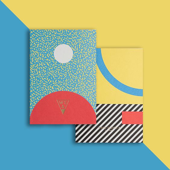
This is a good example of catchphrase branding. You have multiple colors and different shapes. It’s not over the top, but it offers a lot to look at.

Stationery is a great way to use your product as your branding. Get people familiar with everything your brand has to offer.
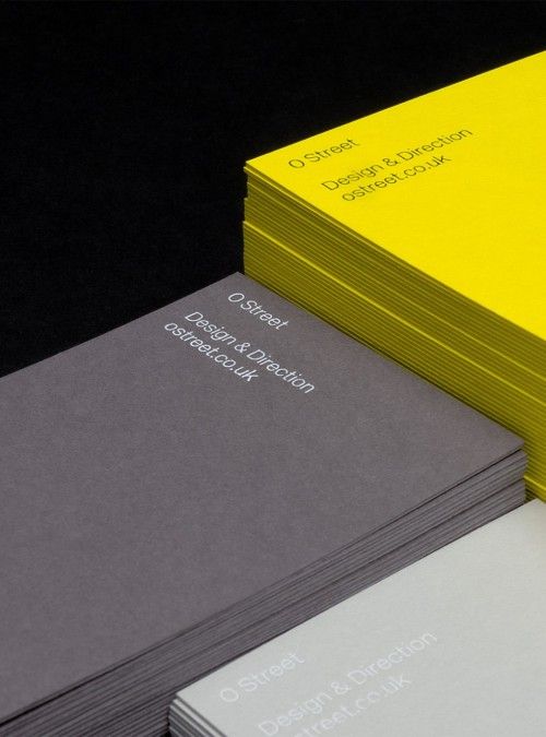
This one is simple and very effective. It shows off the name and the contact information. This is a great tactic for design firms that have a lot to offer, and may not can capture it in one shot.

This is a great template or anyone that hasn’t honed in on their creative bug yet. You can see that the scenery is very detailed, but dark. In the middle of it all is a plain white sheet of paper that you can display a name, logo, or anything you want on.

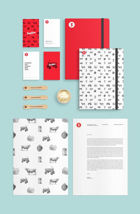
Product placement at its finest. This one sort of combined all elements into one image. You have products, names, colors, designs, and different shapes. This is pretty much the perfect example of stationery branding.
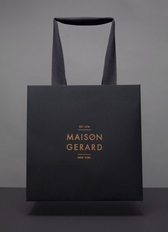
This may just look like a bag, but if you look closely you’ll see the brand name and its established date. A great way to get your name out there.
Everyone loves a little splash of color once in a while, but what about designs? Combining these two ideas can really set your branding apart from everyone else. Get creative and colorful!

There’s a lot going on in this image. You have the name, logo, and a few different details. What really sets this apart is the fact that it looks like a workspace. It’s authentic and really gives a warm feel.
What’s your favorite stationery branding design? Got any tips for setting your branding apart? Let us know in the comment section below!


Leave a Reply