
Needless to say, the website has become the face of any company nowadays, regardless of its size or area of activity. Since the Internet is the go-to choice for most people, every business struggles to achieve an impeccable image online. Moreover, they tend to adopt the latest trends in communication to a certain extent. But have you ever wondered how the world’s richest companies deal with their online presence and representation? Your question is absolutely valid. Last weeks, Fortune released the list of top 500 largest companies in the world. It would be interesting to analyze their websites. Surely, there are better and worse websites out there. But to our surprise, some of these companies could have done significantly better, considering their wealth and status. Therefore, in this article, we have explored the aforementioned list and selected 10 companies that should invest in redesigning their web pages.
Our list consists of two gasoline traders (Sinopec, Marathon Petroleum Corporation), one Healthcare company (United Health), one financial company (Berkshire Hathaway), a commercial vehicle distribution business (Penske Automotive), an electricity provider (State Grid), two retailers (Kroger, Best Buy), a postal service (Japan Post Holdings), and a wireless operator (Verizon).
Frankly speaking, it was somewhat frustrating to see poorly-designed websites pertaining to some of the most thriving businesses in the world. How can we expect high-quality designs from smaller ones, when companies such as these fail to impress their audience? Is it because these companies are powerful and wealthy that they do not pay attention to their websites?
State Grid

This is one of the most outdated websites we have seen lately. When landing on the State Grid’s web page, you feel as if you have traveled 10-15 years back in time. It looks as if it was designed in the 2000s, with zero updates ever since. There are various gaffes here. The two most blatant mistakes were the use of Flash and that of automatic carousels on the home page. Along with these two outdated trends, the company logo is poorly rendered, the text is hardly legible, and the article-preview block has text lines that are not trimmed properly. It’s understandable that a government-owned company would not focus on providing a great user experience. Nevertheless, taking into consideration the scale of State Grid, we believe they could have done a better job with their website.
Sinopec Corp
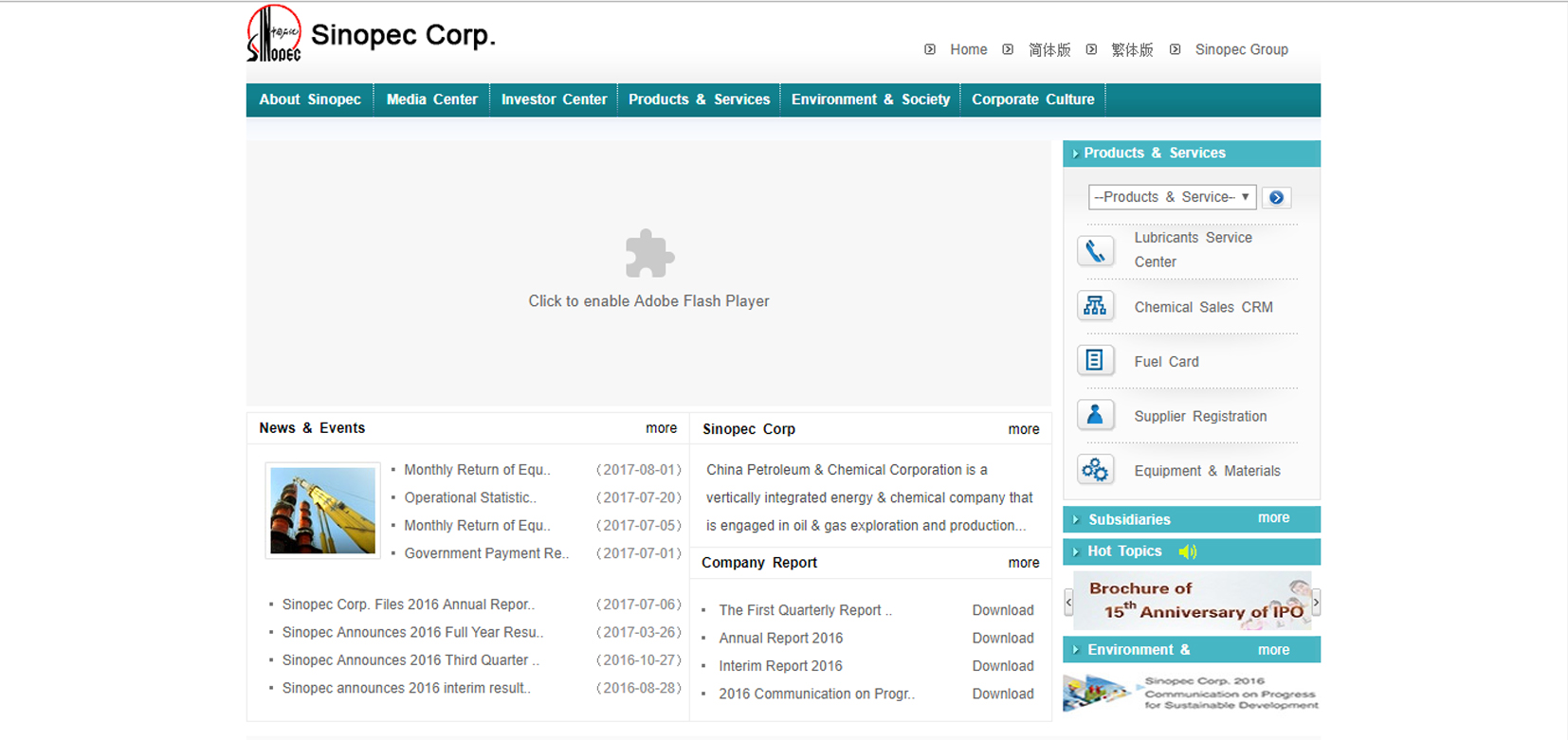
Yet another website built using Flash… “Add your advertisement here” is the first thought that comes to mind when seeing this homepage. Also, the design seems to be stuck in the 2000s. They could have done a better job at telling more about their company. For example, a video with the company’s latest promo clip or a hero image focusing on the visitor’s attention could have been better choices.
This also applies to the Chinese version of the website. Speaking about the languages in which the content is written, mixing Chinese and English on the same page is not a good option. Apparently, the company does not pay too much attention on providing a great UX to its visitors.
Berkshire Hathaway

Just what is this? Believe it or not, this is Berkshire Hathaway’s official website, a company ranked no.8 worldwide, having a + $200M revenue. We are speechless. It is, hands down, the worst website we have ever seen, and we have seen way too many terrible web pages until now. Still, some of its subsidiaries, such as GEICO, DURACELL or BNSF for example, have decent websites. We just do not understand why the corporate web page of the parent company looks like someone’s planner from the 90s.
There is nothing to say about this site because there is nothing on it. No vision, no design, no content. It is just an incomprehensible absence. Null.
Verizon

Landing on Verizon’s homepage for the first time gives away the vibe of a minimalist website design. Things are a little bit different, though. The simplicity of this web page certainly contributes to an easy navigation, and helps distinguish among the company’s target audiences. Nevertheless, these easy-going pictures may exhibit a sense of unprofessional identity.
If we take a look at the company’s competitors, such as Vodafone, AT&T, and Orange (in Europe), we see a clear customer-centered design replete with pictures of happy clients.


Real images with real people allow the audience to relate to the products or services of a company. But a website that only has plans and phones, without actual people, will most likely not engage their visitors as much as it could.
Japan Post Holdings
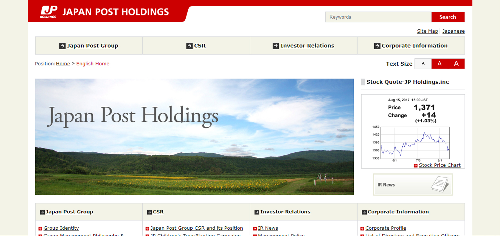
Templates and stock photos everywhere! Cheap website builders and stock photos are available today, but this does not mean that people have to use them as they are. Especially by some of the largest and the most reputable companies in the world!
Any experienced web designer has a keen eye when it comes to template-looking websites. If a web page looks like a politics column, then it certainly does not reflect the company’s image. Japan Post Holding’s website needs some redesign work lest they shrink their business image.
UnitedHealth Group
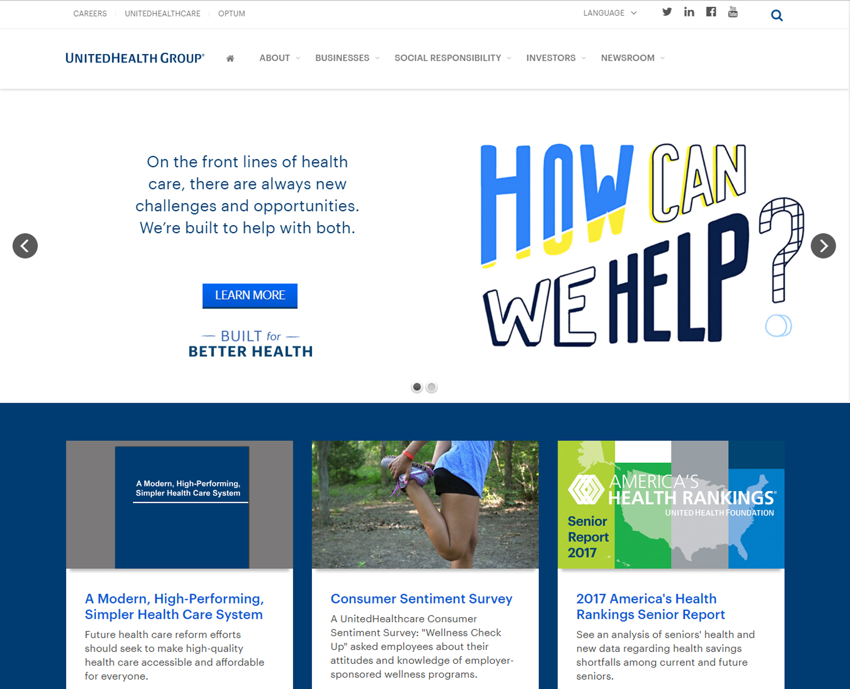
Nowadays, most companies focus on delivering customer-centric content and personalized pictures. This is not just a trend in web design, but a part of an efficient communication strategy. But seeing one of the top 50 companies in the Fortune 500 list using stock photos for the whole site seems a bit out-of-character.
UnitedHealth’s main flaw is that it uses just one picture. More than that, it is next to a huge clip-art image, which is a shocking choice altogether. If you scroll down, you can only see plain text. This approach might work well for the mobile version of the website. But why should it interfere with the desktop user experience?
Unfortunately, the UnitedHealth’s website is a classic example of how not to use stock images for your online presence. They clearly do not know that stock photos do not contribute to the company’s efforts in upholding its reputation.
Best Buy

Believe or not, this is the home page of Best Buy’s company, ranked no. 71 in Fortune 500 list. Honestly, we have seen better websites of much smaller companies. Not to mention that after choosing Country and Language, the “Go” button does not work. We always talk about providing a great user experience to the site’s visitors, but it seems that this company does not know how to do this. Definitely, the website needs a redesign. But before doing so, we think they should take a look at Amazon’s website for some inspiration. Can you spot the difference?

Penske Automotive
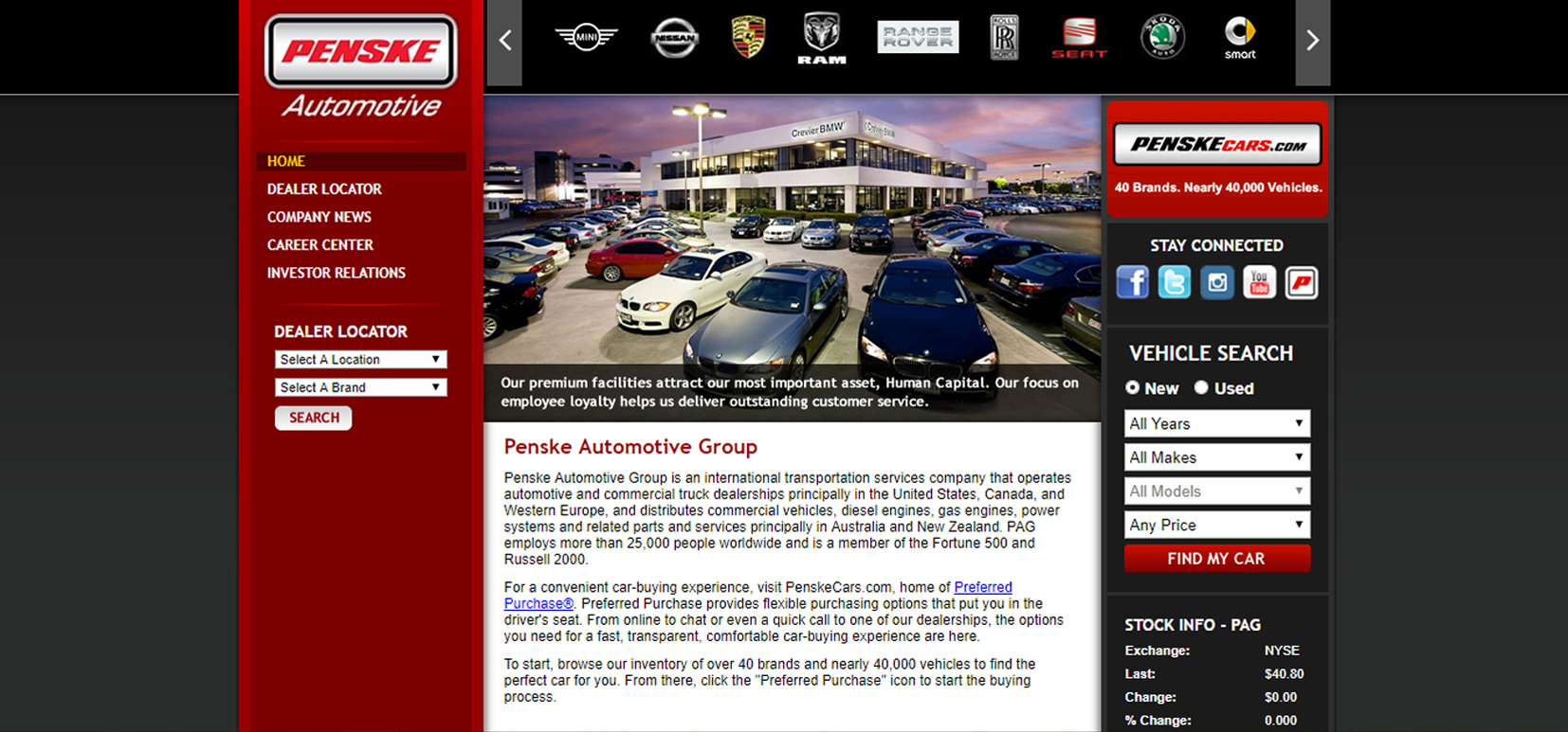
Yet another trip back to the 2000s. This time it is because of Penske Automotive’s home page. Firstly, the design is extremely outdated. A website centered on the screen, large dark gray unused space, an automatic carousel of images above the fold, and well, that’s about it. There are a lot of old elements that just do not go with a modern, eye-catching website. The latter engages its visitors and provides a great user experience. If you check the Press Release page, you’ll notice just a listing of titles. Taking into consideration their area of expertise and the amount of useful information they could share with their visitors, I was surprised to notice the absence of their blog.
Do you know the worst part? The website has been redesigned this year and it is unresponsive!
Kroger

Not a member? You cannot surf their website! This could be appropriate for a website with restricted content, not for a retail network! Buyers are the main category of users for this kind of websites, so the site’s goal should be attracting new customers. But Kroger seems not to care if their users cannot see access prices and useful info unless they logged in.
Strangely enough, it seems that Kroger wants to engage only particular users. This is suggested by publishing cooking recipes and by sponsoring social activities. But the website’s structure does not properly fit any objective. It tells us that the company cannot decide on the purpose of the website – deal with their customers, act as an online shopping platform, or build audience.
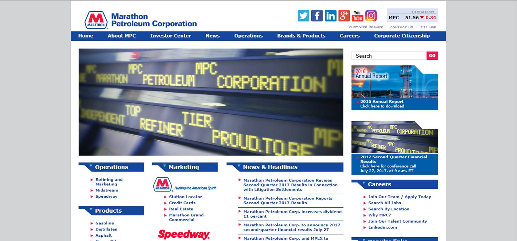
Marathon Petroleum Corporation

Enough with the outdated website designs! According to its own presentation, Marathon Petroleum Corporation “is one of the largest petroleum product refiners, marketers and transporters in the United States”. Surely, their website does not reflect this. It looks rather like an unhappy news web page. Take a closer look at the main picture. Even if they wanted that to be a custom image, the result is poor. And just what is there under “Popular links”? Nothing. Maybe that is because there are no popular links to share?
Also, they did not pay any attention to the content. Again, that may be simply because they do not have any content – just a listing of titles and a lot of white space. Instead of this, they could have used their home page to either provide useful information or engage their audience.
And to make the situation matters worse, they have just redesigned their website. Guess what. It is unresponsive.
Bottom line
So, these are the websites of 10 companies ranked as the most successful companies in the world. Unfortunately, these site designs do not reflect the status of those companies, nor the successful principles behind these businesses. We are sure there are other companies listed in Fortune 500 that have terrible websites in need of redesigning. But before doing so, they should follow the latest trends when it comes to both web design and online communication.
We hope this article convinced you that there is always something to improve, even if you are a top-tier company.


Best Buy’s website looks nothing like the screenshot on this post, though.
That’s really interesting. I’ve actually took that screenshot so they must’ve changed it. I guess they are avid WDL readers and they acted quickly. 🙂