Thousands and thousands of new websites get launched every year, hoping to capture the interest and attention of many readers. The content, of course, is crucial, but so is the canvas people choose to publish their work on. People seem to adopt a more basic and fewer color themes, creating Clean and Minimalist Website Designs. Would you like to see some of them? Check them out below!
A popular statement says “The less is more” and it’s true. Our collection of clean minimalist website designs proves it. Minimalist websites became quite famous over the years. There are a lot of advantages of clean, simpler websites, such as speed of loading and focus on the most important things. They are also super stylish!
The minimalist design makes the content, the product you sell, or your artwork the star of the website. Besides, they give a professional impression to the audience. A minimalist website design fits almost any type of business, especially the technology oriented ones, desingers’ blogs, fashion publications, and many others.
Sometimes it may be quite challenging to save the balance between a minimalist design and the client’s requirements. The websites collected below are great examples worth to follow and get inspired from.
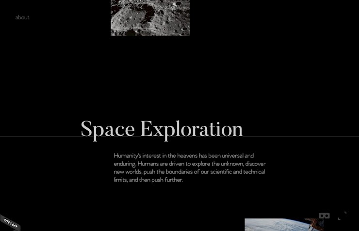
1. Why we Explore
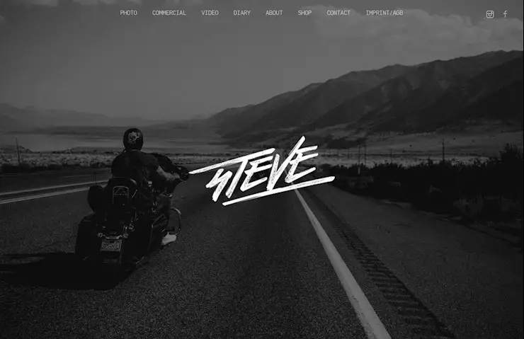
2. Steve
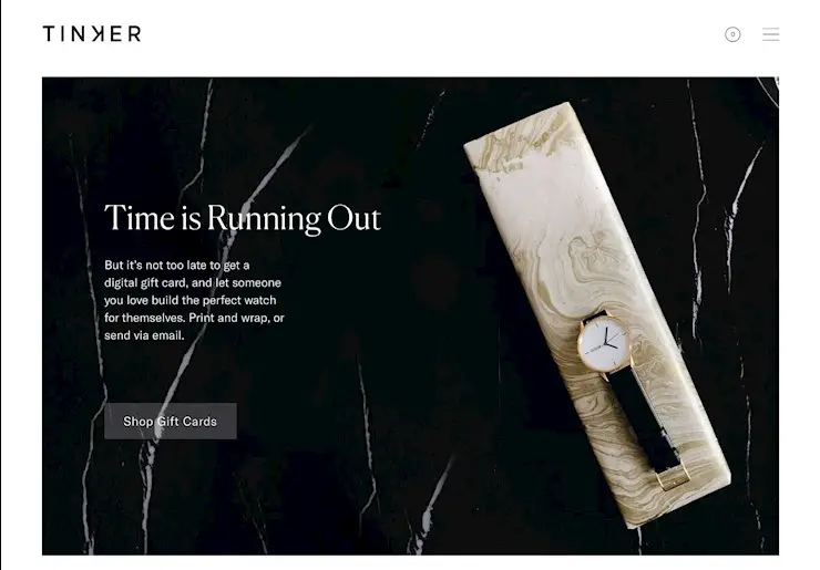
3. Tinker
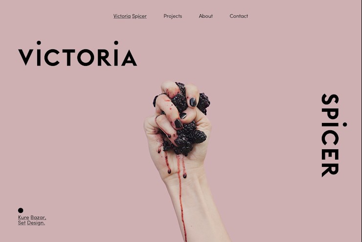
4. Spicer
5. Pauwels
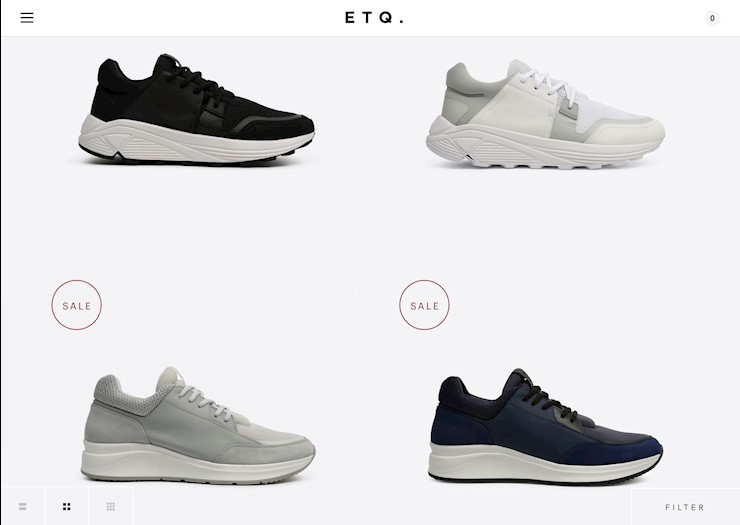
6. Etq.-amstedam
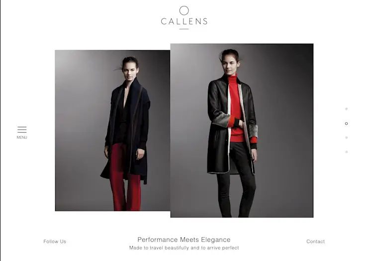
7. Callens
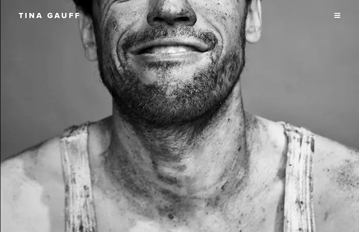
8. Tina Gauff
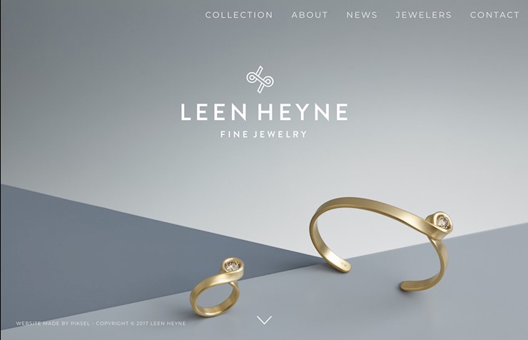
9. Leen Heyne
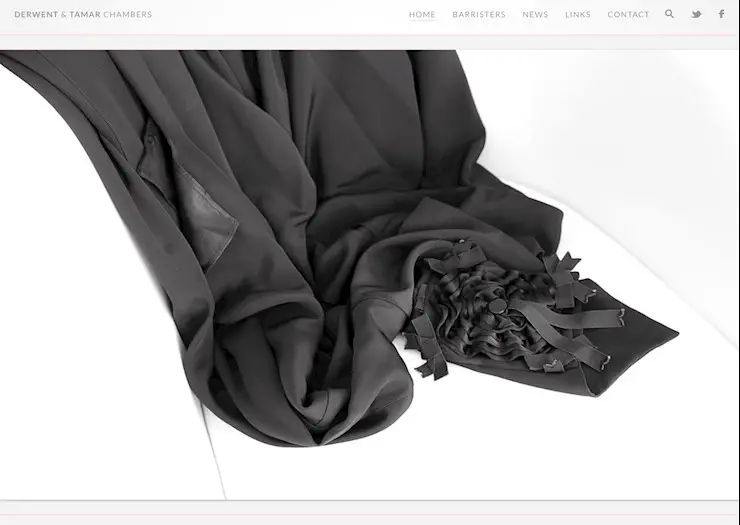
10. Derwent and Tamar chambers
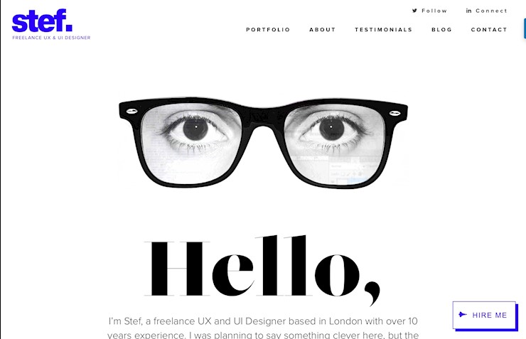
11. Stef
12. Panini Bay
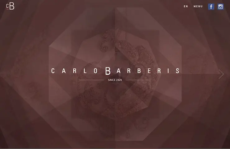
13. Carlo Barberis
14. Dennis Adelmann
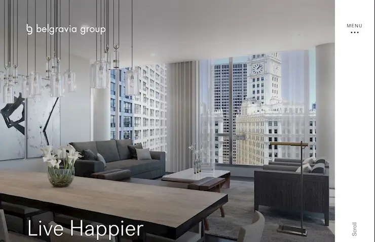
15. Belgravia group
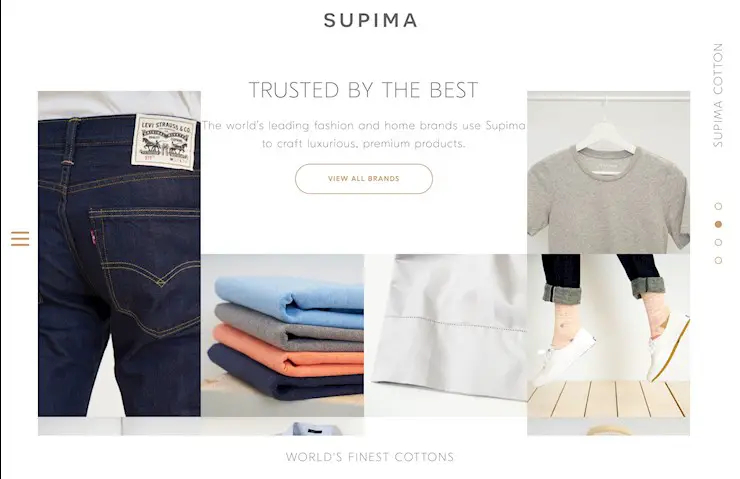
16. Supima
17. Mikiya Kobayashi
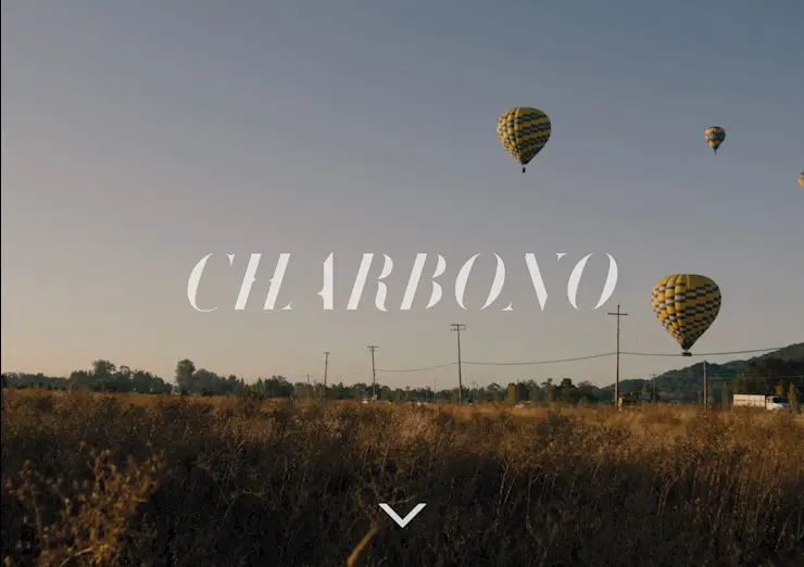
18. Charbono
19. Elite
20. Sliders
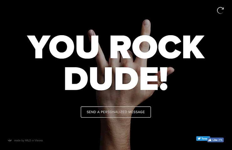
21. Sendamessage
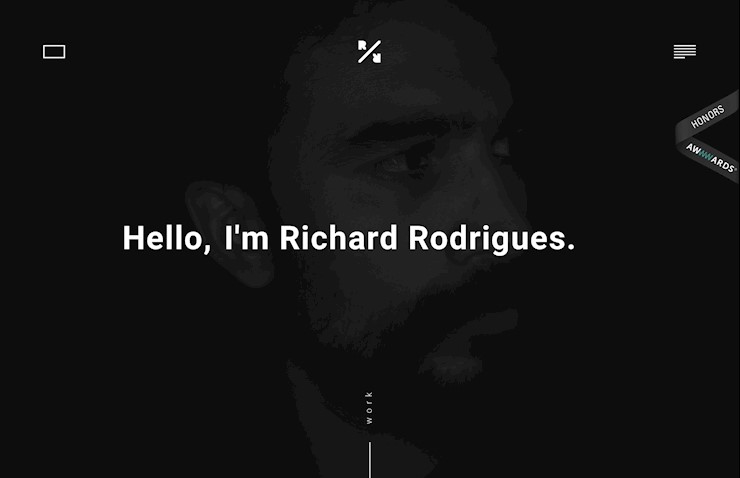
22. Richard
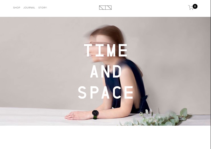
23. Time and space
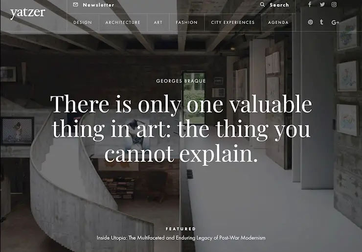
24. Yatzer
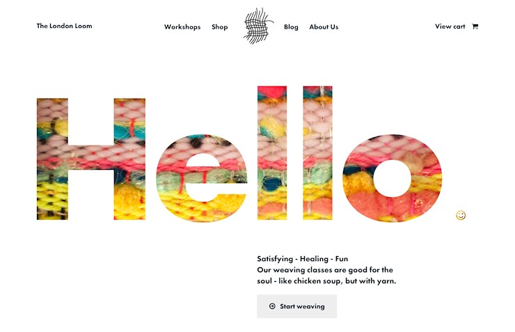
25. The London Loom
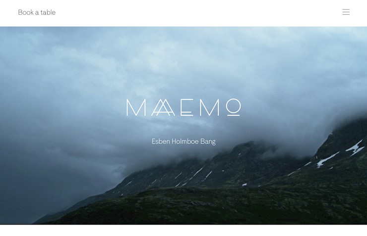
26. Maaemo
27. Matt Quinn
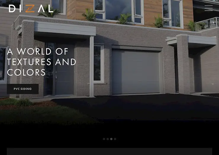
28. Dizal
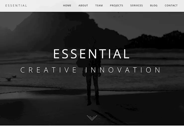
29. Essential
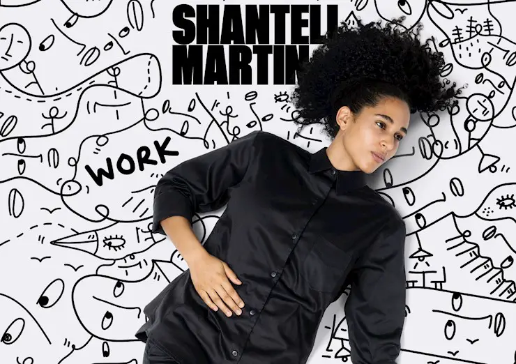
30. Shantell Martin
You’ve succesfully made it to the end of the article! Yay! We truly hope that you have found it inspiring and the minimalist website design you are working at the moment won’t give you headaches anymore. We would appreciate if you shared this article with other minimalism lovers!











Leave a Reply