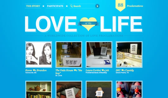
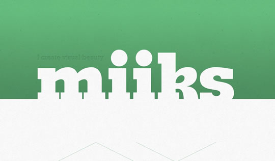
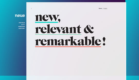
Last year we showcased 55 Examples of Huge Typography in Web Design and since typography is always an important aspect of web design, we decided to gather a new list of websites that use big typography. From tag lines, to headers to whole texts, there are plenty of great examples to show. Check it out, and start thinking about going big on your next project.
Inspiration  Gisele MullerFebruary 21, 201117 Comments014.6k
30 Examples of Big Typography in Web Design
Share
Gisele Muller
Gisele Muller loves communication, technology, web, design, movies, gastronomy and creativity. Web writer, portuguese/english translator and co founder of @refilmagem & @mentaway Twitter: @gismullr


Some really great examples of typography. Big type on these home-pages give an instant impact of importance. Love the way type is used in most of these designs above.
My favorite ones have to be Miiks and Matt Hamm’s typography.
Thanks for sharing.
Great, thank you! We will show these to our students at web courses bangkok. thanks!
You missed mine 😉 https://www.carlrosekilly.co.uk
Great examples within this list, ,y favourite is ‘Forefathers’
Great collection. Thanks! I am sure there is more to come now custom fonts become so accessible.. Looking forward to see the next batch 🙂
Excellent collection. Another thumbs up for Miiks, whose play on white space caught my eye immediately. I also love Denise Chandler’s illustrative touch.
Thank you for including my little portfolio 🙂
Thanks for posting this information. Improving the typography on a website can transform it from a boring design to a great design.
huuuaaaa….very cool
Great collection of sites using big typography, my favourite’s got to be Visual Republic… Thanks for sharing.
Great!!!! 😉
Great designs. I see most use a big picture in the layout and just type on top. Nice perspective I’ll try it!
Great selection of websites with stunning typography.
Yes. Your selection of websites with an especially typography stil is nice. There are some great ideas to improve the usability of a webside. The focus of a webside could be clearer and directly for the user of this webside.
I love this style the most for these types of sites by Denise Chandler and Kyle Steed. Most of the sites listed here are pretty amazing too but these stand out to me more lately. Nice!
you forgot https://helveticasux.com
Hey great post… Think you missed one out though! https://www.creativezest.co.uk
Love the use of retro fonts around at the moment.
Thanks for including POKE New York. We’re honored. And guess what? We’ve recently relaunched as Makeable! Would you mind correcting the link and image?