
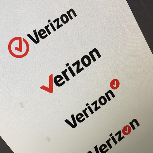
While checking Dribbble I stumbled onto a really great shot by David Kovalev.
![]()
Looking through the comments I noticed a fairly accurate point made by Claudiu Cioba:

So what do you think? Are all of those logos really better than Verizon’s?
In my eyes the answer is pretty clear, and I think Verion should hire David Kovalev to give them a real 2015 redesign.


To me, the included Verizon logo at the bottom seems alot more compressed / low resolution compared to the others which makes a comparison unjust. However, all logos looks alot better than the previous Verizon logo.
latest logo just looks lazy!
#2 & #4 are more visually appealing. I like that the “V” is apart of the name. It simplifies it.