
Today we’re getting into the nitty-gritty of integrating dark theme design into your website, app, and overall designs.
We are major stans of dark UI, and we know that lots of other people are too.

Considering that dark UI was the most highly requested thing of Apple by their clients in 2019.
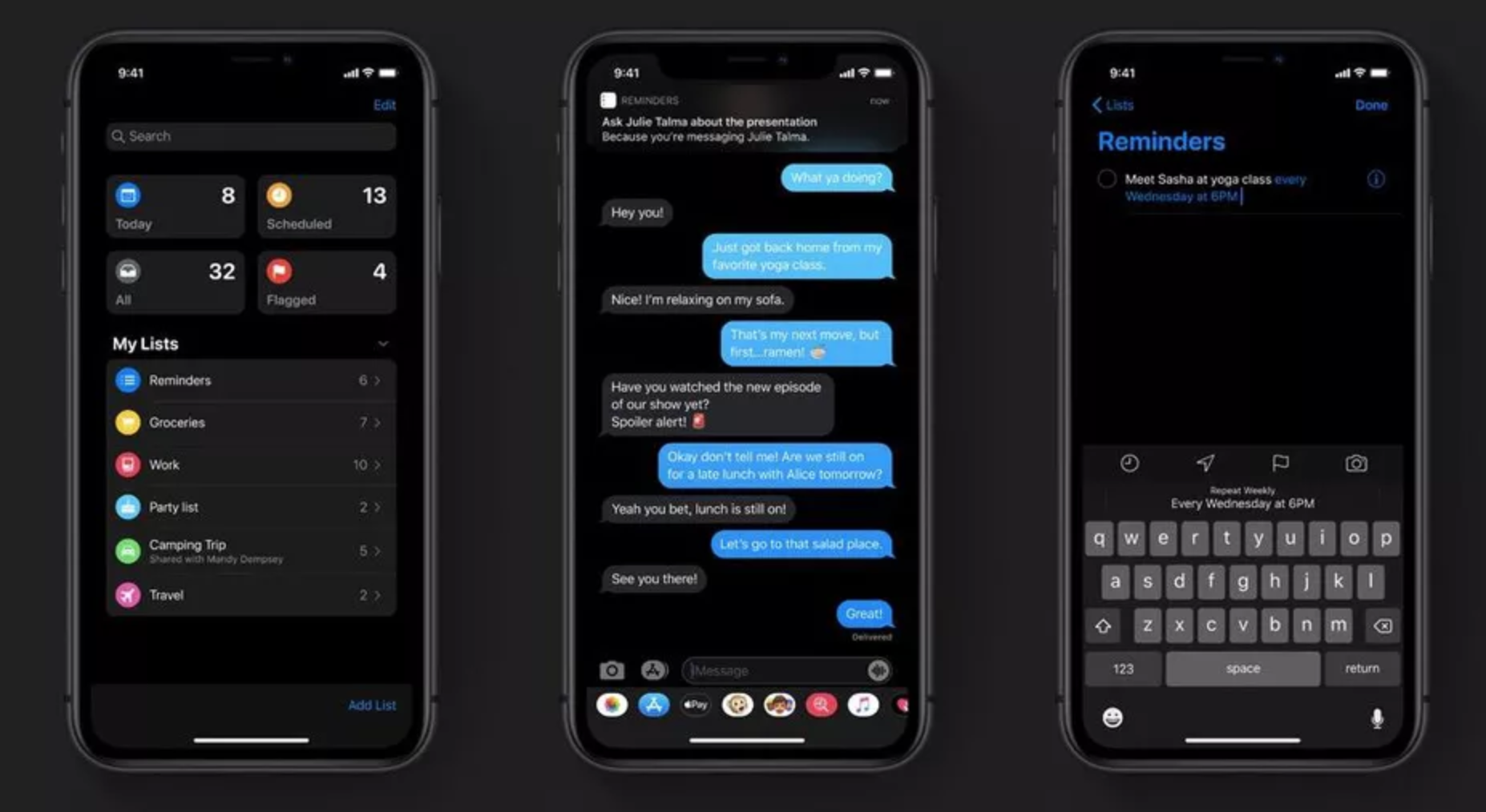
Lots of apps like Instagram and YouTube have given users the option to use their dark theme and people are living for it.

[source]
4 Tips For Dark User Interface Design – What You Need to Know
If you’re considering “coming to the dark side”, then there are 5 things you need to know before you start designing.
So, here we go!
1. Allow People to Use Dark or Regular Mode
The first and most important thing is to give your clients and users the option of using dark or regular mode.
You can’t please everyone 100%, but at least you can give people the option of using whatever mode they like most.
Some people like dark mode, some people like regular mode. I, personally, am one of the few of my friends that will always use regular mode.
I am definitely the outcast of my group when it comes to using dark mode.
I’m literally the only person who will ever use regular mode because all of my co-workers and friends are obsessed with dark mode.
So remember, it’s important to let people choose what they want to use.
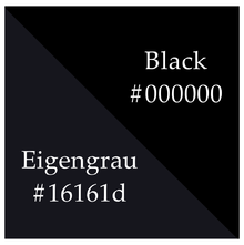
2. Don’t Use Pure Black
Dark mode doesn’t mean you have to use the color pure black as your background.
In fact, using a pure black color can actually cause more harm to your eye than using the bright mode.
One of the many reasons people use dark mode is to protect their eyes from all the bright colors, and when you use pure black, it can be hard for people’s eyes to adjust and register everything.
 [source]
Especially if your primary color is pure white. It’ll just be a disaster, which I’ll unpack more in the next point.
So, instead of using pure black, use a dark grey color instead. Or even a lighter grey. The choice is yours.
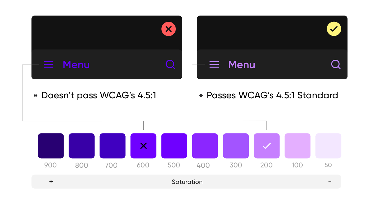
3. Make Sure You Use Desaturated Colors
Just like using pure black can damage your eyes, you should also avoid using very bright, saturated colors.
When you use saturated colors, it strains your eyes to be able to decipher what is written.
Take these 2 different color choices for example. One is easy to read, the other is more difficult.
[source]
It’s safest to go with the more neutral version of whatever color you’ve chosen as your primary and secondary colors.
It’ll still be beautiful, and it will be less straining on your client’s eyes.
Wouldn’t you hate to lose a client that loves your product, over a poor color choice?
4. Use Depth to Your Advantage
When you decide to create and design a dark mode for your app, it’s very important to use depth to your advantage and create a sense of hierarchy and to put lots of emphasis on important elements in your design.
As you know, in regular or light mode, you can use shadows to express elevation. But that approach won’t work well in dark mode.
Since you can’t see a shadow on a dark color very well, a better approach to this problem would be to use lighter colors to create some depth.
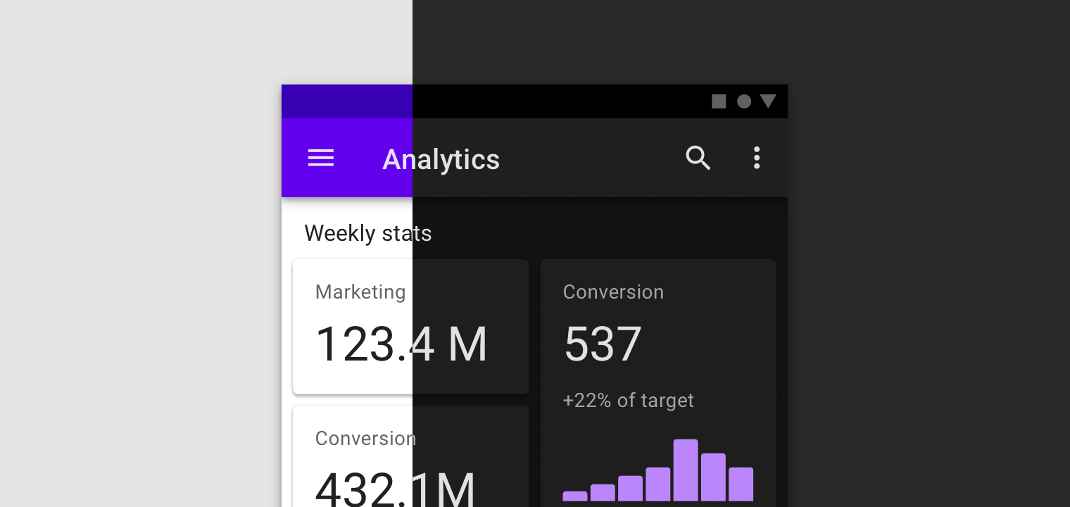
[source]
It’s best to illuminate the surface of each level because the higher a surface’s elevation, the lighter that surface becomes.
Wrapping up
We hope you found these 4 tips of dark UI design helpful and that you can integrate these principals with ease into your next design project.
Let us know what other tips you all have when designing a dark mode for an app.
Until next time,
Stay creative, folks!


Leave a Reply