There are times when customers want as much content as possible, as many design elements and drop-downs as possible. They saw some cool sites and they wanted a little of everything.
That’s quite understandable, but we’re trying to explain that a site with a lot of content and complicated design is not necessarily easy to use, sometimes even having the opposite effect for users.
That’s why we’ve created a mini guide of 4 Ways To Simplify Your Website Design To Attract Customers:
1) Shorten the content of the website:

Web visitors rarely read line by line, usually, they only scan the web pages and their focus is only on a few words and images. However, there are many web pages that have content that is not needed to send the message. You can clean up a lot of the content of a website by limiting the number of words on the screen. Try refraining text to remove parasite words.
How can you do that? You can practice by expressing a single idea in a single paragraph – it’s a good way to write and helps readers “scan” the text with the look. Another way to write is the “pyramid” format, that is, start from the conclusion and add content along the way. A site that I really like for the simplicity offered is Apple.com.
2) Delete the visual decorations:

When it comes to visuals, it often happens that we want to add extra elements because it ‘looks good’. Everyone desires a design that looks good and unique. But although intentions are good, the end result may be disastrous. Try to have as little decoration as possible or other items that won’t distract the reader from what is important.
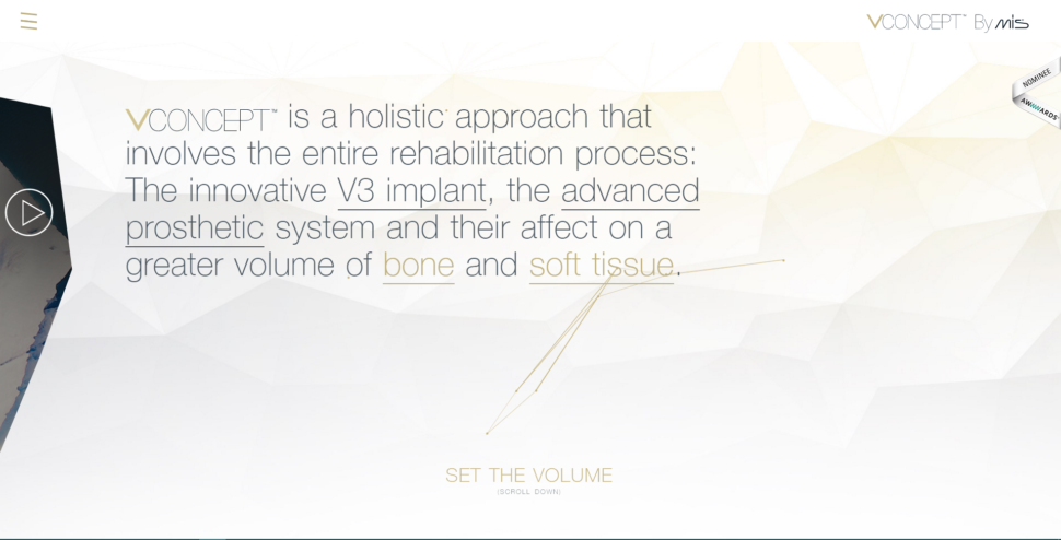
Below I attached a screenshot on the Vconcept.com page. It can be noticed that they do not have a lot of text, but the text is very difficult to understand and they have a problem with the fonts. They use plain text, underlined text, some words have a different color, and the first word that represents the company’s logo is a different font. We can also talk about all triangles flying in the background, a decoration that does not bring any benefit to the site.
3) Reuse design elements:

Try to create repetitive elements and consolidate them. If you use a lot of colors, fonts and style variations, the result will be overwhelming, but in a ba way. I recommend that you re-use the design elements to maintain a consistent design on the page. There are also some basic rules such as: Do not use more than two types of font per page. The same rule applies to colors and design elements. If you have a quote at the end of each page, make sure it looks the same on all pages.
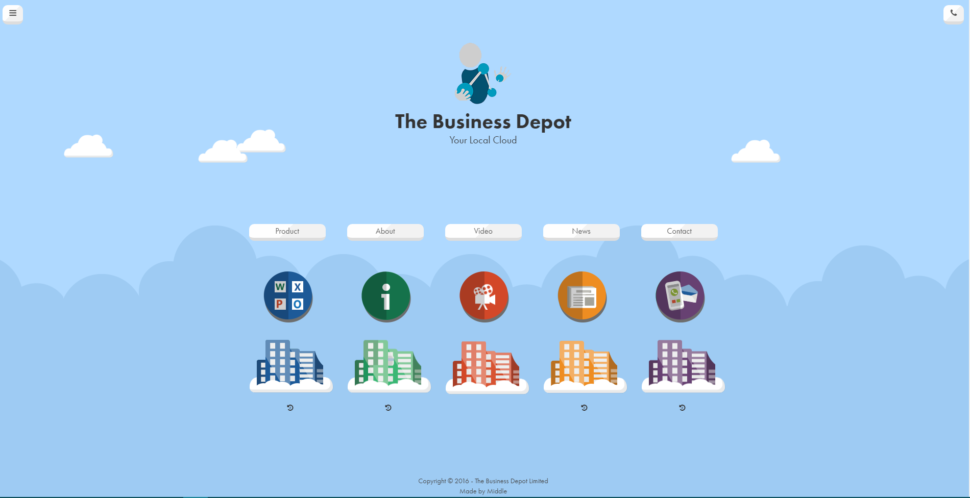
An example would be thebusinessdepot.co.uk. They seem to use a simple theme, but too many colors are used. Also for each page, there is a different color that has no meaning.
4) Have one user as target:
I know it sounds a little crazy for me to tell you this, but it works. I’ve encountered too many companies that are trying to address a wide range of clients, different ages, different backgrounds, different sexes, and so on. Which person do you think your message will reach if you have such a large target? Surely the message will be very diluted and so will be the results. Try to have one user in the head when thinking about the design of a site. Think exactly who you are addressing, what age you have, what educational profile, what gender, what hobbies and concentrate all your energy and resources on this person.
Also, if you have product campaigns on your site, try making them as clear as possible. If your goal is to make a customer purchase a particular online course, delete all the things that might distract him. I also recommend a landing page dedicated to each marketing campaign you have. This way you can send a much clearer message to your customers.
We hope that you found these tips helpful and that you will make your website stand out in the crowd.


Leave a Reply