
As great as it might seem to have a massive team working on your brand’s image, (logo, imagery, content, etc.) it might not always be the best idea. True, more designers means more design, but in a lot of cases, it also means a lot of variation in style. On the other hand, one designer providing one particular style may prove to be more effective.
On another hand, a lot of brands have many designing needs. It can be a lot for one person to do alone. That’s why most brands create a style guide to help any current or future team member understand the brand’s voice, and what they expect from the new team member.
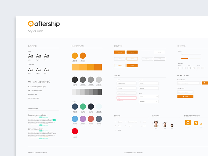
A style guide is a crucial piece of onboarding material, especially for larger teams. That being said, it’s not written in stone. Style guides can and should change frequently to meet the needs of the clients. Trends change, and so do style guides.
Now, it is worth saying that a style guide is a free document that is. We will give you advice on some elements that it should include, but in no case is it the absolute truth. If the designer estimates that you should include other material or remove some, go ahead! This is just a general guide, to get you started off on the right foot. More can be added or taken away later, according to your brand’s needs.
Shall we?
1. Define the brand image
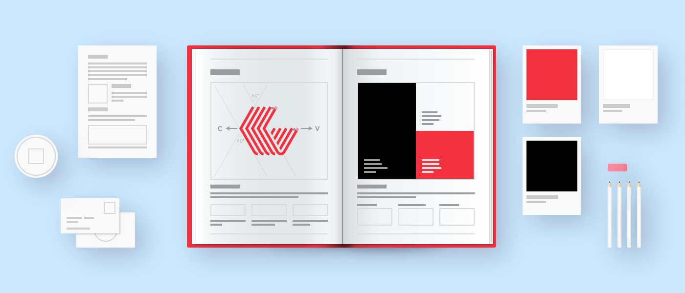
Every style guide has to start with the image for the brand. It is difficult to design or know how to design the other corporate elements if we do not know what the logo will be like.
This is usually the one that sets the basis of the style guide, so to begin with, we have to study branding and competition and know where we are going to start. It is time to investigate, study and have in our minds ideas of how we can develop the image of the company.
Once we have developed this idea, we can take the first step to design our style guide, in which the logo will be the one that feels the bases.
2. Different logo options
Once we have defined our logo with its corporate colors, we must take into account the different options in which the logo may appear, so it is convenient to specify how the design appears depending on the situation (on a white or black background, in responsive, etc.).
Of course, the logo is editable and we can expand or decrease it, but depending on the design we can reach a point where we resize it so much that it loses its essence, so we have to mention it now before it gets too far out of hand.
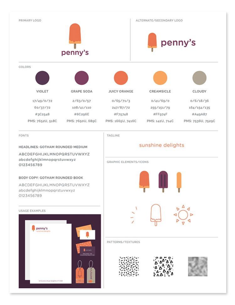
3. Define the typography
Once we have defined our brand image, we have decided to turn several elements such as colors or fonts. The colors will be fixed for the other elements, but the typography that we use in the logo may or may not be as relevant in some situations.

The first decision we have to make is the size and position of the typography. You’ll probably have to play around a bit to find a few acceptable combinations.
So, we must create a guide in which the typographies that are used are determined, with the different sizes of text. Each and every approved combination should be listed and explained in detail so that the hierarchy and the color of the typography are well defined.
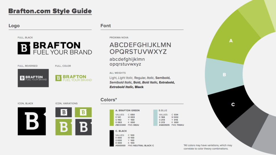
4. Define the color
Just as we must define typography, we must also make clear what the corporate colors are. As we already know, the colors have a code that makes them unique. These are the codes that we have to mention so that regardless of the tools we use, or the person using them, we get the color we have designed. It’s not as simple as “dark blue” or “bright red.” Be specific, and you’ll avoid any and all confusion regarding colors in the future.

The more options of combinations you offer, the more versatile your guide will be.
5. Definition of the general elements
It is very difficult to define the general elements that may be needed for the development of the brand. What we can define, however, are the recommendations for use, so that they can serve as a starting point for their design.
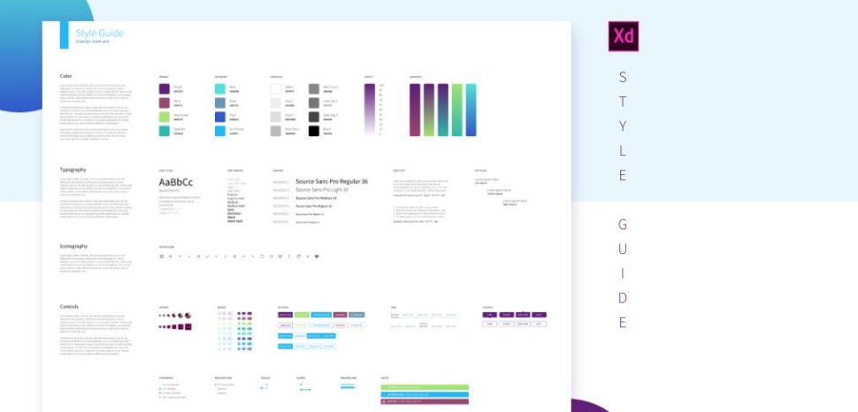
This is complicated I know, but there are some factors that can be determined, such as the size of the images and the color of the icons. These are general specifications, sure, but they can be used as a starting point for the design of these elements.
6. Defines the spacing
This is a point that usually goes unnoticed but that is very important. Often times, this is responsible for bad readability of the text. Sometimes, it can make users confused about where old content stops, and new content begins.
Because of this, the decision of the spacing, whether of the logo with its borders, the hierarchy of the text or of the general elements, will help us know how we want the overall design to be.
In addition, uniform spacing between all the elements gives a more serious and professional look, and it certainly comes off as more organized.
7. What to do / what not to do
Clearly, this is not a mandatory element but it can be very helpful in any style guide. This point is to give a few guidelines of what we can or can not do with each of the elements, such as logos, icons, images, and so on. This doesn’t mean, however, that each tip listed above can’t be expanded on.
For example, we talked about the use of colors in logos and typography. Depending on the image you want to portray, you could even go into color codes that you want to avoid completely. Or, you could talk about the use of certain words within your content.
It is very useful to include actions that you do not want. Although there might be a lot, it’s worth listing as many as you can, and adding to them as you go if you need.
The conclusion
There is a lot of content that goes into making a brand style guide. By no means is this a comprehensive guide, but it certainly will get you started off on the right foot. Remember that although these tips will be useful, the completed version of your brand’s style guide will all depend on your brand and your brand alone.
In that regard, no 2 style guides are the same. Sure, they contain similar elements, but they were each designed for one purpose: to define the style of the particular brand. So, as you get started, take it slow, put some thought into the guide, and don’t be afraid to revise it if you think it needs change.


Leave a Reply