Design principles are a set of generally applicable laws, guidelines, and design considerations. These principles reflect the knowledge and experience accumulated over the years by professionals and researchers from different fields. These principles serve as a starting point for the creation and resolution of problems in our designs. In addition, they tend to combine developments in different disciplines, not only related to design, but also to sociology, psychology, physics, ergonomics, and human behavioral sciences.
In this article we not will not only look at these principles as they are applied to graphic design but, we will also see how they can be applied for web designers. Although at first, they may seem two completely separate worlds, they have in common more aspects than we can believe in a principle.
Alignment
We refer to placing text or any other design element in a format or page as being aligned. This helps us create a certain order, organize each of the elements, create visual connections and improve the overall legibility of our designs.
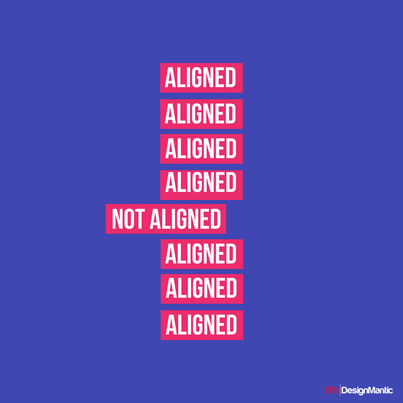
Aligning elements that are not close to each other helps us offer an invisible connection between them. For this reason, if our design is well aligned, it will go unnoticed. But on the contrary, poor alignment will cause the opposite effect, and it will be noticed almost instantaneously.
This principle is displayed in a multitude of ways. We can align both vertically and horizontally. Align with respect to one of the edges of our work table, or the center of it. Or we can even use the break of the alignment to highlight an element. Having a completely aligned design can add an element of value, allowing us to give importance to certain areas.
Contrast
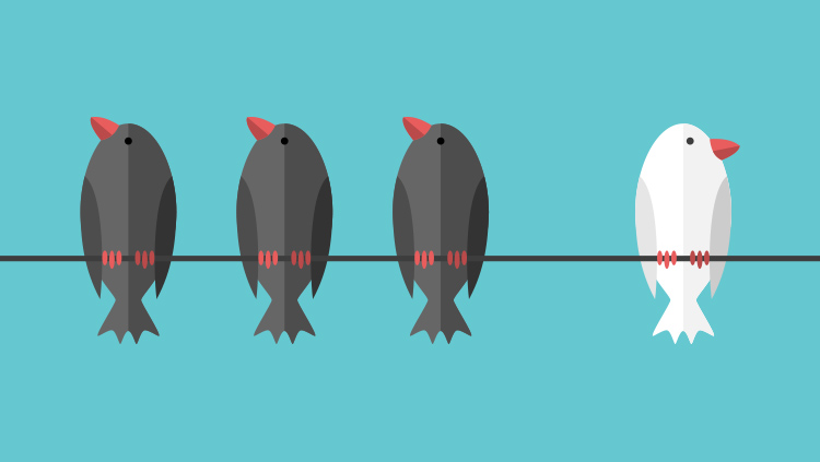
Contrast allows you to emphasize or highlight one or several key elements of your design. We create this contrast by showing two totally opposite elements. For example, with well-differentiated typographies, different thickness of lines, or the scale of the elements.
The contrast has a basic role if our purpose is to organize the information on the page. At the same time, we want to guide the reader to where we want them to look in the first place. It will serve so that our point of interest becomes a focal point of our design. For that reason, the best thing to do is to stop using subtleties. The contrast should show in an obvious and striking way.
Blank space
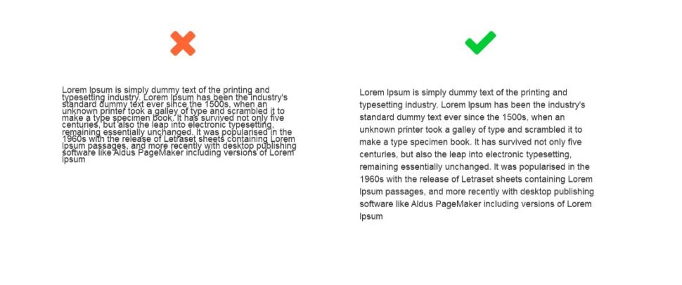
The parts of the design that we leave blank, or empty, are almost as important as those that we fill with color, images or texts. This empty space between the rest of the elements is creating a shape, which will highlight the most important areas of our design.
With the blank space, we can differentiate into two large groups. This way, there is the use of a large blank canvas with a single main element. With this, we obtain a minimalist and clean design, also playing with the contrast, of which we have just spoken. An example of this type of design is the Google search page. Clean, minimalist, and with the right elements to avoid distractions.
Balance
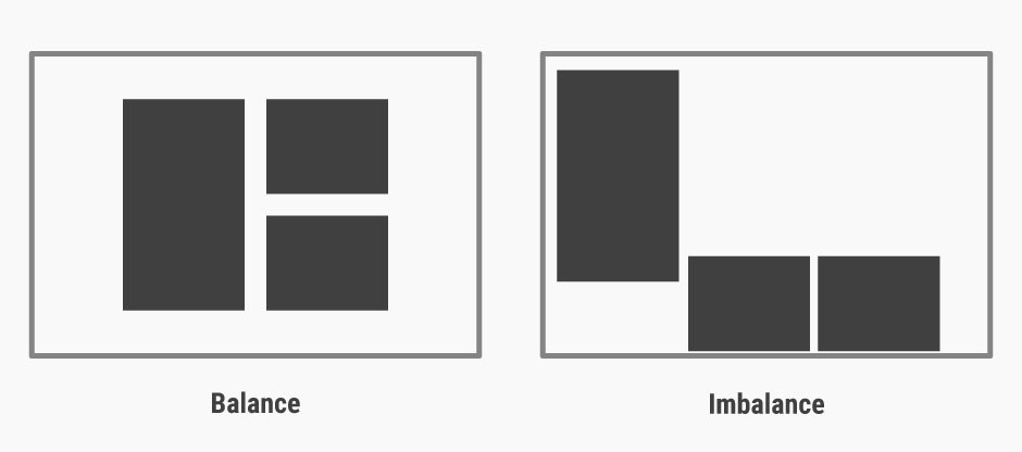
Each element of the design has a visual weight. Using this visual weight, we can create a balance in our composition. This is a very important part to take into account, since people, in a natural and unconscious way, look for a balance, both in our lives and in everything that surrounds us.
Finding this balance is an essential part in the work of a good graphic designer or web designer. If we succeed, we can direct the reader’s gaze wherever we want. In addition to correctly communicating the message, we want to portray. Because after all, that is the main point of all of this.
The lack of a balance in our designs also makes us evoke certain emotions in people. Of course, it may seem that certain works or designs are unbalanced at random. But if they achieve their purpose, they will have the reader or viewer practically drooling out of satisfaction.
Hierarchy
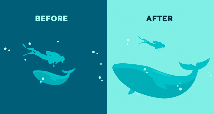
The hierarchy must classify each element of the design according to its importance within it, creating a guide by which our eyes should move. The viewers or readers will fix their vision at first by the most dominant characteristics of the design, going little by little through the secondary content, until they have examined all the information
This hierarchy is established in different ways: size, color, shape, orientation, etc. This visual hierarchy is fundamental in any graphic design that has multiple elements. It serves to identify a logo so that browsing through a website is as simple and easy as possible.
There are many tools available that allow you to check to see if your desired hierarchies are working. Tools like heat maps are great for anyone looking to perfect the flow of content on their website. It’s also pretty important to keep track of your website’s performance using statistics in Analytics.
Proximity
Proximity within the graphic design helps us group certain elements. The elements that have no relationship or are different must be spaced, to emphasize their lack of relationship.
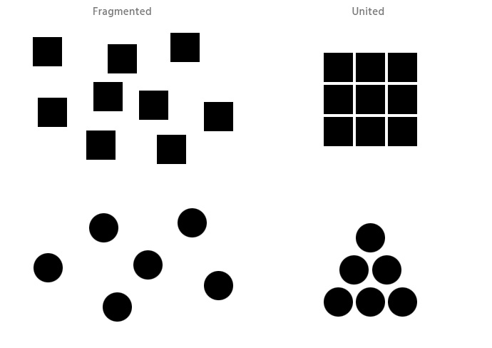
This is because human beings tend to organize elements in logical groups, as they serve to maintain a certain logic and order. This principle is just a way to formalize this innate order that we have, to communicate with others more easily.
For example, if we have to design elements that contain texts, it is appropriate to create logical groups of information. Together with the information we already have about the use of the hierarchy, order them appropriately. And speaking of text, we must not forget the importance of creating a correct structure of a text, which is at the same level as our design. Because if we do not have it, it can spoil our work completely.
Repetition

If what we are looking for is to create a unified and cohesive design, the repetition of certain elements and/or characteristics will be our best ally. Especially when you are creating a brand or a series of images.
This principle can essentially be split into two parts: repetition and patterns. The first one is clear, for example, in web design. We always choose to repeat the same design and placement of each of the elements in the same place. This makes the visitor feel more comfortable and improve their user experience.
The patterns are nothing more than the repetition of several elements. These are quite common in backgrounds of web pages or applications. They help us to make the background a whole, but not so boring that when we use a background with a flat color.
Wrapping it up
With all these principles in mind, it will be easier to face any design, whether we are talking about graphic design or web design. Although these principles are quite simple, not every designer follows them, and certainly the ones that do not execute them perfectly.
The key is to play around with these principles. Use them to your advantage, but don’t be afraid to adopt them if they’re needed.


Leave a Reply