For any website or blog, the contact form is an element that makes a very powerful statement. Just like a business card, the contact form speaks for itself, as it is the gateway people use for passing their love to you. Best web forms are strong in three parameters: idea, design, usability. Let’s take an expedition to the nicest of the contact forms out there.
The following snapshots are taken from visual art websites and blogs. Dive in!
krijtenberg.nl

No doubt over the professional look of this website. This photography boosts the effect of a simple contact form. It really ties the tie!
m1-design.de

A flash contact form that impressed us. Everything is in dynamic here, kind of hard to catch but surely an eye-catcher.
englishworkshop.eu

Modern graphics and wise choosen colours join in this contact form to create a powerful effect.
beakable.com

Is your posted content fragile? If so, there’s nothing to worry about, the envelope is completely safe, beakable.com has taken care of that.
moozedesign.com

What do reindeers and the colour blue have in common? This contact form right here.
Along with the beautiful design of the contact form itself, proper positioning is also important, so that the other elements on the page contribute to the overall aesthetics. The following blogs have made the best out of the available space, colours and shapes from the general theme.
alexarts.ru

We are in Moscow and everything floats around in the world of Alexey Abramov. The lightbox contact form fits perfectly in.
bio-bak.nl

This flashy website is a show and the contact form makes no exception. You can fill it in as soon as you get used to the big hand that replaced your mouse cursor.
apbaxter.com
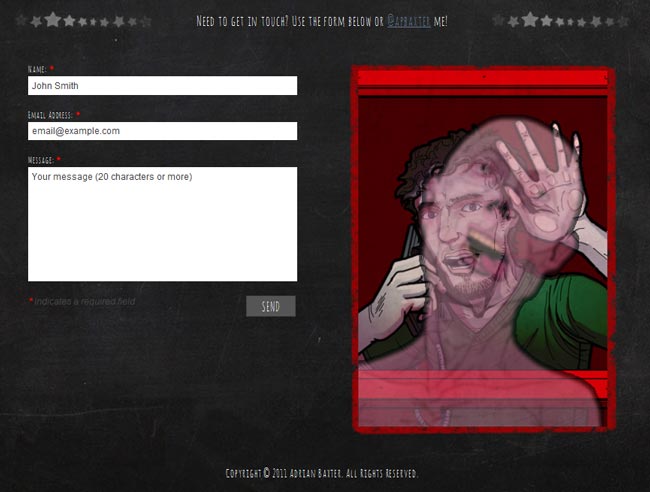
Seems like the phone booth is a little crowded right now in here, but you can still leave a message using the contact form. If you dare to.
denisreggie.com

A photographer’s website in contre-jour has its contact form all the same.
fullfatdesigns.co.uk

This contact page also contains information on payment plans, so that the user wastes no time in getting the point.
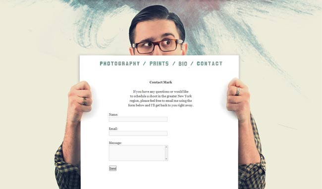
markjaworskistudios.com

Mark Jaworski is here to help and so is his contact form.
dreamerlines.lv

This contact form is the main element on the homepage of dreamerlines.lv. Crystal clear message.
crayonslife.com

A playful overall theme in which the blog’s contact form is immersed as well.
Sense the elegance of simplicity! A brief contact form is just all you need most of the times, if it hits the right spot. Some of them come in lighboxes, some in plain HTML. Let’s have a look at how wonderful they are.
charliegentle.co.uk

Contrast and a touch of handmade graphics give the unique feel of this contact form.
christianothstudio.com

A telephone is quite a frequent icon for contact forms. This old fashioned phone, however, is no cliche, but an impressive touch.
du-bout-des-yeux.com

Just like that! Simple, clear and effective.
ftdesigner.net

The joy of minimalism. The playfulness of colours when in contrast with a black background makes this contact form a very wise choice for a designer’s website.
fullstopinteractive.com
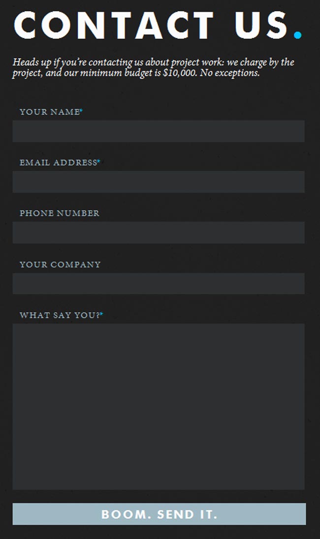
An out of the box send button and, boom, there we have one impressive feedback form.
yourbeautifulphotography.com

A contact form in high key. The logo balances the page beautifully.
thetoke.com

This one here represents the low key. Straight to the point.
theserved.com

The burst of layered colours is the salt and pepper of this contact form.
amazeelabs.com

Back to basics… but not quite. A beautifully designed contact form in delicate colours.
softicons.com
![]()
Pixel art and a contact form make a good team in here.
tympanus.net

Use of colours is very important in a contact form, as it speaks about the brand. The combination of blue shades here is distinctive for tympanus.net.
sushimonstr.com

Last but not least, a wood textured message board that nails it.



I sincerely hope this is an ironic post?! I mean…seriously? Things have changed a bit on the last 2 decades…
True, that is complete nonsense, this author should get updated with the modern trends!
Great ideas. We bookmark your website to be update about your every new post.
I thought they were pretty unique. Crayon to send a note …. loved a few of the ideas. Contact forms can have a sense of humor.
this looks so bad…