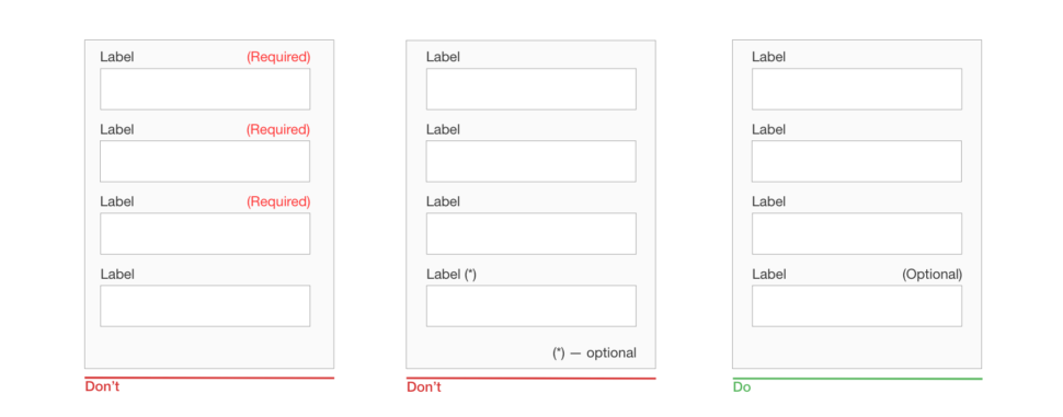
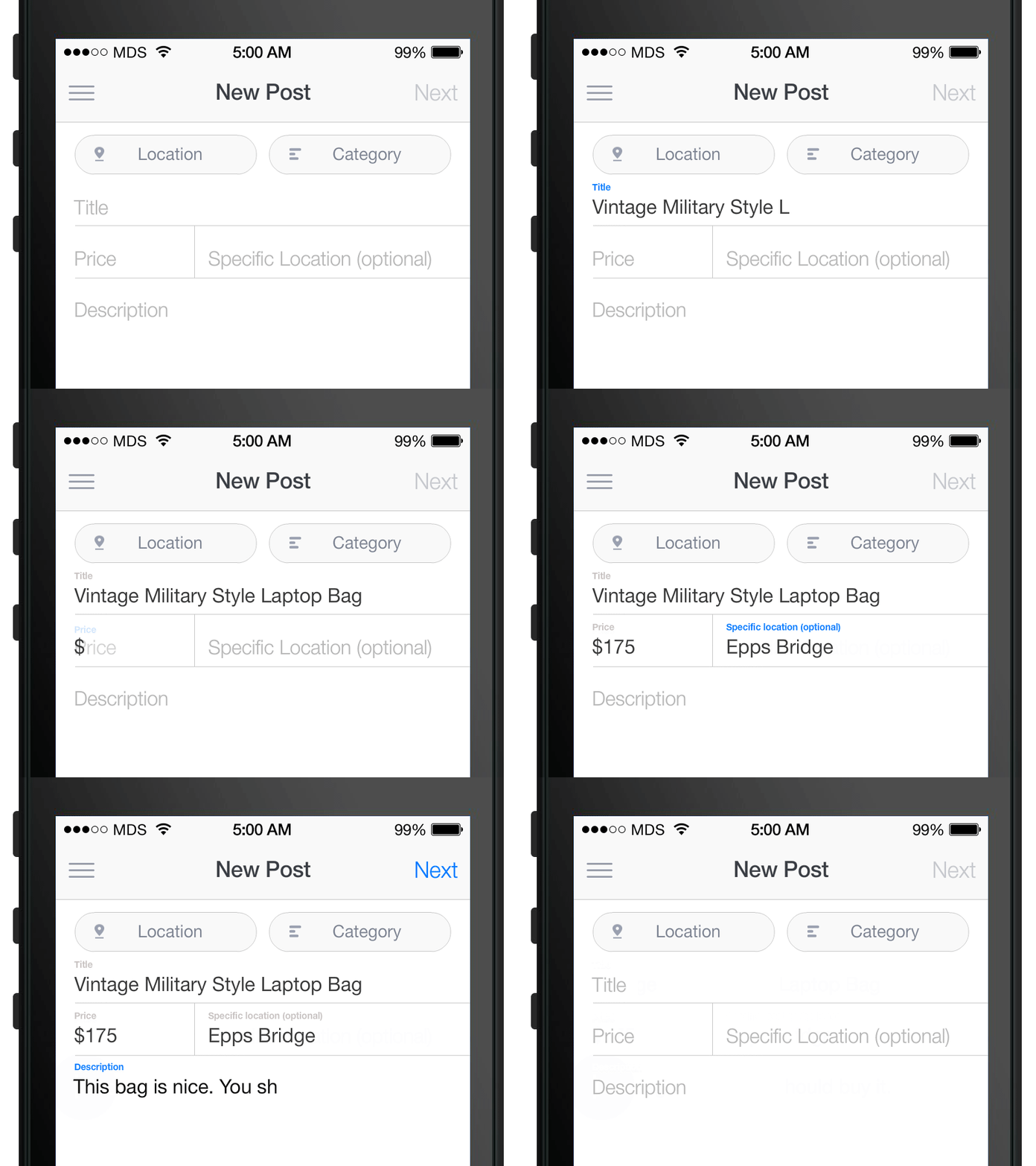
As an avid internet user, both mobile and computer, I think it’s safe to safe that filling out forms is one of the worst things ever. As boring and time consuming as they can be, they are undisputedly necessary. Today, we are looking at what should a mobile form look like and how to give it a formal touch.
Let’s think for a second about how many times we use forms for an online interaction. You use them basically anytime you purchase goods, hotel rooms, or movie tickets. Not to mention, companies often use them to bring better service to the customer. So, the question remains: what can we do to make this process better? I’m glad you asked.
Say no to too much info
In terms of a transaction form, one thing that needs to become the norm is putting all the necessary information on one page. Notice that I said “necessary.” Too often, I’ll go online to order something and I’m bombarded with additional advertisements and options that make my eyes water if I stare too long. Listen, I already purchased something from your website. You don’t have to convince me anymore.

First impressions mean the most
I think most people will admit that if the form looks too complex, they won’t finish it. It’s not really anything new. People are going online for their convenience. If you make something too complex, or even just look complex, people will avoid it. I’m certainly guilty of thinking this way. Make forms effective and efficient.
The perfect mobile FORM (ula)
What exactly does a good form comprise of? Believe it or not, there is a basic recipe for a good form. One that doesn’t overwhelm users, and one that gets the job done. Here’s what we’ve got:

- Input fields
Here, you’ll have room for all the required information. Things such as passwords, discount codes, sliders, checkboxes, etc. will all be input in these boxes.
- Field labels
Field labels tell the user what to put into the input fields.
- Structure
You have to have some sort of framework for your fields. Make the order make sense and it’ll be easier to follow along.
- Action button(s)
The page will have to have at least one button that submits all the input info.
- Feedback
After the action button is triggered, the submitter should get a notification that everything went smoothly.

There are many successful form templates out there. Depending on what the form is used for, it will probably look a little different than the last. The key is to make it simple, understandable, and convenient for the user. Remember, people do things online to make it easier for them. A complex form will only scare away potential customers.


Leave a Reply