

The Angular Material project integrates Google’s Material Design with the AngularJS MVC framework and offers web engineers(especially AngularJS devs) a solid foundation of tools.
Google’s Design project is a system of tools for prototyping both web and native applications. From this Google created Material Design, a framework centered around design-driven principles.
Material Design was eventually adapted to work with AngularJS, thus marking the creation of angular-material. Throughout this article I’m going to talk further about different aspects of the angular-material project and show you how well it integrates these 2 platforms together.

Harnessing the Power of Angular-Material
When dealing with headings and other typography related styles, Angular-Material offers css classes for you to use. Much of the true power of Angular-Material is accessed through custom components that allow you to control every aspect of an Angular application.

These components come in the form of directives and attributes, and offer a broad range of functionality.
The Layout Attribute
Angular-material utilizes several variations of the layout attribute to style web applications. In the same way that BootStrap uses classes, Angular-Material uses custom attributes to define your applications layout.
Material Design utilizes flexbox, therefore Angular-Material provides the flex attribute for developers to use. Due to its recent struggles with browser support, many are unaware of the inherent control flexbox gives to developers.
Nonetheless Angular-Material’s flex attribute can take a value, though it does not necessarily have to.
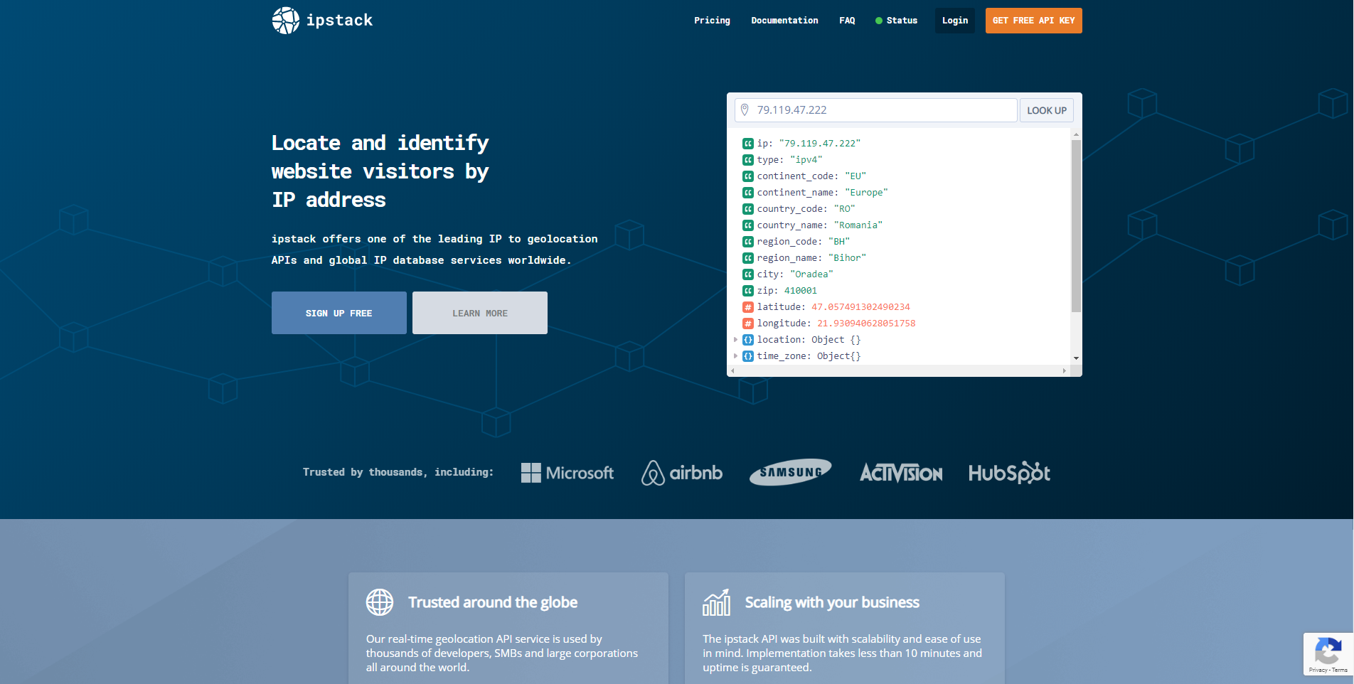
Let’s take a look at a bit of code in an example from the Angular-Material website. It gives you a bit of insight as to how the flex attributes work.
<div layout="row">
  <div flex="66" flex-sm="33">
  This is the first div!
  </div>
  <div flex="33" flex-sm="66">
  This is the second div!
  </div>
</div>
The first div tag would flex to one-third of the space on mobile, and two-thirds on other devices, and the second div expands to two-thirds of the space on mobile, and one-third on other devices.
Functionality Through Different Directives
The flex attribute is just one of the many things that Angular-Material offers.
The framework also makes great use of directives that make tons of different thing possible. For example, Angular-Material provides directives such as md-autocomplete which a will query through a data set depending on a user’s input. Angular-Material will perform this query in realtime, thus providing a the best possible experience for the user.
Among the other directives Angular-Material offers out of the box is md-grid-list. This directive allows you to define complex grids layout and gives the developer a great deal control over what is displayed inside an angular app.
The md-grid-list directive takes different attributes such as md-cols and md-row-height. This directive allows you to define highly complex layouts that are fully responsive, which you can see for yourself in this demo.
The angular-material framework gives you all the tools you need to create highly functional web applications that provide users with a great design & experience. Now that you have some background of the framework, I encourage you to experiment as it is truly a web developer’s best friend.


Leave a Reply