
After nearly 100 years, BMW has decided to change up its old logo and give us something new and fresh.
With every new and upcoming generation, BMW loves to switch things up and give us a new logo.
![]()
“The new logo and brand design symbolizes the importance and relevance of the brand for mobility and the joy of driving in the future,” Jens Thiemer, Senior Vice President BMW Customer Brand
The logo has seen 6 facelifts in its time, each corresponding to an appropriate design of the era.
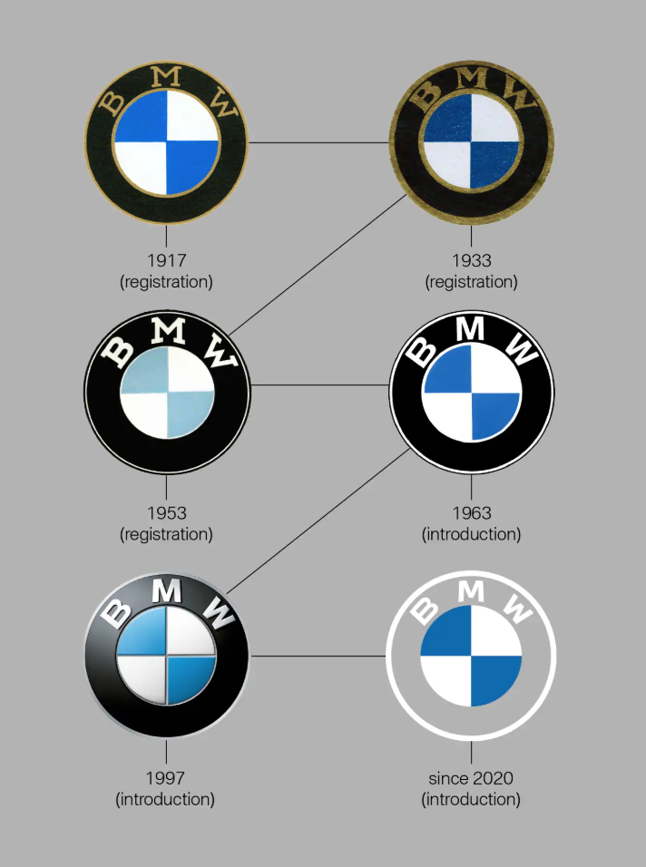
The BMW logo that I grew up with (1997-2019) is quite different than the new one of 2020.
To me, it seems BMW really took it back to its roots when they retired their gradients and 3D effects and traded it for a flat design.

The colors are obviously changed from a lighter blue to a dark blue and the font also got the slightest facelift.
The new and improved logo has kept its original shape, but it’s withing the logo that we’re going to see some major differences.
Of course, the bavarian colors of the iconic BMW emblem are still a must and are prevalent in the design.
And the outer ring is now flat, as opposed to what it used to be.
It is with these identity changes and visual changes that BMW wants their clients to view them as more accessible and available to all.
Also, I need to mention that BMW’s subbrands, BMW i and BMW m, will also stand to get new identities.
![]()
![]()
I personally am a huge fan of the new logo. It’s the perfect combo of modern-yet-vintage-and-a-little-bit-of-luxurious, but we want to know your thoughts on the new BMW logo.
Are you a huge fan or could you pass?
Let us know in the comments!
Until next time,
Stay creative, folks!


Leave a Reply