A logo can make or break a company, product or event. Some logos are so iconic that they can easily be recognized without needing to be put into context or contain any words. For example, everyone knows what the Olympic rings represent. Although it’s changed some over the years, the Pepsi circle with red, white and blue swirls is another instantly recognizable logo that has been very influential.
Unfortunately, for every logo that becomes famous, there are several that run the gamut from boring to flat out terrible. In some cases, a poorly designed logo can cause a decline in revenue and may even be controversial enough to hurt the company’s overall reputation. Avoiding this type of mistake is critically important, especially for new businesses. Therefore, we present a look at some of the worst logo designs of all time to help you steer clear of doing something similar.
Inappropriate Designs that Caused Controversy
There are many ways that a logo can fail, but arguably the worst offenders are those that are inappropriate. Consider for example how much controversy was caused by the Olympics London 2012 logo.

It’s an eyesore for sure, and people from all walks of life saw a variety of inappropriate things in it, ranging from a lewd sex act starring Lisa Simpson all the way to it reminding some people of a swastika.
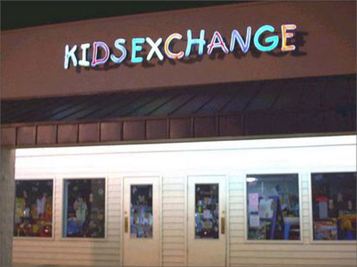
Two other logos that attracted a lot of controversy did so because their designers failed to consider the sexual connotations of the final product. This was especially bad because the companies the logos represented involved children. First up is the shocking Kid’s Exchange logo that omitted the apostrophe and mashed the words together to create what some saw as “kid sex change.”

Even worse is the old logo for the Catholic Church’s Archdiocesan Youth Commission, which appears to put a child in a compromising position.

Ultimately, when it comes to anything dealing with kids, it’s best to err on the side of caution to ensure that no one will see anything sexual in the logo. Otherwise, controversy will follow, and not the type that can get a company or a graphic designer positive attention.
Horrible Letter Spacing
The Kid’s Exchange example also fits under the heading of horrible letter spacing. This is what happens when a designer doesn’t provide enough space based on their font choice. It’s also a problem that’s caused by choosing the wrong font altogether. As a result, the letters within the logo end up looking like they spell something other than the intended words.
This can be comical for those of us on the outside looking in, but if you’re the owner of a business such as Mega Flicks, it’s a nightmare to discover that the L and I appear to be melded together to create a U instead. Keep in mind that part of logo design can involve creating eye-catching signage, but you want to attract attention in the right way.

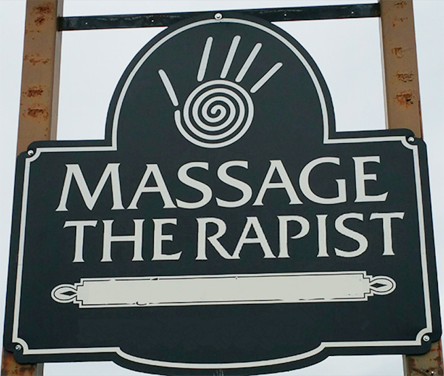
A massage therapist definitely learned this lesson the hard way when an unfortunate space between the E and R on their sign appeared to send a very different message than what they had in mind. Mistakes of this nature have also happened in full-fledged logos, so always double and triple check everything before publishing it.

Redesigns That Shocked the Graphic Design World
Being a graphic designer who is entrusted with the job of creating a fresh new look for an established company is a huge compliment. Sadly, some of these designers create something that makes it clear the company in question was better off sticking with their original logo. There are dozens upon dozens of examples from this category that have been discussed to death, so we’ll just highlight a couple for your reference.
Kraft is a household name and staple thanks to their Macaroni and Cheese and countless other food products. When they transitioned to a new logo, they did choose a design that’s softer, prettier and takes a more feminine approach. However, it also looks like a rip-off of the Yoplait logo. That alone would be bad enough, but rebranding from Kraft to Kraft Foods in such a drastic way was confusing for consumers.

In an attempt to become relevant and hip again, AOL rebranded themselves as Aol. with a period at the end of their name. That’s odd enough looking, but the ugly and chaotic background images, especially the green squiggles, make the company seem more annoying than hip. This is rather fitting, though, for the company that did annoy people nationwide with countless free startup discs during the ‘90s and early 2000s.

Ugly Logos that Send the Wrong Message
A logo needs to be a major part of a company’s branding, and as such, it must be consistent with their overall message. When this doesn’t happen, the logo is not only typically ugly but it also conflicts with the products and services on display. For instance, a company called The Detail Doctor should probably steer clear of omitting important details in their logo. Unfortunately, that’s not what happened. Instead, their logo showcased a car with many details missing, including the tires.

Another small business that attracted big attention for the wrong reason is Catwear. This clothing company, which has since gone out of business, used the tagline: “Clothing for the independent woman.” So far, so good, right? Using a cat in the name and logo could have also been very cute if the cat hadn’t been depicted butt first. Later revisions of the logo removed the part of the cat drawing that looks like a butthole, and eventually, the cat was dropped altogether. Still, the damage was done, and Catwear will live on by showing designers everywhere what not to do.

Staying off of “Worst Of” Lists
Lists of the worst designs are humorous and sometimes borderline painful to look at, but no one wants their company or design to end up on one. Some of the most obvious logo fails that we skipped over were clearly not designed by a professional, so always keep that in mind. Also, remember to use proper letter spacing, steer clear of anything that could appear sexual or otherwise inappropriate and make sure the logo actually sends the right message about the business. If you stick to these tips, you still may not end up with one of the best logos of all time, but at least you can steer clear of designing or buying one of the worst.
Bonus:
Here are the worst logo redesigns of 2016 and an analyze on the Mozilla Firefox redesign.


Pingback: Everything You Need To Know About Kerning - Web Design Ledger