
Mobile devices like Apple’s latest iPad Pro was released with a larger screen size in hope to compete with the most portable of laptops. The overtake of mobile browsing continues as phone screen get larger influencing both web design and UI. This creates a constant challenge for designers when their canvas changes every year. A different way of thinking is required for responsive design, designing for the traditional browser window is no longer reliable.

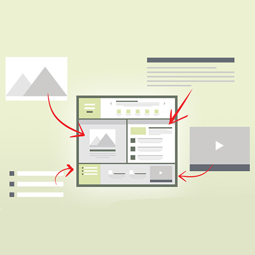
Designing with multiple screen sizes in mind becomes speedy and more effective when considering content in the wireframing process. This is explained in UXPin’s free e-book Content Wireframing for Responsive Design which describes content wireframes as the on-screen layout of content without actually depicting it. By blocking out areas for the content or splitting it into different categories, designers can create movable parts to adapt to any screen size.
The book is written by Adobe-certified author Tom Green and can be downloaded via Creative Bloc.


Leave a Reply